CSS-in-JS Next JS
Last Updated :
06 Feb, 2024
NextJS is a very popular React framework which offers powerful tools to users for creating robust web applications. NextJS important key feature is that it support CSS-in-JS which allows CSS directly within their JavaScript code. In this article learn how to use CSS-in-JS in NextJS its syntax, project setup and its example.
Prerequisites:
Steps to Create the Project:
Step 1: Install NodeJS.
Step 2: Install NextJS globally using npm or yarn.
npm install -g next or yarn global add next
Step 3: Create a new NextJS project.
npx create-next-app my-app
Step 4: Navigate into your project directory.
cd my-app
Step 5: Install your preferred CSS in JS library.
npm install styled-components or yarn add styled-components
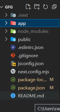
Project Structure:
The updated dependencies in package.json file will look like:
"dependencies": {
    "next": "14.1.0",
    "react": "^18",
    "react-dom": "^18",
    "styled-component": "^2.8.0"
}
Example 1: In this example, we import styled from styled-components to create a styled button component. We define its styles using backticks and CSS syntax. Then, we use StyledButton within our JSX to render the styled button.
Javascript
'use client'
import React from 'react';
import styled from 'styled-components';
const CenteredContainer = styled.div`
display: flex;
flex-direction: column;
align-items: center;
justify-content: center;
height: 100vh;
`;
const StyledButton = styled.button`
background-color: #3498db;
color: white;
padding: 10px 20px;
border: none;
border-radius: 5px;
cursor: pointer;
`;
export default function Home() {
return (
<CenteredContainer>
<h1>Welcome to Next.js
with Styled Components</h1>
<StyledButton>
Click Me
</StyledButton>
</CenteredContainer>
);
}
|
Start the development server:
npm run dev or yarn dev
Output:

Example 2: In this example, we create a StyledHeading component using styled-components. We utilize dynamic props to adjust the font size and color based on the provided props. We then render multiple StyledHeading components with different variations.
Javascript
'use client'
import React from 'react';
import styled from 'styled-components';
const CenteredContainer = styled.div`
display: flex;
flex-direction: column;
align-items: center;
justify-content: center;
height: 100vh;
`;
const StyledHeading = styled.h1`
font-size: ${(props) =>
(props.large ? '3rem' : '2rem')};
color: ${(props) =>
(props.primary ? 'blue' : 'darkblue')};
text-align: center;
`;
export default function About() {
return (
<CenteredContainer>
<StyledHeading large>
This is a Large Heading
</StyledHeading>
<StyledHeading>
This is a Regular Heading
</StyledHeading>
<StyledHeading primary>
This is a Primary Heading
</StyledHeading>
</CenteredContainer>
);
}
|
Start the development server:
npm run dev or yarn dev
Output :

Share your thoughts in the comments
Please Login to comment...