Creation & Interpretation of Line Plots
Last Updated :
16 Oct, 2023
In this article, we will discuss about the line chart. Where we will know, what is a line chart, key concepts and interpretations of a line chart. And finally, we will plot the line chart graph with R.
Line plots
Line plots, also known as line graphs or time series plots, are essential tools in data visualization and analysis. They are particularly useful for displaying trends, patterns, and relationships in data over time or across different categories. In the R Programming Language comprehensive guide, we will explore the theory behind line plots, provide examples, and explain how to create and interpret them effectively.
Components of Line Plots
A line plot consists of several key components:
- X-Axis (Horizontal Axis): This axis represents the independent variable, often time or categories. It is where you typically place the values you are measuring or observing.
- Y-Axis (Vertical Axis): This axis represents the dependent variable corresponding to the values you want to visualize or analyze.
- Data Points: Data points are plotted on the graph at specific coordinates (x, y), representing the values of the independent and dependent variables. These points are connected by lines to visualize trends.
- Title and Labels: A title provides context for the graph, while axis labels clarify what is being measured on each axis.
- Legend: In cases where multiple lines or categories are plotted on the same graph, a legend explains the meaning of each line or colour.
When to Use Line Plots
Line plots are suitable for various scenarios, including:
- Time Series Data: Tracking changes in data over time, such as stock prices, temperature fluctuations, or population growth.
- Comparing Trends: Comparing trends in multiple datasets or categories, such as sales figures for different products.
- Displaying Relationships: Showing how one variable affects another, like the relationship between advertising spending and sales revenue.
Creating Line Plots
Here’s a step-by-step guide to creating a line plot:
- Gather Data: Collect and organize your data, ensuring you have a clear distinction between the independent and dependent variables.
- Choose a Tool: Use a data visualization tool or software like Excel, Python, R or specialized data visualization tools like Tableau or Power BI.
- Input Data: Enter your data into the chosen tool, specifying the x and y values.
- Create the Plot: Generate the line plot, ensuring you choose the appropriate chart type and customize it as needed (e.g., adding titles, labels, or legends).
Interpreting Line Plots
Interpreting line plots involves understanding the following:
- Trends: Look for upward or downward trends in the data. An upward trend indicates an increase in the dependent variable over time or across categories, while a downward trend indicates a decrease.
- Seasonality: Seasonal patterns may appear in time series data, such as monthly sales fluctuations or temperature changes across the year.
- Outliers: Identify data points that deviate significantly from the general trend, as they can indicate anomalies or important events.
- Comparisons: If you have multiple lines on the same plot, compare their trends to identify differences or similarities.
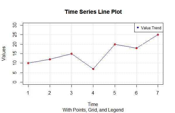
Time Series Line Plot
R
time <- c(1, 2, 3, 4, 5, 6, 7)
values <- c(10, 12, 15, 7, 20, 18, 25)
plot(time, values, type = "o", col = "blue", xlab = "Time", ylab = "Values",
main = "Time Series Line Plot", ylim = c(0, 30))
points(time, values, pch = 19, col = "red")
grid()
legend("topright", legend = "Value Trend", col = "blue", pch = 19, cex = 0.8)
title(main = "Time Series Line Plot", sub = "With Points, Grid, and Legend")
|
Output:
Creation & Interpretation of Line Plots
- We start by defining two vectors, time and values, which represent the time points and corresponding data values.
- The plot() function is used to create the line plot. We specify the type as “o” to indicate both lines and points, set the line color to blue (col = “blue”), label the x-axis with “Time” (xlab), label the y-axis with “Values” (ylab), and set the main title as “Time Series Line Plot.” We also set the y-axis limits with ylim to make the plot look better.
- We add points to the line plot using the points() function. This helps visualize the data points more clearly. We use red points (col = “red”) and specify the point character with pch = 19.
- The grid() function adds a grid to the plot, which makes it easier to read and interpret.
- To add a legend, we use the legend() function. We position it at the top-right corner (“topright”), specify the legend label as “Value Trend,” set the legend color to blue (col = “blue”), and use the same point character as in the plot with pch = 19.
- Finally, we add a title to the plot using the title() function. The main title is “Time Series Line Plot,” and there is an optional sub-title.
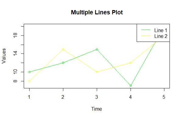
Multiple Lines on One Plot
R
time <- 1:5
values1 <- c(10, 12, 15, 7, 20)
values2 <- c(8, 15, 10, 12, 18)
plot(time, values1, type = "o", col = "blue", xlab = "Time", ylab = "Values",
main = "Multiple Lines Plot")
lines(time, values2, type = "o", col = "red")
legend("topright", legend = c("Line 1", "Line 2"), col = c("blue", "red"), lty = 1)
|
Output:
Creation & Interpretation of Line Plots
We create a line plot with two lines (Line 1 and Line 2) using the plot() function for the first line and the lines() function for the second line. We add a legend to distinguish between the lines.
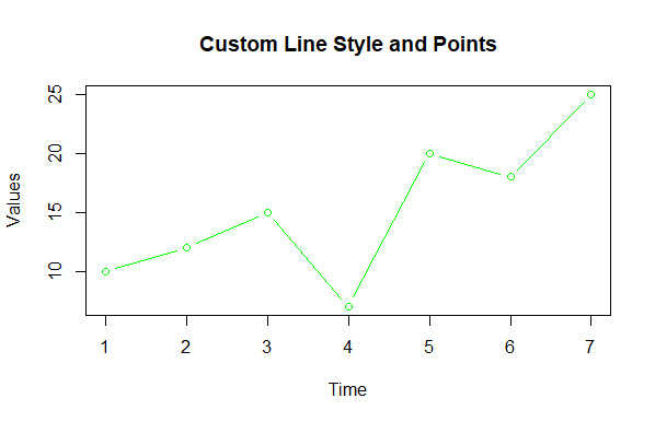
Customizing Line Styles and Points
R
time <- 1:7
values <- c(10, 12, 15, 7, 20, 18, 25)
plot(time, values, type = "b", col = "green", xlab = "Time", ylab = "Values",
main = "Custom Line Style and Points")
|
Output:
Creation & Interpretation of Line Plots
- we create the line plot using the plot() function with various customizations:
- plot(time, values, …) specifies that we want to create a line plot using the time vector as the x-axis values and the values vector as the y-axis values.
- type = “b” is an argument that specifies the type of plot we want to create. In this case, “b” stands for both lines and points. So, the plot will display both a line connecting the data points and individual data points at each time point.
- col = “green” sets the color of both the line and the data points to green.
- xlab = “Time” and ylab = “Values” are used to label the x-axis and y-axis, respectively. In this case, “Time” and “Values” are used as axis labels.
- main = “Custom Line Style and Points” specifies the main title of the plot. Here, the main title will be “Custom Line Style and Points.”
Conclusion
Line plots are powerful tools for visualizing and analyzing data trends and patterns over time or across categories. Understanding their components, when to use them, how to create them, and how to interpret them is crucial for effective data analysis and decision-making. Whether you’re tracking stock prices, sales data, or any other time-dependent information, line plots can provide valuable insights.
Share your thoughts in the comments
Please Login to comment...