Create Responsive Column Cards with CSS
Last Updated :
08 Apr, 2024
Column cards showcase articles, products, or user profiles attractively. Learning these techniques will help beginners and intermediate developers understand CSS better, creating responsive and attractive layouts. In this article, we’ll explore different ways to make column cards responsive with CSS.
Using CSS Grid
We can create responsive column cards using CSS Grid, which makes it easy to create complex grid layouts. With CSS Grid, we can effortlessly create responsive column cards, making our design process easy.
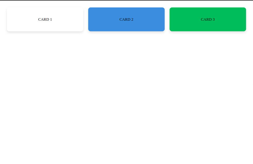
Example: Creating responsive column cards using CSS Grid
HTML
<!DOCTYPE html>
<html lang="en">

<head>
    <meta charset="UTF-8">
    <meta name="viewport"
          content="width=device-width, initial-scale=1.0">
    <title>Responsive Column Cards with CSS Grid</title>
    <link rel="stylesheet"
          type="text/css"
          href="styles.css">
</head>

<body>

    <div class="grid-container">
        <div class="card">CARD 1</div>
        <div class="card">CARD 2</div>
        <div class="card">CARD 3</div>
    </div>

</body>

</html>
body {
    text-align: center;
}

.grid-container {
    display: grid;
    grid-template-columns:
     repeat(auto-fit, minmax(300px, 1fr));
    grid-gap: 20px;
    padding: 20px;
    max-width: 1200px;
    margin: 0 auto;
}

.card {
    padding: 40px;
    border-radius: 10px;
    box-shadow: 0px 5px 10px rgba(0, 0, 0, 0.1);
    transition: transform 0.3s ease;
}

}

.card:nth-child(1) {
}

.card:nth-child(2) {
    background-color: #3498DB;
}

.card:nth-child(3) {
    background-color: #27AE60;
}

@media screen and (max-width: 768px) {
    .grid-container {
        grid-template-columns:
        repeat(auto-fit, minmax(250px, 1fr));
    }

    .card {
        padding: 30px;
    }
}

@media screen and (max-width: 576px) {
    .grid-container {
        grid-template-columns:
        repeat(auto-fit, minmax(200px, 1fr));
    }

    .card {
        padding: 20px;
    }
}
Output:
Using Flexbox
Flexbox is a one-dimensional layout model that provides a more efficient way to distribute space among items in a container. Using Flexbox, we can easily create responsive column cards for our design needs.
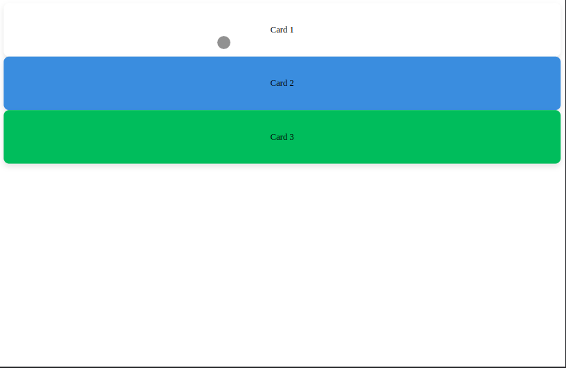
Example: Creating responsive column cards using Flexbox
HTML
<!DOCTYPE html>
<html lang="en">

<head>
    <meta charset="UTF-8">
    <meta name="viewport"
          content="width=device-width, initial-scale=1.0">
    <title>Responsive Column Cards with Flexbox</title>
    <link rel="stylesheet"
          type="text/css" href="styles.css">
</head>

<body>

    <div class="card-container">
        <div class="card card1">Card 1</div>
        <div class="card card2">Card 2</div>
        <div class="card card3">Card 3</div>
    </div>

</body>

</html>
body {
    margin: 0;
    padding: 0;
    box-sizing: border-box;
    font-family: Arial, sans-serif;
}

.card-container {
    display: flex;
    flex-wrap: wrap;
    justify-content: center;
    max-width: 1200px;
    margin: 50px auto;
    padding: 20px;
}


.card {
    flex: 1 1 300px;
    display: flex;
    justify-content: center;
    align-items: center;
    padding: 20px;
    margin: 10px;
    border-radius: 10px;
    box-shadow: 0px 5px 10px rgba(0, 0, 0, 0.1);
    transition: transform 0.3s ease;
    color: #fff;

}

.card:hover {
    transform: translateY(-5px);
    box-shadow: 0px 10px 20px rgba(0, 0, 0, 0.2);
}

.card1 {
    background-color: #3498DB;
}

.card2 {
    background-color: #27AE60;
}

.card3 {
    background-color: #E74C3C;
}
Output:
Using Bootstrap Grid System
Bootstrap is a popular CSS framework that provides a grid-based layout system for building responsive websites. Bootstrap’s grid system helps easily create responsive layouts for websites.
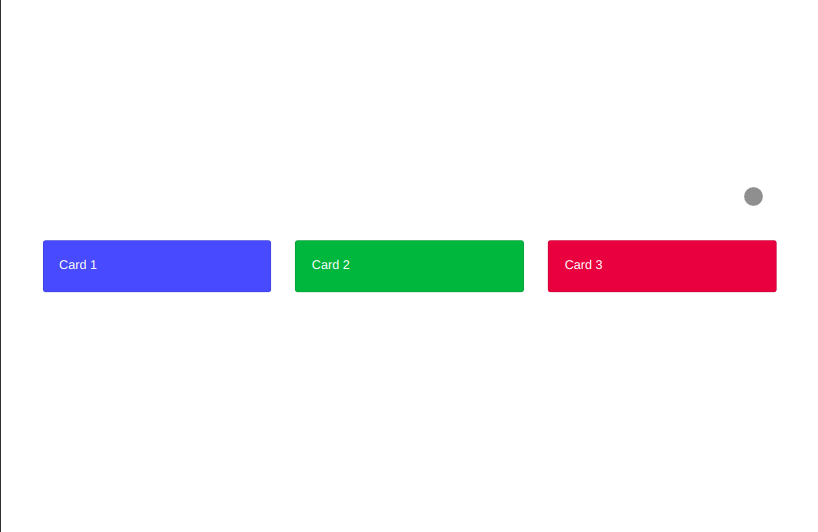
Example: Creating responsive column cards Using Bootstrap Grid System
HTML
<!DOCTYPE html>
<html lang="en">

<head>
    <meta charset="UTF-8">
    <meta name="viewport"
          content="width=device-width, initial-scale=1.0">
    <title>
          Responsive Column Cards with
          Bootstrap Grid System
      </title>
    <link rel="stylesheet"
          href=
"https://stackpath.bootstrapcdn.com/bootstrap/4.5.2/css/bootstrap.min.css">
</head>

<body class="d-flex align-items-center
             justify-content-center"
    style="height: 100vh;">
    <!-- Center the body vertically and horizontally -->
    <div class="container">
        <div class="row">
            <div class="col-md-4">
                <div class="card bg-primary text-white">
                    <div class="card-body">
                        Card 1
                    </div>
                </div>
            </div>
            <div class="col-md-4">
                <div class="card bg-success text-white">
                    <div class="card-body">
                        Card 2
                    </div>
                </div>
            </div>
            <div class="col-md-4">
                <div class="card bg-danger text-white">
                    <div class="card-body">
                        Card 3
                    </div>
                </div>
            </div>
        </div>
    </div>
</body>

</html>
Output:
Share your thoughts in the comments
Please Login to comment...