Chart.js Labeling Axes
Last Updated :
06 Dec, 2023
Chart.js Labeling Axes is used to describe the information in a chart. The Scale Title Configuration allows customization of axis titles, which also includes the options for display, alignment, text, color, and padding.
Syntax:
const config = {
  type: 'bar',
  data:,
  options: {
    scales: {
      y: {
        title: {
          display: true,
          align: 'center',
          text: 'Y-Axis Title',
          color: 'black',
          font: {
            family: 'Arial',
            size: 14,
            weight: 'bold',
          },
          padding: {
            top: 10,
            bottom: 5,
            left: 0,
            right: 0,
          },
        },
      },
    },
  },
};
Scale Title Configuration Properties
- display: This property is used to control the axis title. It is a boolean value, if set to true the title is visible, else becomes hidden.
- align: This property is used to specify the alignment of the axis title like start, center, and end.
- text: This property is used to define the text content for the axis title.
- color: This property is used to set the color of the axis title. It accepts the color values to customize the visual appearance.
- font: This property is used to specify the font styling for the axis tile. We can customize the font family, size, etc.
- padding: This property is used to determine the padding around the axis title.
Creating Custom Tick Formats
We can customize the appearance of tick marks on the axis and include additional information. For this, we need to override the ticks.callback method in the axis configuration. The arguments for this method are given below:
- value: This is the tick value in the internal fat format.
- index: This is the tick index in the ticks array.
- ticks: This is the consisting of all the tick objects.
CDN link:
<script src="https://ajax.googleapis.com/ajax/libs/jquery/3.6.1/jquery.min.js"></script>
<script src="https://cdnjs.cloudflare.com/ajax/libs/Chart.js/4.1.2/chart.umd.js"></script>
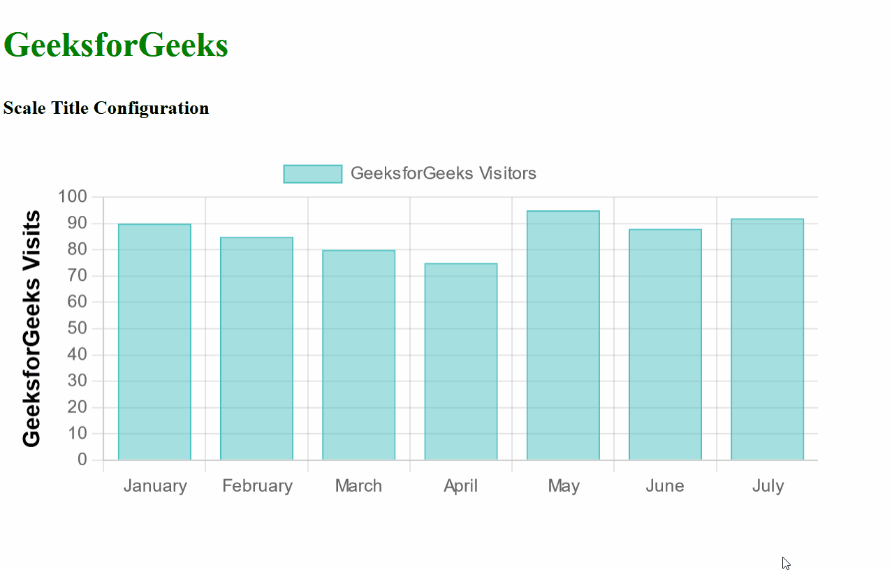
Example 1: In the below example, the Y-axis of the Bar chart is labeled with the custom Title “GeeksforGeeks Visits” using the Scale Title Configuration. This chart represents the information about GeeksforGeeks Visitors per month.
HTML
<!DOCTYPE html>
<html lang="en">
<head>
<meta charset="UTF-8">
<meta name="viewport"
content="width=device-width,
initial-scale=1.0">
<script src=
</script>
<script src=
</script>
<title>Chart.js Example with Scale Title Configuration</title>
</head>
<body>
<div>
<h2 style="color:green">
GeeksforGeeks
</h2>
<h5>Scale Title Configuration </h5>
<div>
<canvas id="myChart"
width="700"
height="300">
</canvas>
</div>
</div>
<script>
const labels = ['January', 'February',
'March', 'April',
'May', 'June', 'July'];
const data = {
labels: labels,
datasets: [{
label: 'GeeksforGeeks Visitors',
data: [90, 85, 80, 75, 95, 88, 92],
backgroundColor: 'rgba(75, 192, 192, 0.5)',
borderColor: 'rgb(75, 192, 192)',
borderWidth: 1,
}]
};
const config = {
type: 'bar',
data: data,
options: {
scales: {
y: {
title: {
display: true,
align: 'center',
text: 'GeeksforGeeks Visits',
color: 'black',
font: {
family: 'Arial',
size: 16,
weight: 'bold',
},
padding: {
top: 10,
bottom: 5,
left: 0,
right: 0,
},
},
},
},
},
};
let ctx = document.getElementById('myChart')
.getContext('2d');
let myChart = new Chart(ctx, config);
</script>
</body>
</html>
|
Output:
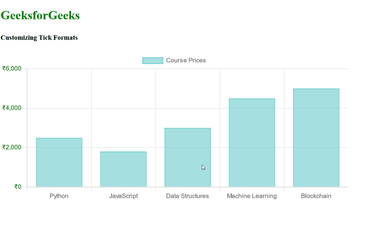
Example 2: In the below example we are representing the GeeksforGeeks courses with the corresponsing proces in Indian Rupee Form. The Y-axis tick labels are customized which include the Rupee symbol and other options are given to customize the color, step size, etc.
HTML
<!DOCTYPE html>
<html lang="en">
<head>
<meta charset="UTF-8">
<meta name="viewport"
content="width=device-width,
initial-scale=1.0">
<script src=
</script>
<script src=
</script>
<title>Chart.js Example with Customized Tick Formats</title>
</head>
<body>
<div>
<h2 style="color:green">
GeeksforGeeks
</h2>
<h5>Customizing Tick Formats</h5>
<div>
<canvas id="myChart"
width="700"
height="300"></canvas>
</div>
</div>
<script>
const courses = ['Python', 'JavaScript',
'Data Structures',
'Machine Learning', 'Blockchain'];
const prices = [2500, 1800, 3000, 4500, 5000];
const config = {
type: 'bar',
data: {
labels: courses,
datasets: [{
label: 'Course Prices',
data: prices,
backgroundColor: 'rgba(75, 192, 192, 0.5)',
borderColor: 'rgb(75, 192, 192)',
borderWidth: 1,
}]
},
options: {
scales: {
y: {
ticks: {
callback: function (value, index, ticks) {
return '₹' + value.toLocaleString();
},
color: 'green',
maxTicksLimit: 5,
stepSize: 1000,
},
},
},
},
};
let ctx = document.getElementById('myChart')
.getContext('2d');
let myChart = new Chart(ctx, config);
</script>
</body>
</html>
|
Output:
Share your thoughts in the comments
Please Login to comment...