Chart.js Radial Axes
Last Updated :
06 Dec, 2023
Chart.js Radical Axes are designed for radar and polar area chart types, overlaying the chart area rather than positioned on the edges. There is one radical axis which is by default and other visual components are angle lines, grid lines, point labels, and ticks.
These visual components provide various customization options which include changing colors, enabling us to customize the appearance of the radical axis based on data visualization preferences. In this article, we will learn about Chart.js Radial Axes.
Radial Axes Visual Components
There are four different Visual components included in Radial Axes:
- Angle Lines: These are drawn on the chart area, by stretching from the center position towards the edge of the canvas area and also provide a reference for data points.
- Grid Lines: This component is drawn on the chart area by helping in visualizing the relationships between data points on the radial axis.
- Point Labels: This component mainly indicates the values for each angle line, which enhances the interpretability of data associated with specific angles in the Radar Chart.
- Ticks: This component is used to label values based on their distance from the center of the radial axis which helps in the measurement of data points about the axis.
CDN link
<script src="https://ajax.googleapis.com/ajax/libs/jquery/3.6.1/jquery.min.js"></script>
<script src="https://cdnjs.cloudflare.com/ajax/libs/Chart.js/4.1.2/chart.umd.js"></script>
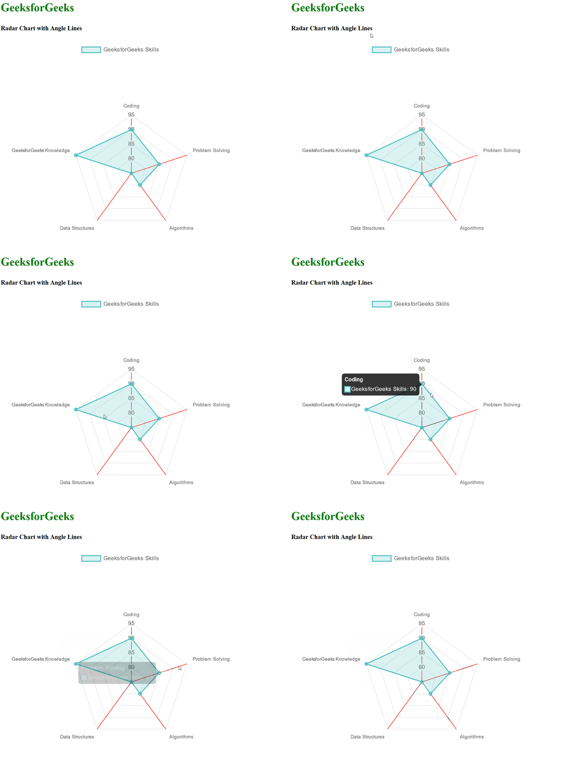
Example1 : In the below example, we have used the Radar Chart to represent the data related to GeeksforGeeks. We have used the angleLines option to customize and set the color of angle lines to red.
HTML
<!DOCTYPE html>
<html lang="en">
<head>
<meta charset="UTF-8">
<meta name="viewport"
content="width=device-width,
initial-scale=1.0">
<script src=
</script>
<script src=
</script>
<title>Radar Chart with Angle Lines Example</title>
</head>
<body>
<div>
<h2 style="color:green">
GeeksforGeeks
</h2>
<h5>Radar Chart with Angle Lines</h5>
<div>
<canvas id="radarChart"
width="700"
height="300">
</canvas>
</div>
</div>
<script>
const data = {
labels: ['Coding', 'Problem Solving',
'Algorithms', 'Data Structures',
'GeeksforGeeks Knowledge'],
datasets: [{
label: 'GeeksforGeeks Skills',
data: [90, 85, 80, 75, 95],
backgroundColor: 'rgba(75, 192, 192, 0.2)',
borderColor: 'rgba(75, 192, 192, 1)',
borderWidth: 2,
}]
};
const config = {
type: 'radar',
data: data,
options: {
scales: {
r: {
angleLines: {
color: 'red',
}
}
}
}
};
let ctx = document.getElementById('radarChart')
.getContext('2d');
let myRadarChart = new Chart(ctx, config);
</script>
</body>
</html>
|
Output:
 Example 2: In the below example, we have used the Polar Area Chart to represent the data relayed to GeeksforGeeks skills. We have also used the grid option and set the color of the grid line to red.
HTML
<!DOCTYPE html>
<html lang="en">
<head>
<meta charset="UTF-8">
<meta name="viewport"
content="width=device-width,
initial-scale=1.0">
<script src=
</script>
<script src=
</script>
<title>Polar Area Chart with Grid Lines Example</title>
</head>
<body>
<div>
<h2 style="color:green">
GeeksforGeeks
</h2>
<h5>Polar Area Chart with Grid Lines</h5>
<div>
<canvas id="polarAreaChart"
width="700"
height="300"></canvas>
</div>
</div>
<script>
const data = {
labels: ['Coding', 'Problem Solving',
'Algorithms', 'Data Structures',
'GeeksforGeeks Knowledge'],
datasets: [{
label: 'GeeksforGeeks Skills',
data: [90, 85, 80, 75, 95],
backgroundColor: 'rgba(75, 192, 192, 0.6)',
borderColor: 'rgba(75, 192, 192, 1)',
borderWidth: 2,
}]
};
const config = {
type: 'polarArea',
data: data,
options: {
scales: {
r: {
grid: {
color: 'red',
}
}
}
}
};
let ctx = document.getElementById('polarAreaChart')
.getContext('2d');
let myPolarAreaChart = new Chart(ctx, config);
</script>
</body>
</html>
|
Output:

Example 3: In the below example, we are using the Radar Chart to represent the GeeksforGeeks data of various categories. We have used the point labels and customized their color as green.
HTML
<!DOCTYPE html>
<html lang="en">
<head>
<meta charset="UTF-8">
<meta name="viewport"
content="width=device-width,
initial-scale=1.0">
<script src=
</script>
<script src=
</script>
<title>Radar Chart with Point Labels Example</title>
</head>
<body>
<div>
<h2 style="color:green">
GeeksforGeeks
</h2>
<h5>Radar Chart with Point Labels</h5>
<div>
<canvas id="radarChart"
width="700"
height="250">
</canvas>
</div>
</div>
<script>
const labels = ['Coding', 'Problem Solving',
'Algorithms', 'Data Structures',
'GeeksforGeeks Knowledge'];
const data = {
labels: labels,
datasets: [{
label: 'GeeksforGeeks Skills',
backgroundColor: 'rgba(54, 162, 235, 0.5)',
borderColor: 'rgb(54, 162, 235)',
borderWidth: 1,
data: [90, 85, 80, 75, 95],
}]
};
const config = {
type: 'radar',
data: data,
options: {
scales: {
r: {
pointLabels: {
color: 'green'
}
}
}
}
};
let ctx = document.getElementById('radarChart')
.getContext('2d');
let myRadarChart = new Chart(ctx, config);
</script>
</body>
</html>
|
Output:

Example 4: In the below example, we have used the Polar Area Chart to represent the GeeksforGeeks skills data of various categories. We have used the ticks options and customized the color of the ticks to red.
HTML
<!DOCTYPE html>
<html lang="en">
<head>
<meta charset="UTF-8">
<meta name="viewport"
content="width=device-width,
initial-scale=1.0">
<script src=
</script>
<script src=
</script>
<title>Polar Area Chart Example with GeeksforGeeks Data</title>
</head>
<body>
<div>
<h2 style="color:green">
GeeksforGeeks
</h2>
<h5>Polar Area Chart with Ticks</h5>
<div>
<canvas id="polarAreaChart"
width="700"
height="300">
</canvas>
</div>
</div>
<script>
const labels = ['Coding', 'Problem Solving',
'Algorithms', 'Data Structures',
'GeeksforGeeks Knowledge'];
const data = {
labels: labels,
datasets: [{
label: 'GeeksforGeeks Skills',
backgroundColor: 'rgba(75, 192, 192, 0.6)',
borderColor: 'rgb(75, 192, 192)',
borderWidth: 1,
data: [90, 85, 80, 75, 95],
}]
};
const config = {
type: 'polarArea',
data: data,
options: {
scales: {
r: {
ticks: {
color: 'red',
}
}
}
}
};
let ctx = document.getElementById('polarAreaChart')
.getContext('2d');
let myPolarAreaChart = new Chart(ctx, config);
</script>
</body>
</html>
|
Output:

Share your thoughts in the comments
Please Login to comment...