How to use Two Y Axes in Chart.js ?
Last Updated :
09 Jan, 2024
In Chart.Js, while representing the complex and multi-datasets in visual form, we always need to use two or more Y-axes to show the data. So we can use two Y-axes in ChartJS by using various approaches. In this article, we will see these approaches to make the Chart with dual Y-axis.
Approach 1: Using the yAxisID Option
In this approach, we are using the yAxisID option to link each dataset with a specific Y-axis in Chart.js. By defining the separate scales as “first” and “second“, both have separate styling and position. By using this, we can show the data in two Y-axes in left and right positions.
Syntax:
datasets: [
  {
    yAxisID: 'yourAxisID',
    label: 'Dataset Label',
    data: data
  },
],
Example: Below is the implementation of the above-discussed approach.
HTML
<!DOCTYPE html>
<html>
<head>
<title>Example 1</title>
<script src=
</script>
</head>
<body>
<h1 style="color: green;">
GeeksforGeeks
</h1>
<h3>
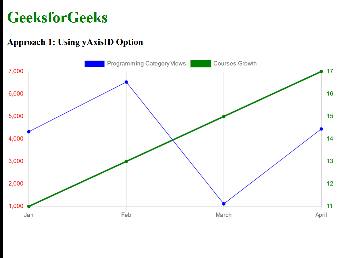
Approach 1: Using yAxisID Option
</h3>
<canvas id="chart1"></canvas>
<script>
const ctx = document.
getElementById('chart1').
getContext('2d');
const chart1 = new Chart(ctx, {
type: 'line',
data: {
labels:
['Jan', 'Feb', 'March', 'April'],
datasets: [
{
yAxisID: 'first',
label:
'Programming Category Views',
data:
[4321, 6531, 1111, 4444],
borderWidth: 1,
backgroundColor: 'blue',
borderColor: 'blue'
},
{
yAxisID: 'second',
label: 'Courses Growth',
data: [11, 13, 15, 17],
backgroundColor: 'green',
borderColor: 'green'
}
]
},
options: {
responsive: true,
scales: {
first: {
type: 'linear',
position: 'left',
ticks:
{
beginAtZero: true,
color: 'red'
},
grid: { display: false }
},
second: {
type: 'linear',
position: 'right',
ticks:
{
beginAtZero: true,
color: 'green'
},
grid: { display: false }
},
x: { ticks: { beginAtZero: true } }
}
}
});
</script>
</body>
</html>
|
Output:
Approach 2: Using Datasets Array for Each Axis
In this approach, we are creating the Bar chart with two datasets, where each dataset is lined with a separate y-axis as y-axis-1 and y-axis-2. The scales property in the options mainly configures two linear y-axis positions.
Syntax:
options: {
  scales: {
    yAxes: [
      {
        // left y-axis
        },
      },
      {
        // right y-axis
        },
      },
    ],
  },
}
Example: Below is the implementation of the above-discussed approach.
HTML
<!DOCTYPE html>
<html>
<head>
<title>Example 2</title>
<script src=
</script>
</head>
<body>
<center>
<h1 style="color: green;">
GeeksforGeeks
</h1>
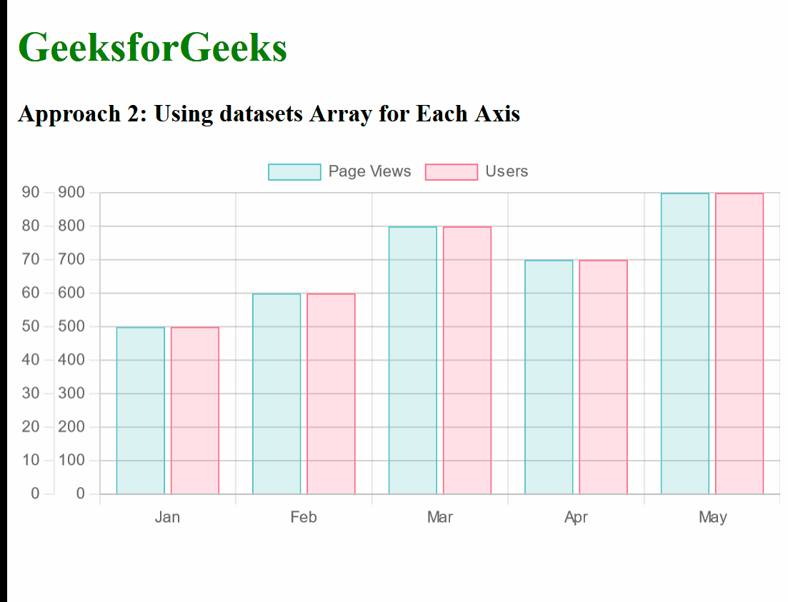
<h3>
Approach 2: Using datasets
Array for Each Axis
</h3>
<canvas id="chart2"
width="400"
height="200">
</canvas>
</center>
<script>
const data = {
labels:
['Jan', 'Feb', 'Mar', 'Apr', 'May'],
datasets: [
{
label: 'Page Views',
data:
[500, 600, 800, 700, 900],
yAxisID: 'y-axis-1',
backgroundColor:
'rgba(75, 192, 192, 0.2)',
borderColor:
'rgba(75, 192, 192, 1)',
borderWidth: 1
},
{
label: 'Users',
data:
[30, 70, 50, 80, 60],
yAxisID: 'y-axis-2',
backgroundColor:
'rgba(255, 99, 132, 0.2)',
borderColor:
'rgba(255, 99, 132, 1)',
borderWidth: 1
}
]
};
const config = {
type: 'bar',
data: data,
options: {
scales: {
yAxes: [
{
type: 'linear',
position: 'left',
id: 'y-axis-1',
},
{
type: 'linear',
position: 'right',
id: 'y-axis-2',
},
]
}
}
};
const chart2 = new Chart(
document.getElementById('chart2'), config);
</script>
</body>
</html>
|
Output:
Share your thoughts in the comments
Please Login to comment...