Chakra UI The as prop
Last Updated :
04 Feb, 2024
Chakra UI is the React component library for building attractive and responsive user interfaces. Chakra-UI as props are UI styling props that are used to add or alter some styles, marks, formats, animations, behavior, and interactions with UI components. The as props also help in converting non-chakra components to Chakra enabled component. The as props are heavily used with custom components.
Prerequisite:
Approach:
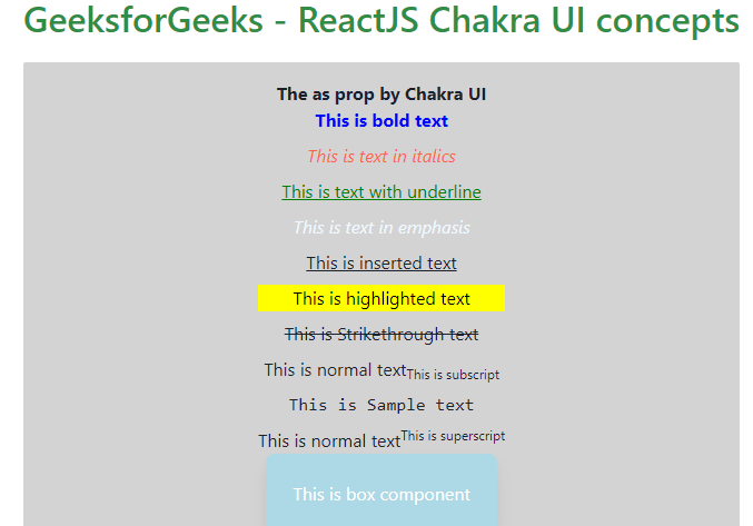
We will create the basic Box component having Stack of Text components using the as prop of Chakra UI. We will be using the Chakra components like Box, Flex, Text, and Stack along with the as prop to show some different styled texts like bold, italic, underlined, strikethrough, subscript, superscript and so on.
Steps to Create React Application And Installing Module:
Step 1: Create a React application using the following command
npm create-react-app gfg-react-as-prop
Step 2: After creating your project folder(i.e. gfg-react-as-prop), move to it by using the following command:
cd gfg-react-as-prop
Step 3: After creating the React application, Install the required package using the following command:
npm i @chakra-ui/react @emotion/react@^11 @emotion/styled@^11 framer-motion@^6
Project Structure:
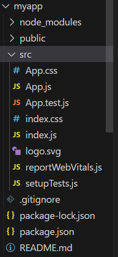
Project Structure
The updated dependencies in the package.json file.
"dependencies": {
    "@chakra-ui/react": "^2.8.2",
    "@emotion/react": "^11.11.3",
    "@emotion/styled": "^11.11.0",
    "framer-motion": "^6.5.1",
    "react": "^18.2.0",
    "react-dom": "^18.2.0"
},
Example: Write down the code in respective files. Inside your src folder, open App.js, where we will write our Form input code. Below is the code for the same.
Javascript
import {
ChakraProvider, Text, Box
} from "@chakra-ui/react";
import Card from "./Card";
import "./App.css";
function App() {
return (
<ChakraProvider>
<Text
color="#2F8D46"
fontSize="2rem"
textAlign="center"
fontWeight="600"
my="1rem">
GeeksforGeeks -
ReactJS Chakra UI concepts
</Text>
<Card as='button'>
<Text color="black">
This is a card
</Text>
</Card>
</ChakraProvider>
);
}
export default App;
|
Javascript
import {
Flex,
Box,
Text,
Stack,
} from "@chakra-ui/react";
const Card = () => {
return (
<Box rounded='sm' bg='lightgrey' w='100%' p={4} >
<Flex justifyContent="center">
<Flex w="full" direction="column"
w="60%" alignItems="center">
<Text as="h2" fontWeight="bold">
The as prop by Chakra UI
</Text>
<Stack spacing={2}>
<Text as='b' color='blue'>
This is bold text</Text>
<Text as='i' color='tomato'>
This is text in italics</Text>
<Text as='u' color='green'>
This is text with underline</Text>
<Text as='em' color='aliceblue'>
This is text in emphasis</Text>
<Text as='ins'>
This is inserted text</Text>
<Text as='mark'>
This is highlighted text</Text>
<Text as='s'>
This is Strikethrough text</Text>
<Text> This is normal text
<Text as='sub'>This is subscript</Text>
</Text>
<Text as='samp'>This is Sample text</Text>
<Text> This is normal text
<Text as='sup'>This is superscript</Text>
</Text>
</Stack>
<Box bg='lightblue' px='6'
py='6' rounded='lg' shadow='lg' color='white'>
This is box component </Box>
</Flex>
</Flex>
</Box>
);
};
export default Card;
|
Step to run the application:
npm start
Output: Now go to http://localhost:3000 in your browser
Share your thoughts in the comments
Please Login to comment...