Anomaly detection with TensorFlow
Last Updated :
14 Jan, 2024
With the advancement of technology there is also a signification increment of frauds. In modern days, frauds are very common in monetary departments. Let’s assume we have an efficient algorithm which observes data flow actions, learns the patterns and can even predict which are the anomalies or frauds. This efficient algorithm can be the autoencoders which are designed to learn from a bunch of examples without someone telling it what’s normal or anomaly. In this article, we will explore the use of autoencoders in anomaly detection and implement it to detect anomaly within the dataset.
Autoencoders for Anomaly Detection
Autoencoders are like a special algorithm in the Neural Network family. They’re part of the unsupervised learning squad. In simple terms, they learn to turn raw information into an encoded code and then quickly flip it back to cross-check if everything matches up or not. Some of the key-components of autoencoder is discussed below which are used in anomaly detection:
- Triple layering: Autoencoders wear a three-layered cape. There’s the encoder layer, the bottleneck layer (sounds fancy but it is the magical layer) and the decoder layer. The encoder does the starting job of squishing the input data into a smaller encoded data, capturing the complex patterns of features in the data. The bottleneck layer or the latent space is a critical component which represents the compressed form of the input data and acts as a feature space where anomalies are expected to be less well-represented. Finally, the decoder layer reconstructs the input data from the compressed representation which was previously created by the encoder.
- Efficient Training Process: Autoencoders are trained on a dataset containing predominantly normal instances. The model learns to encode and reconstruct this normal data accurately.
- Anomaly Detector: After all that training, it can spot anomalies. It does this by turning data into input data and comparing them. There’s this thing called the “reconstruction error” – basically, how much the reconstructed data differs from the original. If the difference is too big, it’s a red alert – an anomaly!
Step-by-step implementation
Importing required libraries
At first, we will import all required Python libraries like NumPy, Pandas, Matplotlib, TensorFlow and SKlearn etc.
Python3
import numpy as np
import pandas as pd
from sklearn.model_selection import train_test_split
from sklearn.preprocessing import StandardScaler
from sklearn.metrics import accuracy_score
import tensorflow as tf
from tensorflow.keras import layers, models
import matplotlib.pyplot as plt
|
Dataset loading and pre-processing.
We will now load the famous credit card anomaly detection from here. After that we will drop the ‘Time’ column and employ standard scaler to the features and one-hot encoding to the target column. Finally, we will split the dataset into training and testing sets (80:20).
Python3
df = pd.read_csv('creditcard.csv')
df = df.drop(['Time'], axis=1)
scaler = StandardScaler()
df['Amount'] = scaler.fit_transform(df['Amount'].values.reshape(-1, 1))
df['Class'] = df['Class'].astype(str)
df = pd.get_dummies(df, columns=['Class'], prefix=['Class'])
train_data, test_data = train_test_split(df, test_size=0.2, random_state=42)
X_train = train_data.drop(['Class_0', 'Class_1'], axis=1).values
y_train = train_data[['Class_0', 'Class_1']].values
X_test = test_data.drop(['Class_0', 'Class_1'], axis=1).values
y_test = test_data[['Class_0', 'Class_1']].values
|
Autoencoder model training
To train the autoencoder model we need to build it layer by layer. In the top there will be Encoder layer. And in the bottom the Decoder layer will be there. Both encoder and decoder layer will be connected to the bottleneck layer. Then we will train the model for 10 epochs. But it is recommended to go minimum of 25 epochs for better results.
Python3
def build_autoencoder(input_shape):
model = models.Sequential()
model.add(layers.InputLayer(input_shape=input_shape))
model.add(layers.Dense(64, activation='relu'))
model.add(layers.Dense(32, activation='relu'))
model.add(layers.Dense(16, activation='relu'))
model.add(layers.Dense(32, activation='relu'))
model.add(layers.Dense(64, activation='relu'))
model.add(layers.Dense(input_shape, activation='tanh'))
return model
input_shape = X_train.shape[1]
autoencoder = build_autoencoder(input_shape)
autoencoder.compile(optimizer='rmsprop', loss='mse', metrics=['accuracy'])
history = autoencoder.fit(X_train, X_train, epochs=10, batch_size=64, shuffle=False, validation_data=(X_test, X_test))
|
Output:
 Epoch 1/10
3561/3561 [==============================] - 14s 4ms/step - loss: 0.5597 - accuracy: 0.5890 - val_loss: 0.5098 - val_accuracy: 0.6283
Epoch 2/10
3561/3561 [==============================] - 10s 3ms/step - loss: 0.4823 - accuracy: 0.6911 - val_loss: 0.4699 - val_accuracy: 0.6822
Epoch 3/10
3561/3561 [==============================] - 10s 3ms/step - loss: 0.4691 - accuracy: 0.7083 - val_loss: 0.4569 - val_accuracy: 0.6998
Epoch 4/10
3561/3561 [==============================] - 11s 3ms/step - loss: 0.4621 - accuracy: 0.7261 - val_loss: 0.4491 - val_accuracy: 0.7030
Epoch 5/10
3561/3561 [==============================] - 12s 3ms/step - loss: 0.4584 - accuracy: 0.7345 - val_loss: 0.4451 - val_accuracy: 0.7250
Epoch 6/10
3561/3561 [==============================] - 10s 3ms/step - loss: 0.4560 - accuracy: 0.7402 - val_loss: 0.4392 - val_accuracy: 0.7485
Epoch 7/10
3561/3561 [==============================] - 16s 4ms/step - loss: 0.4544 - accuracy: 0.7437 - val_loss: 0.4407 - val_accuracy: 0.7388
Epoch 8/10
3561/3561 [==============================] - 10s 3ms/step - loss: 0.4532 - accuracy: 0.7464 - val_loss: 0.4387 - val_accuracy: 0.7506
Epoch 9/10
3561/3561 [==============================] - 11s 3ms/step - loss: 0.4523 - accuracy: 0.7477 - val_loss: 0.4360 - val_accuracy: 0.7444
Epoch 10/10
3561/3561 [==============================] - 11s 3ms/step - loss: 0.4515 - accuracy: 0.7477 - val_loss: 0.4358 - val_accuracy: 0.7475
Visualizing training and validation results
After training, now we will visualize how the loss and accuracy curve behave with the increase of epochs for both train and validation sets of data.
Python3
plt.figure(figsize=(12, 4))
plt.subplot(1, 2, 1)
plt.plot(history.history['loss'], label='Training Loss')
plt.plot(history.history['accuracy'], label='Training Accuracy')
plt.title('Training Loss and Accuracy')
plt.xlabel('Epochs')
plt.ylabel('Loss')
plt.legend()
plt.subplot(1, 2, 2)
plt.plot(history.history['val_loss'], label='Validation Loss')
plt.plot(history.history['val_accuracy'], label='Validation Accuracy')
plt.title('Validation Loss and Accuracy')
plt.xlabel('Epochs')
plt.ylabel('Accuracy')
plt.legend()
plt.tight_layout()
plt.show()
|
Output:
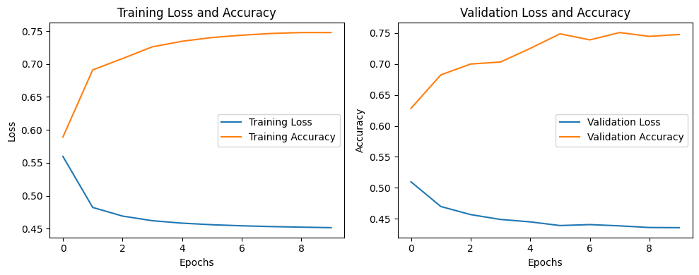
Loss vs. Accuracy
This plot shows that increasing the number of training epochs can effectively increase the model’s overall performance.
Model evaluation
Now we will evaluate our model’s performance in the terms of Accuracy.
Python3
predictions = autoencoder.predict(X_test)
mse = np.mean(np.power(X_test - predictions, 2), axis=1)
threshold = 0.6
anomalies = mse > threshold
y_true = np.argmax(y_test, axis=1)
y_pred = anomalies.astype(int)
accuracy = accuracy_score(y_true, y_pred)
print(f'Test Accuracy: {accuracy:.4f}')
|
Output:
Test Accuracy: 0.9216
So, our model has achieved a well accuracy of 92% which suggests that our model can effective detect 92% of the anomalies. However, we can improve our model’s performance by more advanced feature engineering and increasing the number epochs. Also, we can experiment with other loss functions and perform hyperparameter tuning.
Visualizing anomalies in the data
Now we will visualize the detected anomalies within the data.
Python3
plt.figure(figsize=(7, 4))
plt.scatter(range(len(mse)), mse, c=anomalies, cmap='coolwarm', s=4)
plt.title('Detected Anomalies')
plt.xlabel('Data Points')
plt.ylabel('Mean Squared Error')
plt.show()
|
Output:
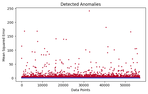
Detected Anomalies
So, in this graph plot we can clearly visualize the anomalies which are with greater MSE. This is we have already achieved from out autoencoder model. The points nearest to the blue base line are normal point with the MSE value of 0. Points with higher MSE or reconstruction error are detected as anomalies.
Visualizing comparative plot with reconstruction error
This plot is only for better understanding purpose where we will compare the input and reconstruction side by side and finally plot the reconstruction error with anomalies.
Python3
plt.figure(figsize=(7, 5))
plt.subplot(3, 1, 1)
plt.imshow(X_test.T, aspect='auto', cmap='viridis')
plt.title('Input Data')
plt.xlabel('Data Points')
plt.ylabel('Features')
plt.subplot(3, 1, 2)
plt.imshow(predictions.T, aspect='auto', cmap='viridis')
plt.title('Reconstruction')
plt.xlabel('Data Points')
plt.ylabel('Features')
plt.subplot(3, 1, 3)
plt.plot(mse, label='Reconstruction Error')
plt.scatter(np.where(anomalies)[0], mse[anomalies], color='green', label='Anomalies')
plt.title('Reconstruction Error and Anomalies')
plt.xlabel('Data Points')
plt.ylabel('Mean Squared Error')
plt.legend()
plt.tight_layout()
plt.show()
|
Output:
-min-(1).png)
From this above plot we can clearly visualize the differences between Input and reconstruction. And how the anomalies detected based on the peck of reconstruction errors. However, for more clear results and accuracy we need more epochs to train the model.
Share your thoughts in the comments
Please Login to comment...