Weather data analysis allows us to understand patterns, trends, and anomalies in weather conditions over time. We will explore how to analyze weather data using the R Programming Language. We will use a dataset containing various weather parameters such as temperature, humidity, wind speed, and more.
Understanding Weather Dataset
The weather dataset contains various parameters recorded at different times, providing insights into weather conditions.
The dataset includes information such as the date and time of the recording, a summary of the weather conditions, the type of precipitation (if any), temperature in Celsius, perceived temperature, humidity level, wind speed and direction, visibility, atmospheric pressure, and a summary of the day’s weather. Each parameter gives us valuable information about the prevailing weather conditions at the time of recording, allowing us to analyze trends, patterns, and relationships between different weather elements. This data is crucial for understanding how weather patterns evolve and their potential impact on our environment and daily activities.
Dataset Link: Weather Data
By loading the libraries required for our analysis. These libraries contain functions and tools that we’ll use later for data manipulation, visualization, and modeling.Also we read the weather dataset from a CSV file into our R environment.
R
library(readr)
library(dplyr)
library(ggplot2)
library(forecast)
weather_data <- read_csv("Your//path")
|
Basically here we check the structure of the dataset , we display the first few rows of the dataset to get an overview of its structure and contents. This helps us understand what kind of data we’re working with.
Output:
                 Formatted.Date       Summary Precip.Type Temperature..C.
1 2006-04-01 00:00:00.000 +0200 Partly Cloudy        rain        9.472222
2 2006-04-01 01:00:00.000 +0200 Partly Cloudy        rain        9.355556
3 2006-04-01 02:00:00.000 +0200 Mostly Cloudy        rain        9.377778
4 2006-04-01 03:00:00.000 +0200 Partly Cloudy        rain        8.288889
5 2006-04-01 04:00:00.000 +0200 Mostly Cloudy        rain        8.755556
6 2006-04-01 05:00:00.000 +0200 Partly Cloudy        rain        9.222222
  Apparent.Temperature..C. Humidity Wind.Speed..km.h.
1                 7.388889     0.89           14.1197
2                 7.227778     0.86           14.2646
3                 9.377778     0.89            3.9284
4                 5.944444     0.83           14.1036
5                 6.977778     0.83           11.0446
6                 7.111111     0.85           13.9587
  Wind.Bearing..degrees. Visibility..km. Loud.Cover Pressure..millibars.
1                    251         15.8263          0              1015.13
2                    259         15.8263          0              1015.63
3                    204         14.9569          0              1015.94
4                    269         15.8263          0              1016.41
5                    259         15.8263          0              1016.51
6                    258         14.9569          0              1016.66
                      Daily.Summary
1 Partly cloudy throughout the day.
2 Partly cloudy throughout the day.
3 Partly cloudy throughout the day.
4 Partly cloudy throughout the day.
5 Partly cloudy throughout the day.
6 Partly cloudy throughout the day.
Check the structure of the dataset
Output:
'data.frame':    96453 obs. of  12 variables:
 $ Formatted.Date          : Factor w/ 96429 levels "2006-01-01 00:00:00.000 +0100",..: 2160 2161 2162 2163 2 ...
 $ Summary                 : Factor w/ 27 levels "Breezy","Breezy and Dry",..: 20 20 18 20 18 20 20 20 20 20 ...
 $ Precip.Type             : Factor w/ 3 levels "null","rain",..: 2 2 2 2 2 2 2 2 2 2 ...
 $ Temperature..C.         : num  9.47 9.36 9.38 8.29 8.76 ...
 $ Apparent.Temperature..C.: num  7.39 7.23 9.38 5.94 6.98 ...
 $ Humidity                : num  0.89 0.86 0.89 0.83 0.83 0.85 0.95 0.89 0.82 0.72 ...
 $ Wind.Speed..km.h.       : num  14.12 14.26 3.93 14.1 11.04 ...
 $ Wind.Bearing..degrees.  : num  251 259 204 269 259 258 259 260 259 279 ...
 $ Visibility..km.         : num  15.8 15.8 15 15.8 15.8 ...
 $ Loud.Cover              : num  0 0 0 0 0 0 0 0 0 0 ...
 $ Pressure..millibars.    : num  1015 1016 1016 1016 1017 ...
 $ Daily.Summary           : Factor w/ 214 levels "Breezy and foggy starting in the evening.",..: 198 198 198 198 ...
str(weather_data) it’s provides the structure of the dataset. It gives information about the variables (columns) present in the dataset, including their names, data types, and the first few values. It’s particularly useful for understanding the types of variables we’re dealing with, such as numeric, factor, or character.
Generate summary statistics
Output:
                       Formatted.Date                 Summary
 2010-08-02 00:00:00.000 +0200:    2   Partly Cloudy      :31733
 2010-08-02 01:00:00.000 +0200:    2   Mostly Cloudy      :28094
 2010-08-02 02:00:00.000 +0200:    2   Overcast           :16597
 2010-08-02 03:00:00.000 +0200:    2   Clear              :10890
 2010-08-02 04:00:00.000 +0200:    2   Foggy              : 7148
 2010-08-02 05:00:00.000 +0200:    2   Breezy and Overcast:  528
 (Other)                      :96441   (Other)            : 1463
 Precip.Type  Temperature..C.   Apparent.Temperature..C.    Humidity
 null:  517   Min.   :-21.822   Min.   :-27.717          Min.   :0.0000
 rain:85224   1st Qu.:  4.689   1st Qu.:  2.311          1st Qu.:0.6000
 snow:10712   Median : 12.000   Median : 12.000          Median :0.7800
              Mean   : 11.933   Mean   : 10.855          Mean   :0.7349
              3rd Qu.: 18.839   3rd Qu.: 18.839          3rd Qu.:0.8900
              Max.   : 39.906   Max.   : 39.344          Max.   :1.0000

 Wind.Speed..km.h. Wind.Bearing..degrees. Visibility..km.   Loud.Cover
 Min.   : 0.000    Min.   :  0.0          Min.   : 0.00   Min.   :0
 1st Qu.: 5.828    1st Qu.:116.0          1st Qu.: 8.34   1st Qu.:0
 Median : 9.966    Median :180.0          Median :10.05   Median :0
 Mean   :10.811    Mean   :187.5          Mean   :10.35   Mean   :0
 3rd Qu.:14.136    3rd Qu.:290.0          3rd Qu.:14.81   3rd Qu.:0
 Max.   :63.853    Max.   :359.0          Max.   :16.10   Max.   :0

 Pressure..millibars.
 Min.   :   0
 1st Qu.:1012
 Median :1016
 Mean   :1003
 3rd Qu.:1021
 Max.   :1046

                                            Daily.Summary
 Mostly cloudy throughout the day.                 :20085
 Partly cloudy throughout the day.                 : 9981
 Partly cloudy until night.                        : 6169
 Partly cloudy starting in the morning.            : 5184
 Foggy in the morning.                             : 4201
 Foggy starting overnight continuing until morning.: 3576
 (Other)                                           :47257
Now generate summary statistics for the numeric variables in the dataset. These statistics provide us with insights into the central tendency, dispersion, and distribution of the data.
Checking Null Value of the Dataset
R
na_count <- colSums(is.na(weather_data))
na_count
|
Output:
          Formatted.Date                  Summary              Precip.Type
                       0                        0                        0
         Temperature..C. Apparent.Temperature..C.                 Humidity
                       0                        0                        0
       Wind.Speed..km.h.   Wind.Bearing..degrees.          Visibility..km.
                       0                        0                        0
              Loud.Cover     Pressure..millibars.            Daily.Summary
                       0                        0                        0
Data Visualization of Weather dataset in R
R
library(ggplot2)
ggplot(weather_data, aes(x = Summary, y = Temperature..C., fill = Precip.Type)) +
geom_boxplot() +
labs(title = "Box Plot of Temperature by Summary Category",
x = "Summary",
y = "Temperature (°C)") +
theme_minimal() +
theme(axis.text.x = element_text(angle = 45, hjust = 1))
|
Output:

Analyzing Weather Data in R
It’s reads weather data, reshapes it to long format, and then generates a boxplot to visualize the distribution of various weather parameters. The x-axis represents different weather parameters, and the y-axis represents their corresponding values. Labels and titles are added for clarity, and the x-axis labels are adjusted for better readability.
Histogram
R
ggplot(weather_data, aes(x = Temperature..C.)) +
geom_histogram(binwidth = 1, fill = "skyblue", color = "black") +
labs(title = "Histogram of Temperature (C)",
x = "Temperature (C)",
y = "Frequency")
|
Output:

Analyzing Weather Data in R
This code will generate a histogram showing the distribution of temperatures in Celsius recorded in the dataset. The x-axis represents the temperature values, while the y-axis represents the frequency of occurrence for each temperature bin. We can adjust the binwidth parameter to change the width of each bin in the histogram to better visualize the data distribution.
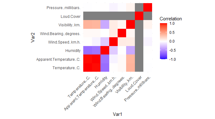
Heatmap
R
library(reshape2)
numerical_data <- weather_data[, sapply(weather_data, is.numeric)]
correlation_matrix <- cor(numerical_data)
melted_corr <- melt(correlation_matrix)
ggplot(melted_corr, aes(x = Var1, y = Var2, fill = value)) +
geom_tile() +
scale_fill_gradient2(low = "blue", high = "red", mid = "white", midpoint = 0,
limit = c(-1, 1), space = "Lab", name = "Correlation") +
theme_minimal() +
theme(axis.text.x = element_text(angle = 45, vjust = 1, size = 10, hjust = 1)) +
coord_fixed()
|
Output:
Analyzing Weather Data in R
A heatmap where each cell represents the correlation coefficient between two numerical parameters in the weather dataset. The color intensity indicates the strength and direction of the correlation, with blue indicating a negative correlation, red indicating a positive correlation, and white indicating no correlation.
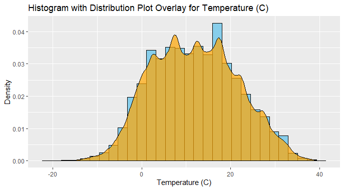
Histogram with Distplot
R
ggplot(weather_data, aes(x = Temperature..C.)) +
geom_histogram(aes(y = ..density..), fill = "skyblue", color = "black", bins = 30) +
geom_density(alpha = 0.7, fill = "orange") +
labs(title = "Histogram with Distribution Plot Overlay for Temperature (C)",
x = "Temperature (C)",
y = "Density")
|
Output:
Analyzing Weather Data in R
We specify aes(y = ..density..) within geom_histogram() to ensure that the histogram is plotted based on density instead of counts.
- The bins parameter in geom_histogram() controls the number of bins used to discretize the continuous variable (temperature in this case). Adjust this parameter as needed to adjust the granularity of the histogram.
- geom_density() adds a density curve overlay to the histogram, with the fill color set to “orange” and transparency set to 0.7 (alpha = 0.7). This curve represents the smoothed density estimate of the data.
- The labs() function adds a title and axis labels to the plot, providing context for interpretation.
A histogram with a distribution plot overlay for the “Temperature (C)” column in the weather dataset, help to visualize the distribution of temperatures along with the smoothed density curve.
Time series forecasting
Time series forecasting involves predicting future values based on past observations of a time-dependent variable.Create a simple example using R to forecast future temperature values based on historical temperature data from the weather dataset.
There are several methods for time series forecasting, including:
- Exponential smoothing methods (e.g., Simple Exponential Smoothing, Holt’s Exponential Smoothing, Holt-Winters Method)
- Autoregressive Integrated Moving Average (ARIMA) models
- Seasonal decomposition methods (e.g., STL decomposition)
- Machine learning algorithms (e.g., Random Forests, Neural Networks)
Create a time series object using the historical temperature data. In this example, we’ll use daily temperature values.
R
weather_data$Formatted.Date <- as.Date(weather_data$Formatted.Date)
temperature_data <- weather_data[, c("Formatted.Date", "Temperature..C.")]
temperature_ts <- ts(temperature_data$Temperature..C., frequency = 365)
|
Before forecasting, let’s visualize the historical temperature data to understand its patterns and trends.
R
ggplot(temperature_data, aes(x = Formatted.Date, y = Temperature..C.)) +
geom_line() +
labs(title = "Historical Temperature Data", x = "Date", y = "Temperature (C)")
|
Output:
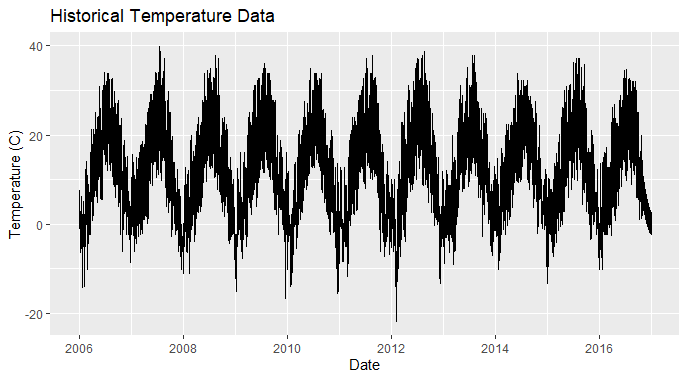
Analyzing Weather Data in R
Now, let’s use a forecasting method (e.g., exponential smoothing) to predict future temperature values and visualize the forecasted temperature values along with prediction intervals.
R
forecast_temp <- forecast(temperature_ts, h = 30)
plot(forecast_temp, main = "Forecasted Temperature", xlab = "Date",
ylab = "Temperature (C)")
|
Output:

Analyzing Weather Data in R
Load the necessary libraries `forecast` and `ggplot2` for time series forecasting and visualization, respectively.
- Load the weather dataset and convert the date column to a proper date format. Focus on the “Temperature (C)” column.
- Create a time series object using the historical temperature data, considering daily temperature values.
- Visualize the historical temperature data to understand its patterns and trends over time.
- Use a forecasting method (such as exponential smoothing) to predict future temperature values, forecasting for the next 30 days.
- Visualize the forecasted temperature values along with prediction intervals to gain insights into future temperature trends.
Time Series Decomposition
Time series decomposition breaks down a time series into its components, typically trend, seasonality, and noise. It helps us understand the underlying patterns and fluctuations in the data.
There are different approaches to decomposition, including:
- Additive decomposition: The observed time series is considered as the sum of the trend, seasonal, and residual components.
- Multiplicative decomposition: The observed time series is considered as the product of the trend, seasonal, and residual components.
- Seasonal and Trend decomposition using Loess (STL): A robust method for decomposing time series data that can handle non-linear trends and irregular seasonal patterns.
- Trend: Represents the long-term movement or direction in the data, indicating overall growth or decline.
- Seasonality: Refers to regular, repeating patterns or fluctuations that occur at fixed intervals (e.g., daily, weekly, or yearly).
- Noise: Represents random fluctuations or irregularities in the data that cannot be attributed to the trend or seasonality.
R
weather_data$Formatted.Date <- as.Date(weather_data$Formatted.Date)
temperature_data <- weather_data[, c("Formatted.Date", "Temperature..C.")]
temperature_ts <- ts(temperature_data$Temperature..C., frequency = 365)
decomposed <- decompose(temperature_ts, type = "additive")
autoplot(decomposed) +
labs(title = "Time Series Decomposition",
x = "Date",
y = "Temperature (C)")
|
Output:
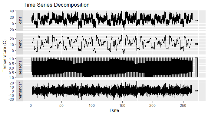
Analyzing Weather Data in R
We load the necessary libraries forecast and ggplot2.
- Then load the weather dataset and convert the date column to a proper date format.
- Next, create a time series object using the historical temperature data.
- We use the decompose() function to decompose the time series into its components, specifying the type of decomposition (additive).
- Finally visualize the decomposed components (trend, seasonality, and residual) using autoplot(), which provides an easy-to-interpret plot of the decomposition results
Saving the Time Series Data
To save the time series data in R, you can use various methods depending on your preference and the format you want to save it in. Here are a couple of common methods.
1. Save as CSV
If you want to save the time series data as a CSV file, you can use the `write.csv()` function.
R
write.csv(as.data.frame(temperature_ts), "temperature_data.csv", row.names = FALSE)
|
This will save the time series data to a file named “temperature_data.csv” in working directory.
2. Save as RDS (R Data) file
If you want to save the time series data as an RDS file (native R format), use the `saveRDS()` function.
R
saveRDS(temperature_ts, "temperature_data.rds")
|
Output:

Analyzing Weather Data in R
It will save the time series data to a file named “temperature_data.rds” in the working directory.
Conclusion
Our analysis of weather data using R has provided valuable insights into weather patterns over time. We began by understanding the dataset’s parameters, such as temperature and humidity, and conducted exploratory data analysis to uncover trends and relationships also explore time series forecasting , time series decomposition and how to save the time series data in different format.
Share your thoughts in the comments
Please Login to comment...