Draw Confidence Interval on Histogram with ggplot2 in R
Last Updated :
12 Jun, 2023
A histogram is a graph that shows the distribution of a dataset. It can be used to estimate the probability distribution of a continuous variable, such as height or weight. To create a histogram, you need to divide the range of values into a series of intervals, called bins, and count the number of observations that fall into each bin. The bins should be adjacent and often of equal size.
A histogram is made up of adjacent rectangles that represent the frequencies of the observations in each interval. The area of each rectangle is equal to the frequency of the observations in that interval. You can also normalize a histogram to show the relative frequencies of each interval, with the total area of the rectangles equaling 1.
Histograms are typically used for visualizing continuous data, while bar charts are used for categorical or discrete data. A bar chart shows the frequencies or counts of observations in different categories, with each category represented by a separate bar. The height of each bar corresponds to the frequency of observations in that category. Unlike histograms, the categories in a bar chart are not adjacent and may not be of equal size.
What is a Confidence Interval?
A confidence interval is a range of values used to estimate an unknown population parameter with a certain level of confidence. When constructing a histogram, a confidence interval can help estimate the range of values where a population mean is likely to fall, based on a sample of data.
To create a histogram with a confidence interval, you need to calculate the mean and standard deviation of the sample data first. Then, using a selected level of confidence, like 95%, you can calculate the confidence interval by adding and subtracting a margin of error from the mean. The margin of error is determined using the sample’s standard deviation and sample size.
After calculating the confidence interval, you can represent it on the histogram using a ribbon or band that usually appears as a shaded area around the histogram. The shaded area indicates the range of values that the population mean is likely to fall within, based on the sample data and the chosen level of confidence.
How to install ggplot2 in R?
You can install the ggplot2 library by running the following command in the R console:
install.packages("ggplot2")
Then, you can load the library by running the following command:
library(ggplot2)
Make sure that you are connected to the internet while installing the package. Once the package is installed and loaded successfully you can proceed with the code and you should not encounter the error message.
Also, make sure that you are running the latest version of R and ggplot2 package, if you face any issue with the package then you can update the package by running the following command.
update.packages("ggplot2")
In R Programming Language, the geom_ribbon() function can be used to plot a confidence interval on a histogram. The geom_ribbon() function is a geom in the ggplot2 package, which is an add-on to the base R plotting functions. It creates a ribbon or band that can be used to represent a range of values on the plot.
To use geom_ribbon() to plot a confidence interval on a histogram, you will first need to calculate the confidence interval using the mean and standard deviation of your sample data, and then use the geom_ribbon() function to add the ribbon to your plot.
Syntax:
geom_ribbon(mapping = NULL, data = NULL, stat = “identity”, position = “identity”,
…, na.rm = FALSE, show.legend = NA, inherit.aes = TRUE)
where,
- mapping: This is where you will specify the aesthetic mappings for the data, such as x and y values. For example, to plot a ribbon representing the confidence interval, you would use aes(xmin = conf_int[1], xmax = conf_int[2]), where conf_int is a vector containing the lower and upper bounds of the confidence interval.
- data: This parameter specifies the data frame to use for the plot.
- ymin and ymax: These parameters specify the y-axis range for the ribbon. To represent the confidence interval, you can use ymin = 0 and ymax = Inf.
- fill: This parameter is used to specify the color of the ribbon.
- alpha: This parameter is used to specify the transparency of the ribbon.
This would create a histogram of the data and the geom_ribbon() function would draw a gray band around the histogram representing the 95% confidence interval.
R
library(ggplot2)
set.seed(123)
data <- rnorm(1000)
data_df <- data.frame(data)
mean_data <- mean(data)
sd_data <- sd(data)
conf_int <- mean_data + c(-1.96, 1.96) * sd_data/sqrt(length(data))
ggplot(data = data_df, aes(x = data)) +
geom_histogram(binwidth = 0.5,
fill = "blue", color = "black") +
geom_vline(xintercept = mean_data,
color = "red", linetype = "dashed") +
geom_ribbon(aes(ymin = 0, ymax = Inf,
xmin = conf_int[1],
xmax = conf_int[2]),
fill = "gray80", alpha = 0.5) +
ggtitle("Histogram with 95% Confidence Interval") +
xlab("Data") +
ylab("Density")
|
Output:
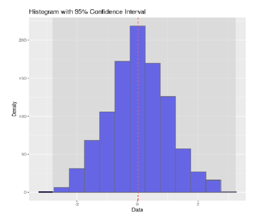
95% Confidence interval using Normally Distributed Data
This would create a histogram of the Poisson distributed data with a 95% confidence interval.
R
library(ggplot2)
set.seed(123)
data <- rpois(1000, lambda = 5)
data_df <- data.frame(data)
mean_data <- mean(data)
sd_data <- sd(data)
conf_int <- mean_data + c(-1.96, 1.96) * sd_data/sqrt(length(data))
ggplot(data = data_df, aes(x = data)) +
geom_histogram(binwidth = 1, fill = "green",
color = "black") +
geom_vline(xintercept = mean_data,
color = "red", linetype = "dashed") +
geom_ribbon(aes(ymin = 0, ymax = Inf,
xmin = conf_int[1],
xmax = conf_int[2]),
fill = "gray", alpha = 0.5) +
ggtitle("Poisson Histogram with 95% Confidence Interval") +
xlab("Data") +
ylab("Frequency")
|
Output:
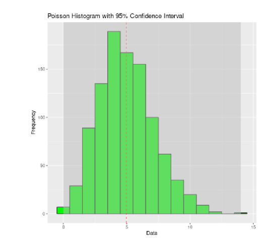
95% Confidence interval using Poisson Distributed Data
This would create a histogram of the normally distributed data with a 95% confidence interval.
R
library(ggplot2)
set.seed(456)
data <- rnorm(1000, mean = 0, sd = 2)
data_df <- data.frame(data)
mean_data <- mean(data)
sd_data <- sd(data)
conf_int <- mean_data + c(-1.96, 1.96) * sd_data/sqrt(length(data))
ggplot(data = data_df, aes(x = data)) +
geom_histogram(binwidth = 0.5,
fill = "purple", color = "black") +
geom_vline(xintercept = mean_data,
color = "red", linetype = "dashed") +
geom_ribbon(aes(ymin = 0, ymax = Inf,
xmin = conf_int[1],
xmax = conf_int[2]),
fill = "gray", alpha = 0.5) +
ggtitle("Normal Histogram with 95% Confidence Interval") +
xlab("Data") +
ylab("Frequency")
|
Output:
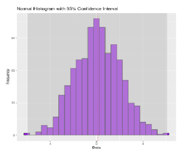
95% Confidence interval using Normally Distributed Data
Share your thoughts in the comments
Please Login to comment...