Angular MDBootstrap Buttons Component
Last Updated :
02 Mar, 2022
MDBootstrap is a Material Design and bootstrap-based Angular UI library that is used to make attractive webpages with its seamless and easy-to-use component. In this article, we will know how to use Buttons Component in Angular MDBootstap. The Buttons component is used to make a button that will indicate a possible user action. It contains several predefined button styles, that represent each having its own semantic purpose.
Properties:
- color: It is used to set the color of a button.
- rounded: It is used to change button style to rounded.
- gradient: It is used to add a gradient background color to the button.
- outline: It is used to change button style to outline.
- flat: It is used to change button style to flat
- size: It is used to change the size of the button.
- block: It is used to change button style to block.
- floating: It is used to change button style to floating.
Syntax:
<button type="button" mdbBtn color="primary" mdbWavesEffect>
        Content
</button>
Approach:
- Download Angular MDBootstrap from the official site.
- Extract the files to the current working directory.
- Install npm in the current project using the following command:
npm install
- After creating your project folder i.e. appname, move to it using the following command:
cd appname
- Start the server using the following command:
ng serve
Project Structure: After complete installation, it will look like the following:
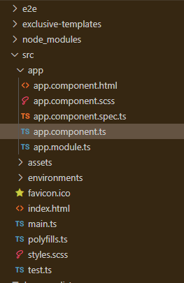
Project Structure
Example 1: This is the basic example that illustrates how to use the Button component in Angular MDBootstrap.
app.component.html
<div id='gfg'>
<h2>GeeksforGeeks</h2>
<h4>Angular MDBootstrap Buttons Component</h4>
<br />
<button mdbBtn color="primary" mdbWavesEffect>
Primary Button
</button>
<button mdbBtn color="secondary" mdbWavesEffect>
Secondary Button
</button>
<button mdbBtn color="success" mdbWavesEffect>
Success Button
</button>
<button mdbBtn color="danger" mdbWavesEffect>
Danger Button
</button>
<br/>
<button mdbBtn color="warning" mdbWavesEffect>
Warning Button
</button>
<button mdbBtn color="info" mdbWavesEffect>
Info Button
</button>
<button mdbBtn color="light" mdbWavesEffect>
Light Button
</button>
<button mdbBtn color="dark" mdbWavesEffect>
Dark Button
</button>
</div>
|
app.component.ts
import { Component } from '@angular/core';
@Component({
selector: 'my-app',
templateUrl: './app.component.html',
styleUrls: ['./app.component.css']
})
export class AppComponent{}
|
app.module.ts
import { BrowserModule } from '@angular/platform-browser';
import { NgModule } from '@angular/core';
import { BrowserAnimationsModule }
from '@angular/platform-browser/animations';
import { AppComponent } from './app.component';
import { MDBBootstrapModule } from 'angular-bootstrap-md';
import { FormsModule } from '@angular/forms';
@NgModule({
declarations: [
AppComponent
],
imports: [
BrowserModule,
BrowserAnimationsModule,
MDBBootstrapModule.forRoot(),
FormsModule,
],
providers: [],
bootstrap: [AppComponent]
})
export class AppModule{}
|
Output:

Angular MDBootstrap Buttons Component
Example 2: This example illustrates the variety of button styles in the Buttons Component.
app.component.html
<div id='gfg'>
<h2>GeeksforGeeks</h2>
<h4>Angular MDBootstrap Buttons Component</h4>
<br />
<button mdbBtn outline='true'
color="primary" mdbWavesEffect>
Button with outline
</button>
<button mdbBtn size="lg"
color="secondary" mdbWavesEffect>
Large Button
</button>
<button mdbBtn size="sm"
color="success" mdbWavesEffect>
Small Button
</button>
<button mdbBtn disabled
color="danger" mdbWavesEffect>
Disabled Button
</button>
<br/>
<button mdbBtn gradient='aqua'
color="warning" mdbWavesEffect>
Gradient Button
</button>
</div>
|
app.component.ts
import { Component } from '@angular/core';
@Component({
selector: 'my-app',
templateUrl: './app.component.html',
styleUrls: ['./app.component.css']
})
export class AppComponent{}
|
app.module.ts
import { BrowserModule } from '@angular/platform-browser';
import { NgModule } from '@angular/core';
import { BrowserAnimationsModule }
from '@angular/platform-browser/animations';
import { AppComponent } from './app.component';
import { MDBBootstrapModule } from 'angular-bootstrap-md';
import { FormsModule } from '@angular/forms';
@NgModule({
declarations: [
AppComponent
],
imports: [
BrowserModule,
BrowserAnimationsModule,
MDBBootstrapModule.forRoot(),
FormsModule,
],
providers: [],
bootstrap: [AppComponent]
})
export class AppModule{}
|
Output:

Various Button styles in Angular MDBootstrap
Reference: https://mdbootstrap.com/docs/angular/components/buttons
Share your thoughts in the comments
Please Login to comment...