Angular MDBootstrap Dropdown Component
Last Updated :
02 Mar, 2022
MDBootstrap is a Material Design and bootstrap-based Angular UI library that is used to make attractive webpages with its seamless and easy-to-use component. In this article, we will know how to use the Dropdown Component in Angular MDBootstap. The Dropdown Component facilitates the creation of toggleable, contextual overlays that allow the user to select a value from a series of options.
Properties:
- autoClose: It is used to indicate that dropdown will be closed on an item or document click, and after pressing ESC.
- dropup: It is used to indicate that dropdown should be opened upwards.
- dropupDefault: It is used to provide the default dropup styles.
- dynamicPosition: It is used to open the component automatically at the top when there is not enough space underneath.
- isDisabled: it allows the user to disable the dropdown toggle and hides the dropdown menu if opened.
- isOpen: It is used to return whether or not the popover is currently being shown.
- placement: it denotes the placement of a popover.
- triggers: It is used to specify events that should trigger.
Syntax:
<div MDBDropdown>
  <button> Content </button>
  <div class="dropdown-menu dropdown-primary">
    <a class="dropdown-item">Dropdown 1</a>
    <a class="dropdown-item">Dropdown 2</a>
  </div>
</div>
Approach:
- Download Angular MDBootstrap from the official site.
- Extract the files to the current working directory.
- Install npm in the current project using the following command:
npm install
- After creating your project folder i.e. appname, move to it using the following command:
cd appname
- Start the server using the following command:
ng serve
Project Structure: After complete installation, it will look like the following:
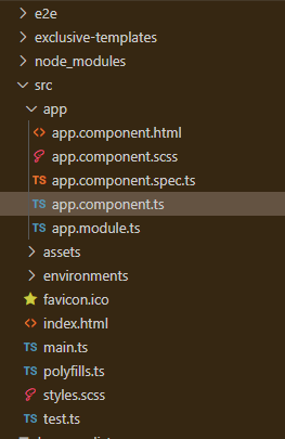
Project Structure
Example 1: This is the basic example that illustrates how to use the Dropdown component in MDBootstrap.
app.component.html
<div id='gfg'>
<h2>GeeksforGeeks</h2>
<h4>Angular MDBootstrap Dropdown Component</h4>
<br />
<div class="btn-group" mdbDropdown>
<button mdbDropdownToggle type="button"
mdbBtn color="green"
class="dropdown-toggle waves-light"
mdbWavesEffect>
GeeksforGeeks
</button>
<div class="dropdown-menu dropdown-primary">
<a class="dropdown-item">Dropdown 1</a>
<a class="dropdown-item">Dropdown 2</a>
<a class="dropdown-item">Dropdown 3</a>
<hr>
<a class="dropdown-item">Dropdown 4</a>
</div>
</div>
</div>
|
app.component.ts
import { Component } from '@angular/core';
@Component({
selector: 'my-app',
templateUrl: './app.component.html',
styleUrls: ['./app.component.css']
})
export class AppComponent { }
|
app.module.ts
import { BrowserModule } from "@angular/platform-browser";
import { NgModule } from "@angular/core";
import { BrowserAnimationsModule }
from "@angular/platform-browser/animations";
import { AppComponent } from "./app.component";
import { MDBBootstrapModule } from "angular-bootstrap-md";
import { FormsModule } from "@angular/forms";
@NgModule({
declarations: [AppComponent],
imports: [
BrowserModule,
BrowserAnimationsModule,
MDBBootstrapModule.forRoot(),
FormsModule,
],
providers: [],
bootstrap: [AppComponent],
})
export class AppModule {}
|
Output:
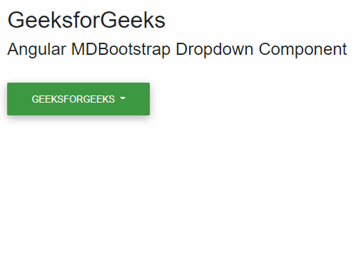
MDBootstrap Default Dropdown Component
Example 2: In this example, we will know how to add additional content in Dropdown Component in MDBootstrap.
app.component.html
<div id='gfg'>
<h2>GeeksforGeeks</h2>
<h4>Angular MDBootstrap Dropdown Component</h4>
<br />
<div class="btn-group" mdbDropdown>
<button mdbDropdownToggle size="lg"
type="button"
mdbBtn color="green"
class="dropdown-toggle waves-light"
mdbWavesEffect>
GeeksforGeeks
</button>
<div class="dropdown-menu">
<a class="dropdown-item active" href="#">Dropdown 1</a>
<a class="dropdown-item disabled" href="#">Dropdown 2</a>
<a class="dropdown-item" href="#">Dropdown 3</a>
</div>
</div>
</div>
|
app.component.ts
import { Component } from '@angular/core';
@Component({
selector: 'my-app',
templateUrl: './app.component.html',
styleUrls: ['./app.component.css']
})
export class AppComponent { }
|
app.module.ts
import { BrowserModule } from '@angular/platform-browser';
import { NgModule } from '@angular/core';
import { BrowserAnimationsModule }
from '@angular/platform-browser/animations';
import { AppComponent } from './app.component';
import { MDBBootstrapModule } from 'angular-bootstrap-md';
import { FormsModule } from '@angular/forms';
@NgModule({
declarations: [
AppComponent
],
imports: [
BrowserModule,
BrowserAnimationsModule,
MDBBootstrapModule.forRoot(),
FormsModule,
],
providers: [],
bootstrap: [AppComponent]
})
export class AppModule { }
|
Output:
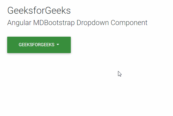
MDBootstrap Dropdown Component
Reference: https://mdbootstrap.com/docs/angular/components/dropdowns
Like Article
Suggest improvement
Share your thoughts in the comments
Please Login to comment...