How to Set Chart Title and Name of X Axis and Y Axis for a Chart in Chart.js ?
Last Updated :
03 Jan, 2024
In this article, we will learn how to set the title, the name of the x-axis, and the name of the y-axis for a chart using the ChartJS CDN library.
Approach:
- In the HTML template, use the <canvas> tag to show the line graph.
- In the script section of the code, instantiate the ChartJS object by setting the type, data, and options properties of the library.
- Set other required options inside each property like datasets, label, borderColor, fill, scales, and others.
CDN Link:
<script src="https://cdn.jsdelivr.net/npm/chart.js"></script>
Syntax:
const chart = document.getElementById('myChart');
new Chart(chart, {
    type: 'line', // Any type can be defined, for ex: line, bar etc..
    data: { ... },
    options: {
        plugins: {
            title: {
                display: true,
                text: 'Title of Chart', // Chart title
                /* Personal styling of chart title */
                color: 'green',
                font: {
                    weight: 'bold',
                    size: 24
                }
            }
        },
        scales: {
            x: {
                title: {
                    display: true,
                    text: 'X Axis Name' // Name of x-axis
                },
                beginAtZero: true // Optional
            },
            y: {
                title: {
                    display: true,
                    text: 'Y Axis Name' // Name of y-axis
                },
                beginAtZero: true // Optional

            }
        }
    }
});
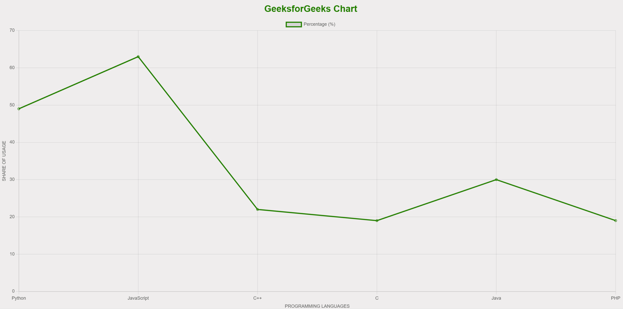
Example 1: The following code shows a simple example of a line chart showcasing percentage of users using programming languages with a list of programming languages on the horizontal axis and a number dataset on the vertical axis.
HTML
<!DOCTYPE html>
<html lang="en">
<head>
<meta charset="UTF-8">
<meta name="viewport"
content="width=device-width, initial-scale=1.0">
<style>
body {
background-color: rgb(239, 237, 237);
}
</style>
<title>Chart</title>
</head>
<body>
<div>
<canvas id="myChart"></canvas>
</div>
<script src=
<script>
const ctx = document.getElementById('myChart');
new Chart(ctx, {
type: 'line',
data: {
labels: ['Python', 'JavaScript', 'C++', 'C', 'Java', 'PHP'],
datasets: [{
label: 'Percentage (%)',
data: [49, 63, 22, 19, 30, 19],
borderColor: 'green',
fill: false,
}]
},
options: {
plugins: {
title: {
display: true,
text: 'GeeksforGeeks Chart', // Chart title
color: 'green',
font: {
weight: 'bold',
size: 24
}
}
},
scales: {
x: {
title: {
display: true,
text: 'PROGRAMMING LANGUAGES' // Name of x-axis
},
beginAtZero: true
},
y: {
title: {
display: true,
text: 'SHARE OF USAGE' // Name of y-axis
},
beginAtZero: true
}
}
}
});
</script>
</body>
</html>
|
Output:
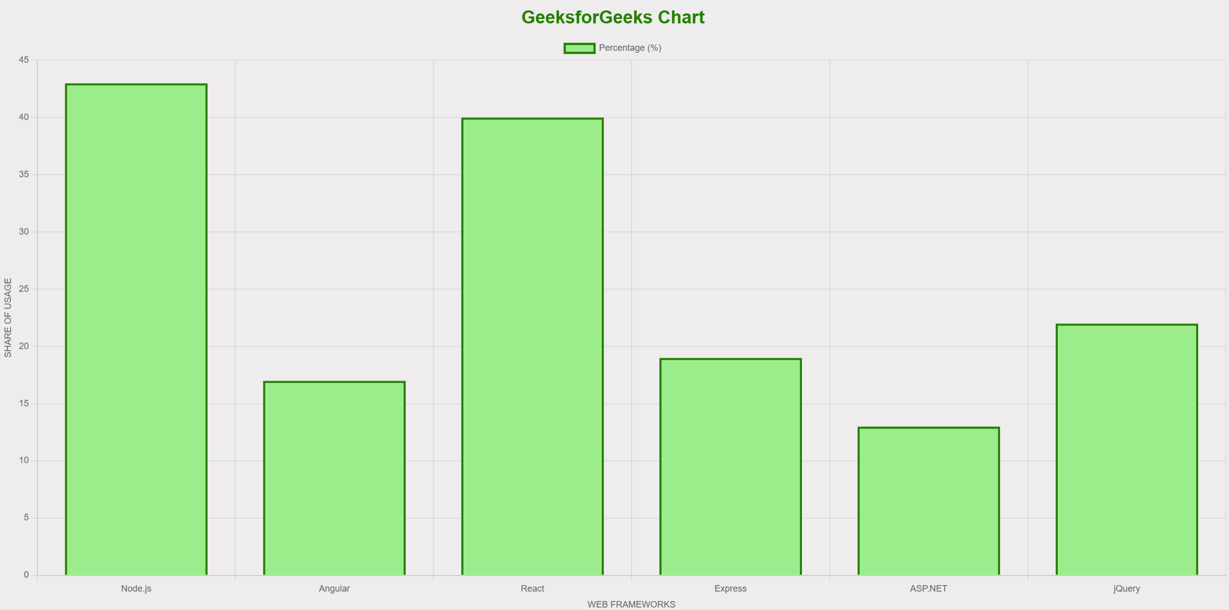
Example 2: The following code shows a simple example of a bar chart illustrating the percentage of users utilizing web frameworks with a list of web frameworks on the horizontal axis and a number dataset on the vertical axis.
HTML
<!DOCTYPE html>
<html lang="en">
<head>
<meta charset="UTF-8">
<meta name="viewport"
content="width=device-width, initial-scale=1.0">
<style>
body {
background-color: rgb(239, 237, 237);
}
</style>
<title>Chart</title>
</head>
<body>
<div>
<canvas id="myChart"></canvas>
</div>
<script src=
<script>
const ctx = document.getElementById('myChart');
new Chart(ctx, {
type: 'bar',
data: {
labels: ['Node.js', 'Angular', 'React',
'Express', 'ASP.NET', 'jQuery'],
datasets: [{
label: 'Percentage (%)',
data: [43, 17, 40, 19, 13, 22],
borderWidth: 3,
backgroundColor: 'lightgreen',
borderColor: 'green'
}]
},
options: {
plugins: {
title: {
display: true,
text: 'GeeksforGeeks Chart', // Chart title
color: 'green',
font: {
weight: 'bold',
size: 24
}
}
},
scales: {
x: {
title: {
display: true,
text: 'WEB FRAMEWORKS' // Name of x-axis
},
beginAtZero: true
},
y: {
title: {
display: true,
text: 'SHARE OF USAGE' // Name of y-axis
},
beginAtZero: true
}
}
}
});
</script>
</body>
</html>
|
Output:
Share your thoughts in the comments
Please Login to comment...