What is a Diagram?
Statistics performs an important function by presenting a complex mass of data in a simple way that makes it easier to understand. Classification and tabulation are two techniques for presenting data in an understandable form. However, as the volume of data increases, it becomes increasingly inconvenient to understand, even after classification and tabulation. Thus, data is presented in the form of diagrams and graphs to enable the comparison of various situations and to understand the various patterns in the data at a glance. A diagram is a visual presentation of statistical data to highlight the basic facts and relationships inherent in the data. As a diagram attracts the attention of the viewer and helps to easily grasp the information, it is appreciated by everyone.
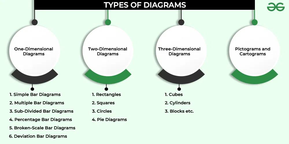
Types of Diagrams
Different types of diagrams can be used to present the data. The selection of the diagram is decided by the nature of the data, the objectives of the presentation, and the abilities and experience of the presenter.
(Note: In this article, we will be covering only one-dimensional diagrams and pie diagrams.)
A. One-Dimensional Diagrams or Bar Diagrams
One-dimensional diagrams are those that have only one-dimensional measurements, such as height or length.
- In these diagrams, the magnitude of the characteristics is shown by the length or height of the bar.
- The width of a bar is arbitrarily set to make the constructed diagram more elegant and attractive.
- The length and height of the bars vary depending on the variable value. However, the width of the bar remains constant.
- Width is also determined by the number of bars that must be accommodated in the diagrams.
- If there are a large number of items, lines can be used instead of bars.
- The bars must be equidistant from one another.
- Bars can be drawn horizontally or vertically. They are, however, usually in vertical form.
The different types of One-Dimensional Diagrams are as follows:
- Simple Bar Diagram
- Multiple Bar Diagram
- Sub-Divided Bar Diagram or Component Bar Diagram
- Percentage Bar Diagram
- Broken-Scale Bar Diagram
- Deviation Bar Diagram
1. Simple Bar Diagram
A diagram in which each class or category of data is represented by a group of rectangular bars of equal width is known as a Simple Bar Diagram. It is the simplest type of bar diagram. In this diagram, each bar represents one figure only. The number of bars will be equal to the number of figures. These diagrams show only one characteristic of the data, such as sales, production, or population figures for various years.
The magnitude of data is determined by the bar’s height (or length). The lower end of the bar touches the base line; therefore, the height of a bar starts from the zero unit. These diagrams can be vertical or horizontal in layout:
- Vertical Bar Diagram: The diagram in which the magnitude of the data is presented vertically, i.e., along the Y-axis, is a Vertical Bar Diagram.
- Horizontal Bar Diagram: The diagram in which the magnitude of the data is presented horizontally; i.e., along the X-axis is a Horizontal Bar Diagram.
The bars of a bar diagram can be visually compared by their relative height, and data can be easily comprehended accordingly.
Example: Present the following data in the form of a simple (vertical and horizontal) bar diagram.
Solution:
2. Multiple Bar Diagram
The Multiple Bar Diagram is used to compare two or more variables such as revenue and expenditure, import and export for different years, marks obtained in different subjects in different grades, and so on. It is often referred to as a Compound Bar Diagram. The method for creating multiple bar diagrams is the same as for creating a Simple Bar Diagram. However, to distinguish the bars from each other, different bars are differentiated by different shades or colours.
Example: Represent the following information showing the number of students that use mobile phones from Realme, Redmi, and OnePlus in College A, College B, and College X, using a multiple-bar diagram.
Solution:
3. Sub-Divided Bar Diagram
In these diagrams, the bar corresponding to each phenomenon is divided into several components. Each part or component occupies a proportional part of the bar to its share in the total. For example, the bar corresponding to the number of students enrolled in a course can be further sub-divided into boys and girls.
- When preparing a sub-divided bar diagram, the various components in each bar should be kept in the same sequence.
- It is important to use different colours or shades to differentiate between different components.
- A suitable index should explain these various colours or shades.
- These diagrams are quite useful for comparing the sizes of various parts and throwing light on the relationship between these integral parts. For instance, such diagrams are used to present data such as sales profits from various products, a family’s expenditure pattern, the budget outlay for receipts and expenditures, and so on.
Example: Represent the following information using a sub-divided bar diagram, showing the number of students that use mobile phones from Realme, Redmi, and OnePlus in College A, College B, and College C.
Solution:
4. Percentage Bar diagram
A Percentage Bar Diagram is a sub-divided bar diagram that indicates the total percentage of each component rather than the magnitude. The absolute magnitudes of several components are presented using a subdivided diagram. These magnitudes can be converted into relative values by describing them as a percentage of the total.
Each data component is expressed as a percentage of the corresponding total. Thus, in a percentage bar diagram, all of the bars are of height 100, while the different segments of the bar representing the various components vary in height depending on their % value of the total. Just like in the sub-divided bar diagram, in the percentage bar diagram, different components can be differentiated by different shades or colours.
Example: Show the following information with the help of a percentage bar graph.
Solution:
5. Broken-Scale Bar Diagram
This diagram is used when the value of one variable is extremely high or extremely low in comparison to others. Larger bars may be broken to make space for the smaller bars of the series. Every bar has its value written on the top of the bar.
When the majority of the data figures are of low magnitude and one or more of the figures are of unusually large magnitude, a broken-scale diagram is used to present the data.
Example: Prepare an appropriate diagram using the following data from company imports in different years.
Solution:
6. Deviation Bar Diagram
These diagrams are used to represent net changes in data such as net profit, net loss, net exports, net imports, etc.
- In these diagrams, only changes are shown, not the original data.
- The values in these diagrams might be both positive and negative.
- Positive values are displayed above the X-axis (Base line), while negative values are displayed below it.
Example: The following data shows the sale proceeds and the cost of a firm in different years. Use a deviation bar diagram to represent the profit/loss made by the firm.
Solution:
A circle can be divided into parts to show the ratios of different components. A pie diagram is one such representation. Pie charts are also referred to as Angular Circle Diagrams. The circle is divided into as many sections as there are elements by drawing straight lines from the centre to the circumference.
While preparing a pie diagram, different sectors, which represent different component elements, should be identified from one another through varied shades and colours or by using either expressive or descriptive labels.
Example:
Draw a pie chart to reflect the following expenditure for an ordinary working-class family.
Solution:
The sum of the percentages of total expenditure is 100. It means that the total angle; i.e., 360° represents 100. Now, multiply each of the percentages by  or 3.6° to determine the proportionate angles.
According to the degrees of angles at the centre, the circle is divided into five parts. Hence, the pie diagram for the given data will be represented as:
.webp)
Share your thoughts in the comments
Please Login to comment...