Tailwind CSS Flex Wrap
Last Updated :
28 Mar, 2022
The CSS flexbox is a vital feature to develop the frontend, there are three wraps available in CSS so in tailwind CSS all the properties are covered as in class form. It is the alternative of CSS flex-wrap Property for fast development of front-end.
Note: To activate the flex-wrap you have to include the flex class in your element before the flex-wrap class.
Flex Wrap:
- flex-wrap
- flex-nowrap
- flex-wrap-reverse
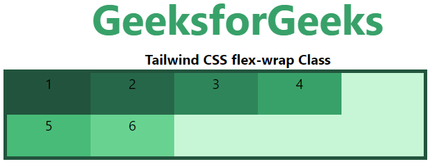
flex-wrap: This class is used to break the flex item into multiples lines. It makes flex items wrap to multiple lines according to flex item width.
Syntax:
<element class="flex flex-wrap"> Contents... </element>
Example:
HTML
<!DOCTYPE html>
<html>
<head>
<title>Tailwind flex-wrap Class</title>
<link href=
rel="stylesheet">
</head>
<body class="text-center">
<h1 class="text-green-600 text-5xl font-bold">
GeeksforGeeks
</h1>
<b>Tailwind CSS flex-wrap Class</b>
<div id="main" class="ml-24 h-28 w-2/3 flex flex-wrap
bg-green-200 border-solid border-4
border-green-900">
<div class="bg-green-900 w-24 h-12">1</div>
<div class="bg-green-800 w-24 h-12">2</div>
<div class="bg-green-700 w-24 h-12">3</div>
<div class="bg-green-600 w-24 h-12">4</div>
<div class="bg-green-500 w-24 h-12">5</div>
<div class="bg-green-400 w-24 h-12">6</div>
</div>
</body>
</html>
|
Output:
flex-nowrap: The default value of wrap-flex is nowrap. It is used to specify that the item has no wrap. It makes item wrap in single lines.
Syntax:
<element class="flex flex-nowrap"> Contents... </element>
Example:
HTML
<!DOCTYPE html>
<html>
<head>
<title>Tailwind flex-nowrap Class</title>
<link href=
rel="stylesheet">
</head>
<body class="text-center">
<h1 class="text-green-600 text-5xl font-bold">
GeeksforGeeks
</h1>
<b>Tailwind CSS flex-nowrap Class</b>
<div id="main" class="ml-24 h-28 w-2/3 flex flex-nowrap
bg-green-200 border-solid border-4
border-green-900">
<div class="bg-green-900 w-24 h-12">1</div>
<div class="bg-green-800 w-24 h-12">2</div>
<div class="bg-green-700 w-24 h-12">3</div>
<div class="bg-green-600 w-24 h-12">4</div>
<div class="bg-green-500 w-24 h-12">5</div>
<div class="bg-green-400 w-24 h-12">6</div>
</div>
</body>
</html>
|
Output:

flex-wrap-reverse: This class is used to reverse the flow of the flex items when they wrap to new lines.
Syntax:
<element class="flex flex-wrap-reverse"> Contents... </element>
Example:
HTML
<!DOCTYPE html>
<html>
<head>
<title>Tailwind flex-wrap-reverse Class</title>
<link href=
rel="stylesheet">
</head>
<body class="text-center">
<h1 class="text-green-600 text-5xl font-bold">
GeeksforGeeks
</h1>
<b>Tailwind CSS flex-wrap-reverse Class</b>
<div id="main" class="ml-24 h-28 w-2/3 flex
flex-wrap-reverse bg-green-200 border-solid
border-4 border-green-900">
<div class="bg-green-900 w-24 h-12">1</div>
<div class="bg-green-800 w-24 h-12">2</div>
<div class="bg-green-700 w-24 h-12">3</div>
<div class="bg-green-600 w-24 h-12">4</div>
<div class="bg-green-500 w-24 h-12">5</div>
<div class="bg-green-400 w-24 h-12">6</div>
</div>
</body>
</html>
|
Output:

Share your thoughts in the comments
Please Login to comment...