Tailwind CSS Grid Auto Flow
Last Updated :
23 Mar, 2022
This class accepts more than one value in tailwind CSS all the properties are covered as in class form. It is the alternative of CSS grid-auto-flow property and it is used to specify how auto-placed items get flowed into the grid items using Tailwind CSS.
Grid Auto Flow:
- grid-flow-row
- grid-flow-col
- grid-flow-row-dense
- grid-flow-col-dense
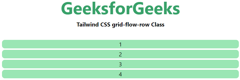
grid-flow-row: Auto-placement algorithm place the items by filling each row in turn, adding new rows as necessary.
Syntax:
<element class="grid-flow-row"> Contents... </element>
Example:
HTML
<!DOCTYPE html>
<html>
<head>
<title>Tailwind grid-flow-row Class</title>
<link href=
rel="stylesheet">
</head>
<body class="text-center">
<h1 class="text-green-600 text-5xl font-bold">
GeeksforGeeks
</h1>
<b>Tailwind CSS grid-flow-row Class</b>
<div class = "m-8 grid grid-flow-row gap-1">
<div class = "bg-green-300 rounded-lg">1</div>
<div class = "bg-green-300 rounded-lg">2</div>
<div class = "bg-green-300 rounded-lg">3</div>
<div class = "bg-green-300 rounded-lg">4</div>
</div>
</body>
</html>
|
Output:
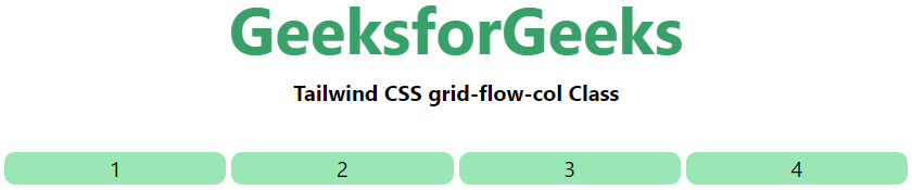
grid-flow-col: Auto-placement algorithm place the items by filling each column in turn, adding new columns as necessary.
Syntax:
<element class="grid-flow-col"> Contents... </element>
Example:
HTML
<!DOCTYPE html>
<html>
<head>
<title>Tailwind grid-flow-col Class</title>
<link href=
rel="stylesheet">
</head>
<body class="text-center">
<h1 class="text-green-600 text-5xl font-bold">
GeeksforGeeks
</h1>
<b>Tailwind CSS grid-flow-col Class</b>
<div class = "m-8 grid grid-flow-col gap-1">
<div class = "bg-green-300 rounded-lg">1</div>
<div class = "bg-green-300 rounded-lg">2</div>
<div class = "bg-green-300 rounded-lg">3</div>
<div class = "bg-green-300 rounded-lg">4</div>
</div>
</body>
</html>
|
Output:
grid-flow-row-dense: Specifying that the auto-placement algorithm uses a “dense” packing algorithm for the column.
Syntax:
<element class="grid-flow-row-dense"> Contents... </element>
Example:
HTML
<!DOCTYPE html>
<html>
<head>
<title>Tailwind grid-flow-row-dense Class</title>
<link href=
rel="stylesheet">
</head>
<body class="text-center">
<h1 class="text-green-600 text-5xl font-bold">
GeeksforGeeks
</h1>
<b>Tailwind CSS grid-flow-row-dense Class</b>
<div class = "m-8 grid grid-flow-row-dense gap-1">
<div class = "bg-green-300 rounded-lg">1</div>
<div class = "bg-green-300 rounded-lg">2</div>
<div class = "bg-green-300 rounded-lg">3</div>
<div class = "bg-green-300 rounded-lg">4</div>
</div>
</body>
</html>
|
Output:

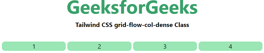
grid-flow-col-dense: Specifying that the auto-placement algorithm uses a “dense” packing algorithm for rows.
Syntax:
<element class="grid-flow-col-dense">..</element>
Example:
HTML
<!DOCTYPE html>
<html>
<head>
<title>Tailwind grid-flow-col-dense Class</title>
<link href=
rel="stylesheet">
</head>
<body class="text-center">
<h1 class="text-green-600 text-5xl font-bold">
GeeksforGeeks
</h1>
<b>Tailwind CSS grid-flow-col-dense Class</b>
<div class = "m-8 grid grid-flow-col-dense gap-1">
<div class = "bg-green-300 rounded-lg">1</div>
<div class = "bg-green-300 rounded-lg">2</div>
<div class = "bg-green-300 rounded-lg">3</div>
<div class = "bg-green-300 rounded-lg">4</div>
</div>
</body>
</html>
|
Output:
Like Article
Suggest improvement
Share your thoughts in the comments
Please Login to comment...