The sparklines are also known as in-line charts. So the question is where do we use sparklines, we can use them in situations where we want the graph/chart to be as near to the data as possible. Mainly we write data in one row / one column and add a sparkline to the end of the row or end of the column.
What are Sparklines
Sparklines are miniature, condensed charts that provide a quick visual representation of data trends and patterns within a single cell in Microsoft Excel. These tiny graphs allow you to analyze data at a glance, without the need to create full-sized charts. Sparklines are an excellent tool for displaying data in a compact and easy-to-read format, making them particularly useful for dashboards, reports, and presentations. In this comprehensive guide, we will explore the concepts of sparklines, how to create them in Excel, and various customization options to enhance their effectiveness. Unlike regular charts, sparklines are not objects. These reside in a cell as the background of that cell.
Sparklines can be of many types: Line, Column, and Win/Loss. An example of a sparkline is as follows :
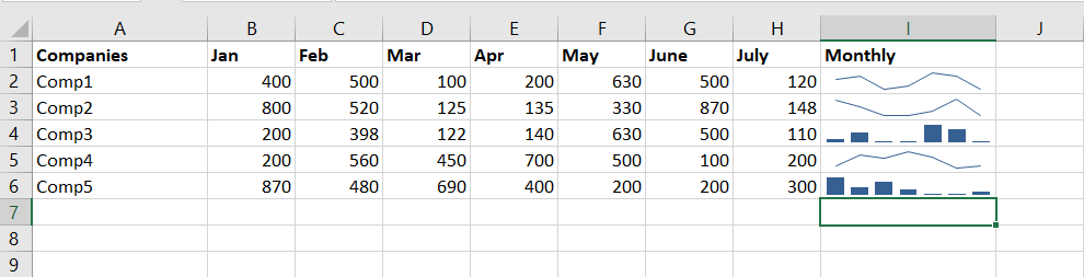
An example of a sparkling
Types of Sparklines in Excel
There are three types of sparklines in Excel:
How to Insert Sparklines in Excel
Follow the below steps to add sparkline in Excel:
Step 1: Go to the Insert tab.
Step 2: Select the cell where you want to insert the sparkline.
 >Line” width=”inherit” height=”inherit”>Go to insert > Sparklines > Select option
Step 3: Select the range of cells for which you have to add a sparkline.
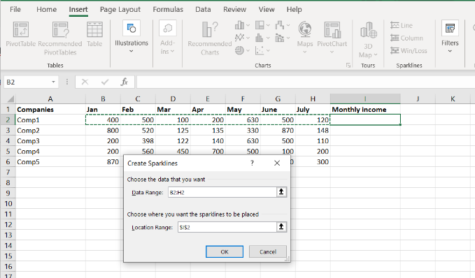
Selecting the range of cells for the sparkline
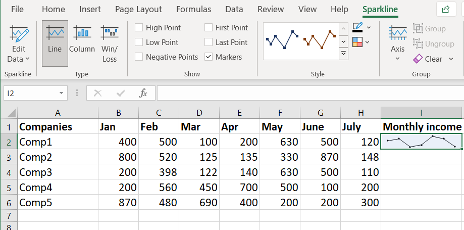
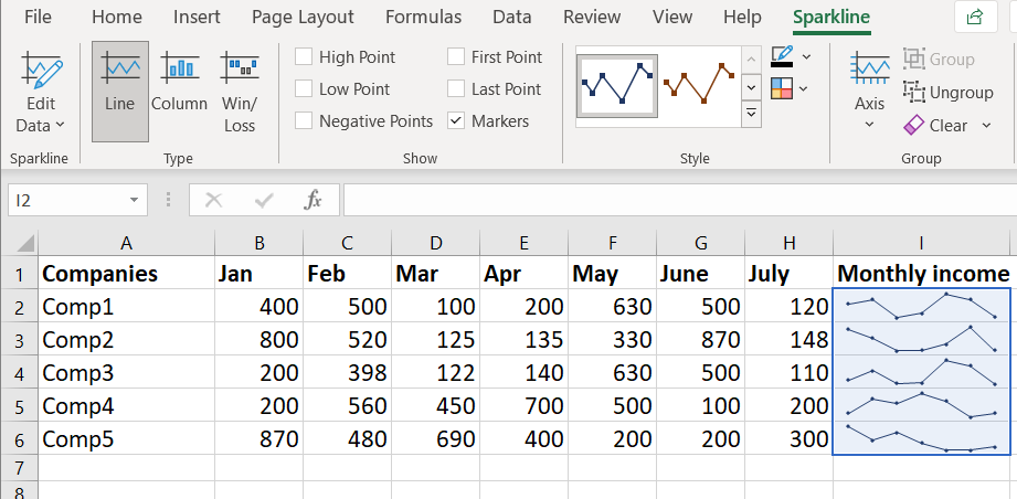
Step 4: Click on the OK button, the sparkline is now added to the selected cell.
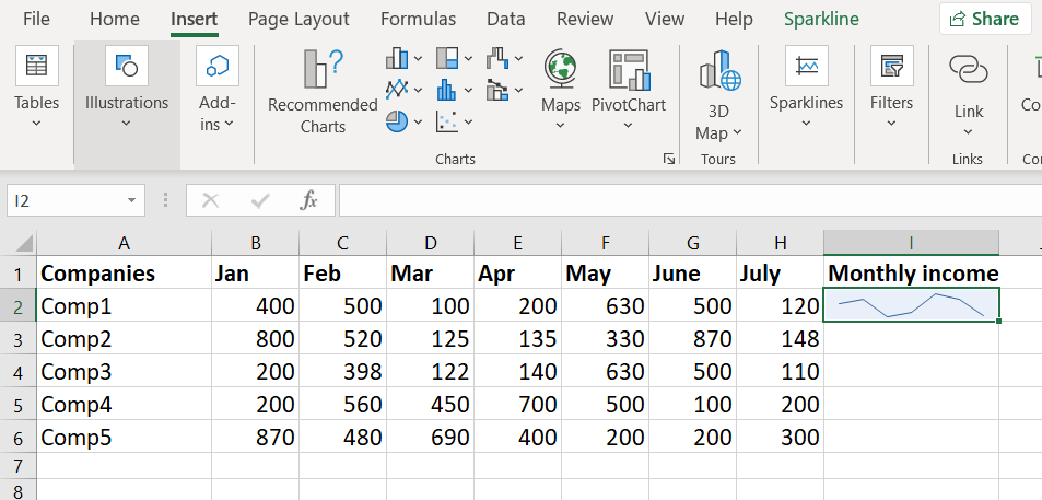
Sparkline is added to the selected cell
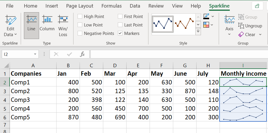
Customize the Sparkline
To format the sparkline, select the sparkline you want to format and then select the Sparkline option on the menubar as shown in the picture below:
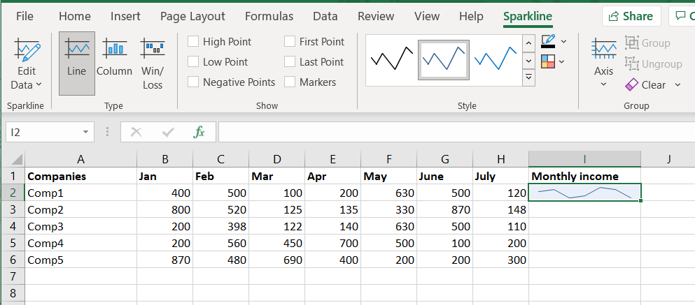
Formatting the sparkline
Using show submenu
In the show submenu, there are 6 options :
- High Point: Marks the maximum point on the sparkline.
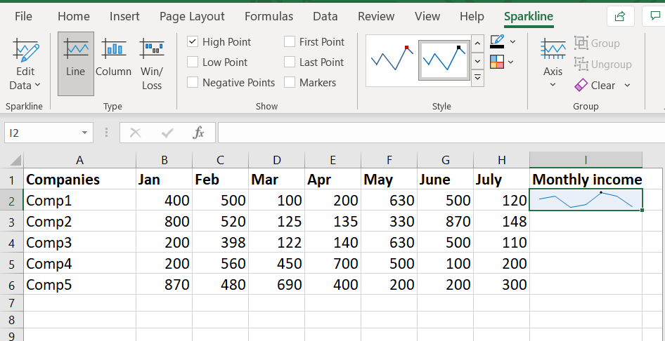
High point marker in the sparkline
- Low Point: Marks the minimum point on the sparkline.
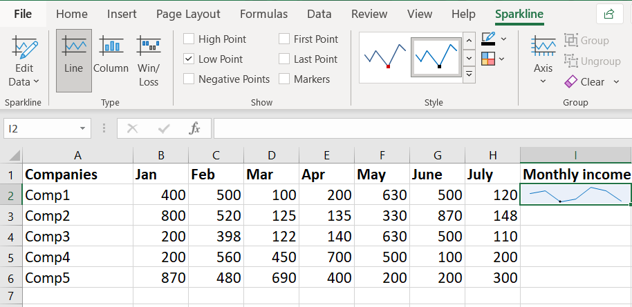
Low point marker in the sparkline
- First Point: Marks the leftmost ( first ) point on the sparkline.
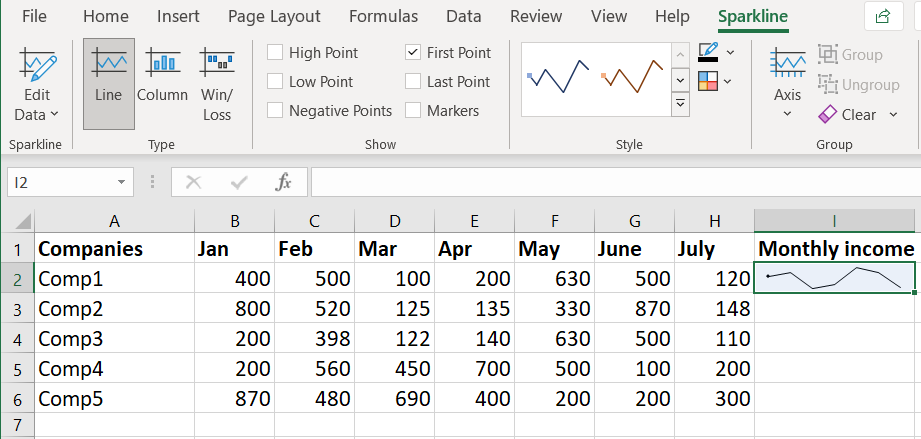
First point marker in the sparkline
- Last Point: Marks the rightmost ( last ) point on the sparkline.
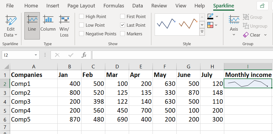
Last point marker in the sparkline
- Markers: Mark all the edge points on the sparkline.
Markers on the sparkline
- Negative Points: Marks the negative points in the graph with a different color which is illustrated in the figure below:

Negative Points marker marks the negative points with different color
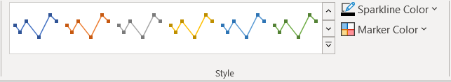
Using Style submenu
In the style submenu, we can select the style of the sparkline, many options are available ( different variety of colors ). We can also set the color of the sparkline and marker color using Sparkline Color and Marker Color options.
Style Tab in Sparkline menu
Using Group submenu
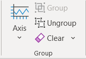
Group Tab in Sparkline
In the Axis section, there are many options by which you can reformat your sparkline. One of the options is Plot Data Right-to-Left, in this case, the data is plotted on the sparkline from the rightmost data to the leftmost data. This is illustrated in the diagram below. The first figure shows the data plotted from left to right and the second figure shows the same data plotted from right to left.
Data plotted from left to right
Now if we choose the option Plot Data Right-to-Left, it will plot the same data from rightmost to leftmost value as illustrated in the figure below.
Same Data plotted from right to left
Group, Ungroup, and Clear Sparklines
- Group: It groups all the sparklines together. In simple words, you can treat all the sparklines as having the same characteristics and applying style on any one of them, styles all the other sparklines in that group. If we change the color of one sparkline, all the other sparklines get affected.
- Ungroup: Ungroup option reverses the effects done by the Group option, it again makes the sparklines as different entities.
- Clear: This option can clear/delete the selected sparkline or the selected sparkline group( all the sparklines in that group ).
Edit the DataSet of Existing Sparklines
Editing the dataset of existing sparklines in Excel is a simple process that allows you to modify the data and update the sparklines accordingly, Follow the below steps to edit the dataset:
Step 1: Select the Sparklines
First, click on the sparkling that you want to edit. Excel will highlight the selected sparkling, including that it is active for editing.
Step 2: Access the Edit Data Option
Next, go to the “Design” tab in the Excel ribbon. In the “Type” group, you will find the “Edit Data” drop-down menu.
Step 3: Choose the Editing Option
Click on the “Edit Data” drop-down menu to reveal the following options:
Edit Group Location & Data
Select this option when you have grouped multiple sparklines, and you want to change the data for the entire group. Grouping Sparklines is a useful feature for managing and updating multiple Sparklines simultaneously.
Edit Single Sparkline’s Data
Choose this option to change the data for the selected sparkling only. This is helpful when you have individual sparklines with unique data that you want to modify independently.
.png)
Hidden and Empty Cells
When working with the line sparklines in a dataset that contains empty cells, you may observe that the sparkline displays a gap to indicate the absence of data in those cells. This gap can sometimes disrupt the continuity o the sparkline and affect data visualization. However, Excel provides effective ways to handle hidden and empty cells within sparklines, ensuring a smooth and acute representation of data trends.
Ignoring Hidden Cells
By default, Excel considers hidden cells in sparklines, leading to gaps in the line when data is hidden. To overcome this, you can instruct Excel to ignore hidden cells while creating sparklines. Follow the below steps to ignore the hidden cells:
Step 1: Click the cell that has the sparkline.
Step 2: Click the Design Tab.
Step 3: Click on the Edit data Option.
Step 3: In the drop-down, select the ‘Hidden & Empty Cells’ option.
.png)
By enabling this setting, sparklines will disregard data in hidden cells, maintaining the line’s continuity.
.png)
How to change sparklines in Excel
You can also change the Sparkline type – form line to column or vice-versa, you can do this using the following steps:
Step 1: Click the sparkling you want to change.
Step 2: Click the sparkling Tools Design Tab.
Step 3: In the type group, select the sparkling you want.
.png)
Highlighting Data Points in Sparklines
While Sparklines provide a concise view of data trends over time, you can further enhance their meaning by adding markers an highlighting to emphasize critical data points.
For instance, you can highlight the maximum and minimum data points, the first and the last data points, or even negative data points to draw attention to specific values.
Below is the example showcasing the maximum and minimum data points in both line and column sparklines:
.png)
You can access these options in the sparkline Tools tab, specifically under the “Show” group.
.png)
Below are some different highlighting options available :
High/Low Point: This option is used to highlight the maximum and/or minimum data points.
First/Last Point: This is used to highlight the First/ last data points.
Negative Points: This option can be used to highlight all negative points if present in your data.
Markers: Exclusive to line sparklines, this option highlights all data points with a marker. You can customize the marker color using the ‘Marker Color” option.
Sparklines Color and Style
Excel offers various style and color options to modify the appearance of sparklines. You can change the color of lines or columns as well as markers.
.png)
Additionally, you can utilize pre-made style options for further personalization. To access the full list of options, click on the drop-down icon located in the botton-right corner of the style box.
.png)
Note: By incorporating data points highlights and leveraging the style and color options, you can create visually appealing sparklines that effectively communicate insights form your data. Utilize these features to anke your sparklines more meaningful and informative, empowering bteer data analysis and decision-making.
Sparkline Axis
When creating sparklines in their default form, the lowest dat ais positioned at the bottom, and all other dat points are relative to it. However, in some cases, this default representation may exaggerate the dat variation, leading to misinterpretation.
In the below example, the data set range between 100 to 630, with a variation of only 5 points, yet the deafultl axis starting form the lowest point(100) makes the variation appear significant.
.png)
This difference is even more pronounced in column sparklines, where it may appear that the march value is close to zero.
.png)
To adjust this issue and ensure accurate data representation, you can customize the axis in sparklines by making it start at a specific value. Follow the below steps to adjust the axis in sparklines:
Step 1: Select the cell with the sparklines.
Step 2: Click on the “Sparkline Tools Design” tab.
Step 3: Click on the “Axis” Option.
.png)
Step 4: In the drop-down menu, select “Custom Value” (in the Vertical Axis Minimum Value options).
.png)
Step 5: In the Sparkline Vertical Axis Settings” dialog box, enter the value as 0) or any specific value as you want).
.png)
Step 6: Click ok.
Note: In the presence of negative numbers in your dataset, it’s best not to set the axis to a specific value. For example, setting the axis to 0 would hide negative numbers from the sparkline(as it starts from 0).
Additionally, you have the option to make the axis visible by selecting the “Show Axis” option. This proves useful when dealing with numbers that cross the axis, such as datasets containing both positive and negative values.
.png)
By customizing the sparklines axis, you can present data more accurately an davpid misinterpretations caused by default settings. Utilize these adjustments to create meaningful sparklines that effectively communicate insights from your data, improving data represenattion for better analysis and understanding.
.png)
Delete Sparklines
It is not possible to delete a sparkline by selecting the cell and hitting the delete key. To delete a sparkline follow the below steps:
Step 1: Select the cell that has the sparkline that you want to delete.
Step 2: Click the Saprkline Tools Design tab.
Step 3: Click the clear option.
.png) FAQs
FAQs
What are Sparklines in Excel?
Sparklines are miniature, condensed charts that provide a quick visual representation of data trends and patterns within a single cell in Microsoft Excel. These tiny graphs allow you to analyze data at a glance, without the need to create full-sized charts. Sparklines are an excellent tool for displaying data in a compact and easy-to-read format, making them particularly useful for dashboards, reports, and presentations. In this comprehensive guide, we will explore the concepts of sparklines, how to create them in Excel, and various customization options to enhance their effectiveness. Unlike regular charts, sparklines are not objects.
How to quickly Add Sparklines in Excel?
Follow the below steps to quickly add sparklines in Excel:
Step 1: Go to the Insert tab.
Step 2: Select the cell where you want to insert the sparkline.
Step 3: Select the range of cells for which you have to add a sparkline.
Step 4: Click on the OK button, the sparkline is now added to the selected cell.
Q4: How to Edit the data of Existing Sparklines?
Answer:
To edit the data of existing sparklines, select the cell with the sparkline, go to the “Sparkline Tools and Design” tab, click on the “Edit Data”, choose “Edit Group Location & Data” for multiple sparklines or “Edit single Sparkline’s Data” for individual sparklines.
Share your thoughts in the comments
Please Login to comment...