React Suite CheckPicker With a label
Last Updated :
07 Sep, 2022
React Suite is a library of React components, sensible UI design, and a friendly development experience. It is supported in all major browsers. It provides pre-built components of React which can be used easily in any web application. In this article, we’ll learn about React suite Checkpicker with a Label.
The Checkpicker Component is very useful for selecting multiple items or selecting a group of data items. To display a label with Checkpicker, a label prop is used that displays the text at the beginning of the toggle button.
Syntax:
<CheckPicker label="..."/>
Creating React Application And Installing Module:
Step 1: Create a React application using the given command:
npm create-react-app projectname
Step 2: After creating your project, move to it using the given command:
cd projectname
Step 3: Now Install the rsuite npm package using the given command:
npm install rsuite
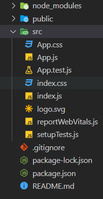
Project Structure: Now your project structure should look like the following:

Project Structure
Example 1: Below example demonstrates the usage of a label with the Checkpicker component.
app.js
import "rsuite/dist/rsuite.min.css";
import { CheckPicker } from "rsuite";
const data = [
"Java",
"C++",
"DSA",
"Web Development",
"Android Development",
].map((item) => ({
label: item,
value: item,
}));
export default function App() {
return (
<div>
<div style={{ textAlign: "center" }}>
<h2>GeeksforGeeks</h2>
<h4 style={{ color: "green" }}>
React Suite CheckPicker with Label
</h4>
<div style={{ padding: 20 }}>
<div>
<CheckPicker label="Select"
data={data} />
</div>
</div>
</div>
</div>
);
}
|
Output:
Example 2: Below example demonstrates the subtle appearance of the label with the Checkpicker component.
app.js
import "rsuite/dist/rsuite.min.css";
import { CheckPicker } from "rsuite";
const data = [
"Java",
"C++",
"DSA",
"Web Development",
"Android Development",
].map((item) => ({
label: item,
value: item,
}));
export default function App() {
return (
<div>
<div style={{ textAlign: "center" }}>
<h2>GeeksforGeeks</h2>
<h4 style={{ color: "green" }}>
React Suite CheckPicker with Label
</h4>
<div style={{ padding: 20 }}>
<div>
<CheckPicker
label="Choose"
appearance="subtle"
data={data}
/>
</div>
</div>
</div>
</div>
);
}
|
Output:
Reference: https://rsuitejs.com/components/check-picker/#with-a-label
Share your thoughts in the comments
Please Login to comment...