React MUI The sx prop
Last Updated :
01 Feb, 2023
React MUI is a massive library of UI components designers and developers can use to build React applications. Material UI provides low-level utility functions called “style functions” for building powerful design systems
The sx prop lets you add any valid CSS to an element while using values from your theme to keep styles consistent. All of the style functions provided in @mui/system are packaged together as a superset of CSS that can be used with the ‘sx’ prop. This prop allows you to define any valid CSS as well as a variety of MUI’s System-specific theme-aware characteristics.
Syntax:
<Component sx={{ cssProperty: value }} />
Theme-aware properties:
- Borders: It allows you to set the border width, style, and color in a single line of code.
- Display: It is used to set the display value of an element for example: “block”, “inline”, “inline-block”, “flex”, “grid”, etc.
- Grid: It allows you to specify the grid properties such as grid-template-columns, grid-template-rows, grid-column-gap, grid-row-gap, grid-template-areas, and grid-area.
- Palette: It allows you to set the colors of an element based on the Material-UI theme.
- Positions: It allows you to specify the position value such as absolute, relative, fixed, sticky etc.
- Shadow: It is used to set the shadow of an element.
- Sizing: It allows you to set the width and height of an element, and it also provides a set of predefined sizes.
- Spacing: It allows you to set the margin and padding of an element, and it also provides a set of predefined spacing.
- Typography: It allows you to set the font family, font size, font weight, line height, letter spacing, and text align of an element
Ways to pass the values in sx prop:
Callback values:
The values of the “sx” prop can also be defined as callbacks, which will be invoked on every render and will return the styles to be applied. This can be useful for applying styles that depend on the component’s state or props. It’s recommended to use callbacks for simple styles and limit the number of elements using them to improve performance.
Syntax:
<Box sx={{ CssProperty: (theme) => theme.themeName(value) }} />
Array values:
The array values in the “sx” prop allow for multiple style objects to be applied to a single element, with the styles cascading down in the order they are defined in the array.
Syntax:
<Component sx={[{ property: "value" }, { property: "value" }]} />
Creating React Application And Installing Module
Step 1: Create React app by writing the below code in any command line.
npx create-react-app app_name
Step 2: Then, we have to move into the folder we will be working on.
cd project_name
Step 3: We will be installing the @mui/material library for working on our project.
npm install @mui/material @emotion/react @emotion/styled
Project Structure: After creating React App and installing all the dependencies, the folder structure will look similar to the figure given below.
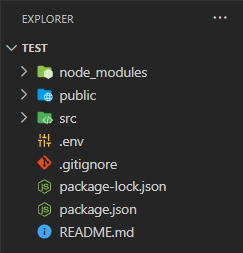
Folder Structure
Step to run the application: Write the below code in the terminal to run the server:
npm start
Example 1: Below is the code for styling a Box component using the ‘sx’ prop.
App.js
Javascript
import styled from "@emotion/styled";
import { Box } from '@mui/material';
const Text = styled.div`
padding-left: 10px;
padding-right: 5px;
`;
const Logo =
const SimpleExample = () => {
return (
<Box sx={{ width: '200px', height: '400px', boxShadow: 2,
margin: '10px', bgcolor: '#9dedb2' }}>
<img src={Logo} alt='GFG logo' width='200px'
height='200px' />
<Text>A Computer Science portal for geeks.
It contains well written, well thought and
well explained computer science and programming
articles.
</Text>
</Box>
);
}
export default SimpleExample;
|
Output:

Simple example using ‘sx’ prop
Example 2: Below is the code for making a simple Form using Material Ui ‘sx’ props.
App.js
Javascript
import React, { useState } from "react";
import styled from "@emotion/styled";
import { Box, Button, TextField } from '@mui/material';
const Text = styled.div`
font-size: 20px;
font-weight: bold;
margin: 10px;
`;
const Form = () => {
const [name, setName] = useState('');
const [password, setPassword] = useState('');
const handleClick = () => {
if (!name) {
alert(`Please Enter Name`)
}
else if (!password) {
alert(`Please Enter Password`)
}
else {
alert(`Thank you ${name} for Signing Up!`)
}
}
const handleChange = (event) => {
setName(event.target.value);
}
const handlePassword = (event) => {
setPassword(event.target.value);
}
return (
<Box sx={{ display: 'flex', alignItems: 'center',
justifyContent: 'center', height: '100vh' }}>
<Box sx={{ width: '200px', height: '400px',
boxShadow: 2, margin: '10px', display: 'flex',
flexDirection: 'column', alignItems: 'center' }}>
<Text>Sign Up</Text>
<TextField label='Name' variant="outlined"
sx={{ margin: '10px' }} onChange={handleChange} />
<TextField type='password' label='Password'
variant="outlined" sx={{ margin: '10px' }}
onChange={handlePassword} />
<Button sx={{ width: '100px' }} variant="contained"
onClick={handleClick}>Sign Up</Button>
</Box>
</Box>
);
}
export default Form;
|
Output:
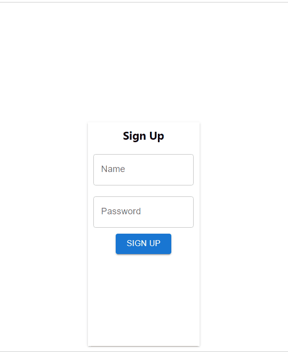
Simple Form using different ‘sx’ props
Reference: https://mui.com/system/getting-started/the-sx-prop/
Share your thoughts in the comments
Please Login to comment...