React MUI Default Theme
Last Updated :
07 Jun, 2023
Material UI is a UI library providing predefined robust and customizable components for React for easier web development. The MUI design is based on top of Material Design by Google. Theme means following a common uniform color scheme, font style, shadow, spacing, shape, transitions, dimensions, and other styles of the component throughout the website. This helps to add a better visual impact on the websites.
Material UI provides a theme object that is responsible for providing a theme to the components. One can further customize the theme of the component by further creating one’s own theme object. In this article, we will look into the default values of the theme object.
Creating React Application And Installing Module:
Step 1: Create a React application using the following command:
npx create-react-app foldername
Step 2: After creating your project folder i.e. foldername, move to it using the following command:
cd foldername
Step 3: After creating the ReactJS application, Install the required module using the following command:
npm install @mui/material @emotion/react @emotion/styled
Import Statement:
import { ThemeProvider, createTheme } from '@mui/material/styles';
import CssBaseline from '@mui/material/CssBaseline';
Project Structure: It will look like the following.
React MUI Default Theme
Example 1: In this example, we are showing the default theme through the Button component.
Javascript
import { Button } from "@mui/material";
function App() {
return (
<div className="App" style={{ textAlign: "center" }}>
<h1 style={{ color: "green" }}>
GeeksforGeeks
</h1>
<h3>
React MUI Default Theme
</h3>
<Button color="primary" variant="contained">
primary
</Button>
<Button color="warning" variant="contained">
warning
</Button>
<Button color="error" variant="contained">
error
</Button>
</div>
);
}
export default App;
|
Step to Run Application: Run the application using the following command from the root directory of the project.
npm start
Output: Now open your browser and go to http://localhost:3000/, you will see the following output.
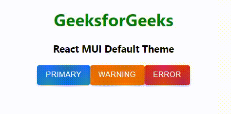
React MUI Default Theme
Example 2: Write the below code to add the default dark theme.
Javascript
import { Button } from "@mui/material";
import { ThemeProvider, createTheme } from '@mui/material/styles';
import CssBaseline from '@mui/material/CssBaseline';
const darkTheme = createTheme({
palette: {
mode: 'dark',
},
});
function App() {
return (
<ThemeProvider theme={darkTheme}>
<CssBaseline />
<div className="App" style={{ textAlign: "center" }}>
<h1 style={{ color: "green" }}>
GeeksforGeeks
</h1>
<h3>React MUI Default Theme</h3>
<Button color="primary" variant="contained">
primary
</Button>
<Button color="warning" variant="contained">
warning
</Button>
<Button color="error" variant="contained">
error
</Button>
</div>
</ThemeProvider>
);
}
export default App;
|
Step to Run Application: Run the application using the following command from the root directory of the project.
npm start
Output: Now open your browser and go to http://localhost:3000/, you will see the following output.
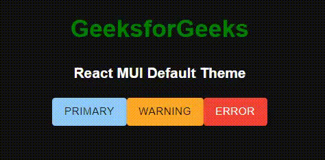
React MUI Default Theme
Reference: https://v4.mui.com/customization/default-theme/
Share your thoughts in the comments
Please Login to comment...