React-Bootstrap Dropdown items
Last Updated :
02 Nov, 2023
React Bootstrap Dropdown Items is used to provide items in a dropdown. Dropdown is a kind of button; when the user clicks on it, it opens and shows the content present in it. So in React Bootstrap, Dropdown is by default present; we just need to add items by using DropDown items.
React Bootstrap DropDown Items props used:
- bsPrefix : Change the underlying component CSS base class name and modifier class names prefix.
- active : It will highlight the DropDown Item as active.
- disabled : It will disable DropDown Item and will make it as inactive.
- eventKey : It will make unique Item so that we can target them in OnSelect.
- href : It is used to pass a hyper link just like anchor tag.
- onClick : It will make a onClick function which can be used while clicking on Menu item.
- as : It will used for custom element type.
Syntax:
<Dropdown.Item * >Your Text</Dropdown.Item>
Note: Replace * with above mentioned props.
Example 1: In this example we used three DropDown Items to display Actions.
Javascript
import React from 'react';
import Dropdown from 'react-bootstrap/Dropdown';
import 'bootstrap/dist/css/bootstrap.min.css';
function MyDropdown() {
return (
<Dropdown>
<Dropdown.Toggle variant="primary"
id="dropdown-basic">
Dropdown
</Dropdown.Toggle>
<Dropdown.Menu>
<Dropdown.Item href="#/action-1">Action 1</Dropdown.Item>
<Dropdown.Item href="#/action-2">Action 2</Dropdown.Item>
<Dropdown.Item href="#/action-3">Action 3</Dropdown.Item>
</Dropdown.Menu>
</Dropdown>
);
}
export default MyDropdown;
|
Javascript
import React from 'react';
import "./App.css";
import MyDropdown from './components/MyDropdown';
function App() {
return (
<div>
<h1>React-Bootstrap Dropdown Menu</h1>
<MyDropdown />
</div>
)
}
export default App;
|
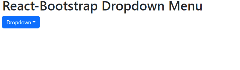
Output

original
Example 2: In this example we used active to display active and Disabled to display second item disabled and third one is linked with hyperlink.
Javascript
import React from 'react';
import "./App.css";
import Dropdown from 'react-bootstrap/Dropdown';
import 'bootstrap/dist/css/bootstrap.min.css';
function App() {
return (
<div>
<h1>React-Bootstrap Dropdown Menu</h1>
<Dropdown>
<Dropdown.Toggle variant="primary"
id="dropdown-basic">
Dropdown
</Dropdown.Toggle>
<Dropdown.Menu>
<Dropdown.Item active>Active</Dropdown.Item>
<Dropdown.Item disabled>Disabled</Dropdown.Item>
<Dropdown.Item href="#/action-3">Action 3</Dropdown.Item>
</Dropdown.Menu>
</Dropdown>
</div>
)
}
export default App;
|
Output :
Share your thoughts in the comments
Please Login to comment...