React-Bootstrap API Dropdown
Last Updated :
20 Nov, 2023
React-bootstrap is a front-End Stylesheet library. It replaces the Bootstrap JavaScript into completely a react component. It creates a seamless front-end development experience.
In this article, we will see the React-Bootstrap API Dropdown. The dropdown components are generally created when we provide a list of items to choose from.
React-Bootstrap API Dropdown Props:
- bsPrefix: This changes the component’s CSS base class name and modifier class names prefix.
- drop: It sets the direction and location of the menu with respect to its to it’s Toggle.
- as: It helps to customize the element or to change the element type.
- show: It is a boolean value. It determines whether the Dropdown is visible or not.
- onToggle: It is a callback function which gets triggered when the Dropdown wishes to change visibility.
- onSelect: It is a callback function which gets triggered when a menu item is selected.
- focusFirstItemOnShow: It controls the the focus behavior for when the Dropdown is opened.
- autoClose: It determines the auto close behaviour of the dropdown.
Syntax:
<Dropdown>...</Dropdown>
Steps to create React Application And Installing Module:
Step 1: Create a React application using the following command:
npx create-react-app foldername
Step 2: After creating your project folder i.e. foldername, move to it using the following command:
cd foldername
Step 3: After creating the ReactJS application, Install the required module using the following command:
npm install react-bootstrap bootstrap
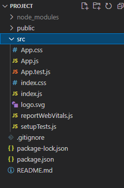
Project Structure: It will look like the following.
Example 1: In this example, we are using the “id” and “drop” props of dropdown API in App.js file
Javascript
import Dropdown from 'react-bootstrap/Dropdown';
import 'bootstrap/dist/css/bootstrap.min.css';
function App() {
return (
<div className="App text-center">
<h1 class="text-success">GeeksforGeeks</h1>
<h3>React-Bootstrap API Dropdown</h3>
<Dropdown drop='down-centered'>
<Dropdown.Toggle id="articles" variant="success">
Articles
</Dropdown.Toggle>
<Dropdown.Menu>
<Dropdown.Item href="#/web-dev">Web Development</Dropdown.Item>
<Dropdown.Item href="#/software-testing">Software Testing</Dropdown.Item>
<Dropdown.Item href="#/python">Python</Dropdown.Item>
<Dropdown.Item href="#/linux">Linux</Dropdown.Item>
</Dropdown.Menu>
</Dropdown>
</div>
);
}
export default App;
|
Step to Run Application: Run the application using the following command from the root directory of the project:
npm start
Output: Now open your browser and go to http://localhost:3000/, you will see the following output:

Example 2: In this example, we are creating a dropdown component by using the “align” and “autoClose” props in App.js file.
Javascript
import Dropdown from 'react-bootstrap/Dropdown';
import 'bootstrap/dist/css/bootstrap.min.css';
function App() {
return (
<div className="App text-center">
<h1 class="text-success">GeeksforGeeks</h1>
<h3>React-Bootstrap API Dropdown</h3>
<Dropdown align="start" autoClose="inside">
<Dropdown.Toggle id="languages">
Programming Languages
</Dropdown.Toggle>
<Dropdown.Menu>
<Dropdown.Item href="#/java">Java</Dropdown.Item>
<Dropdown.Item href="#/c++">C++</Dropdown.Item>
<Dropdown.Item href="#/python">Python</Dropdown.Item>
</Dropdown.Menu>
</Dropdown>
</div>
);
}
export default App;
|
Output:

Share your thoughts in the comments
Please Login to comment...