React-Bootstrap Alerts API
Last Updated :
22 Nov, 2023
React-bootstrap is a front-End Stylesheet library. It replaces the Bootstrap JavaScript into completely a react component. It creates a seamless front-end development experience. In this article, we will see React Bootstrap Alerts API.
The alert components help to show messages for typical user actions.
Alerts API props:
- bsPrefix: The changes the component’s CSS base class name and modifier class names prefix.
- variant: It helps to add the visual variant to the component. We can chose among any of the given options ‘including primary’, ‘secondary’, ‘success’, ‘danger’, ‘warning’, ‘info’, ‘dark’, ‘light’.
- dismissible: It is a boolean value that renders a properly aligned dismiss button and adds extra padding to the component.
- show: It is a boolean value that determines the visual state of the Alert.
- onClose: It is a callback function which gets triggered when the alert is closed.
- closeLabel: It determines the text for alert close button.
- closeVariant: It determines the variant for close button.
- transition: It helps to add a transition animation to the alert component.
Syntax:
<Alert>...</Alert>
Steps to create React Application And Installing Module:
Step 1: Create a React application by running the give command:
npx create-react-app foldername
Step 2: After creating your project folder i.e. foldername, change your directory to created project directory:
cd foldername
Step 3: After creating the your application, Install the react-bootstrap module using the following command:
npm install react-bootstrap bootstrap
Project Structure:
Example 1: We are creating an alert component by using the key and the variant prop in the App.js file
Javascript
import Alert from "react-bootstrap/Alert";
import "bootstrap/dist/css/bootstrap.min.css";
function App() {
return (
<div className="App text-center">
<h1 class="text-success">GeeksforGeeks</h1>
<h3>React-Bootstrap Alerts API</h3>
<Alert key={"success"} variant="success">
Welcome to GeeksforGeeks!
</Alert>
</div>
);
}
export default App;
|
Output:

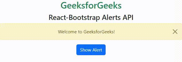
Ecample 2: In this example, we are adding a button with an onClick function that changes the state of the custom hook showAlert, which gets passed to the show prop of the Alert Component.
Javascript
import Alert from "react-bootstrap/Alert";
import "bootstrap/dist/css/bootstrap.min.css";
import { Button } from "react-bootstrap";
import { useState } from "react";
function App() {
const [showAlert, setShowAlert] = useState();
const onClickHandler = () => {
setShowAlert(!showAlert);
};
return (
<div className="App text-center">
<h1 class="text-success">GeeksforGeeks</h1>
<h3>React-Bootstrap Alerts API</h3>
<Alert
key="welcome-text"
variant="warning"
dismissible
onClose={onClickHandler}
show={showAlert}
>
Welcome to GeeksforGeeks!
</Alert>
<Button onClick={onClickHandler}>Show Alert</Button>
</div>
);
}
export default App;
|
Output:
Share your thoughts in the comments
Please Login to comment...