How to Add Dismissible Alerts using React Bootstrap ?
Last Updated :
26 Oct, 2023
A dismissible alert is a type of message that can be dismissed/canceled by the user by clicking the close icon(X) or close button. React Bootstrap provides us with an Alert react component for this. The react component has a dismissible prop which can be set to true to make the alert dismissible.
Creating React Application And Installing Module
Step 1: Create a React application using the following command:
npx create-react-app alert-gfg
Step 2: After creating your project folder i.e. alert-gfg, move to it using the command:
cd alert-gfg
Step 3: After creating the ReactJS application, Install the required modules using the following command:
npm install react-bootstrap bootstrap
Project Structure
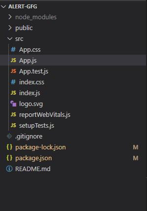
Project Structure
Example: Now write down the following code in the App.js file. Here, App is our default component where we have written our code.
Javascript
import { useState } from 'react';
import Alert from 'react-bootstrap/Alert';
import Button from 'react-bootstrap/Button';
import 'bootstrap/dist/css/bootstrap.min.css';
const alertTypes =
["primary", "info", "secondary", "success",
"danger", "warning", "light", "dark"];
function App() {
const [showAlert, setShowAlert] = useState({
primary: false,
secondary: false,
info: false,
success: false,
danger: false,
warning: false,
light: false,
dark: false
});
const handleClickShowAll = () => {
setShowAlert({
primary: true,
secondary: true,
info: true,
success: true,
danger: true,
warning: true,
light: true,
dark: true
})
}
if (Object.values(showAlert)
.some(val => val === true)) {
return (
<>
{alertTypes.map(type => (
<Alert className='m-3'
variant={type} key={type}
onClose={() => setShowAlert(
{ ...showAlert, [type]: false })}
dismissible={true}>
<Alert.Heading>
Alert!!
</Alert.Heading>
<p>
This is a Geeks For Geeks {type} Alert!!
</p>
</Alert>))}
</>
)
}
return (
<div style={{ textAlign: "center" }}>
<Button onClick={handleClickShowAll}
className='mt-3'>Show All Alerts</Button>
</div>)
}
export default App;
|
Step to Run Application
Run the application using the following command from the root directory of the project:
npm start
Output: Now open your browser and go to http://localhost:3000/, you will see the following output:
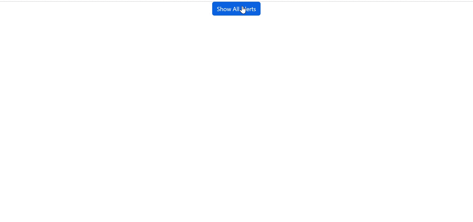
Bootstrap Alerts Output
Share your thoughts in the comments
Please Login to comment...