Bootstrap Alerts , Wells, Pagination and Pager
Last Updated :
02 Jan, 2023
- Introduction and Installation
- Grid System
- Buttons, Glyphicons, Tables
- Vertical Forms, Horizontal Forms, Inline Forms
- DropDowns and Responsive Tabs
- Progress Bar and Jumbotron
Alerts:
We often see certain alerts on some websites before or after completing an action. These alert messages are highlighted texts that are important to take into consideration while performing a process. Bootstrap allows us to show these alert messages on our website using predefined classes. How to add alert messages using bootstrap classes-
1. Inside a div element, add an alert class.
2. Use the following classes to style the color of the message box:
- Green – alert-success
- Blue – alert-info
- Yellow –alert-warning
- Red – alert-danger
Example: Write the text you want for the alert message and close the div element.
HTML
<div class="alert alert-success">
<strong>Success!</strong>
</div>
<div class="alert alert-info">
<strong>Info!</strong>
</div>
<div class="alert alert-warning">
<strong>Warning!</strong>
</div>
<div class="alert alert-danger">
<strong>Danger!</strong>
</div>
|
Output: 
Dismissible Alerts: To close an alert message, you need to add a x icon in your alert. To add the icon include a class alert-dismissible to your div element. Then add a class close and data-dismiss=”alert” to a link or a button like this:
HTML
<div class="alert alert-success alert-dismissible">
<a href="#" class="close"
data-dismiss="alert" aria-label="close">
×
</a>
<strong>Success!</strong>
</div>
<div class="alert alert-info alert-dismissible">
<a href="#" class="close"
data-dismiss="alert" aria-label="close">
×
</a>
<strong>Info!</strong>
</div>
<div class="alert alert-warning alert-dismissible">
<a href="#" class="close"
data-dismiss="alert" aria-label="close">
×
</a>
<strong>Warning!</strong>
</div>
<div class="alert alert-danger alert-dismissible">
<a href="#" class="close"
data-dismiss="alert" aria-label="close">
×
</a>
<strong>Danger!</strong>
</div>
|
Output:  Alert links: To add a link to your alert message, add a alert-link class inside the ‘a’ element. This will create a link in the same font color as that of the alert message box. Then use the ‘a’ tag to add a link to the text like this:
HTML
<div class="alert alert-success">
<strong>Success!</strong>
<a href="#" class="alert-link">
read this message
</a>
</div>
<div class="alert alert-info alert-dismissible">
<strong>Info!</strong>
<a href="#" class="alert-link">
read this message
</a>
</div>
<div class="alert alert-warning alert-dismissible">
<strong>Warning!</strong>
<a href="#" class="alert-link">
read this message
</a>
</div>
<div class="alert alert-danger alert-dismissible">
<strong>Danger!</strong>
<a href="#" class="alert-link">
read this message
</a>
</div>
|
Output: 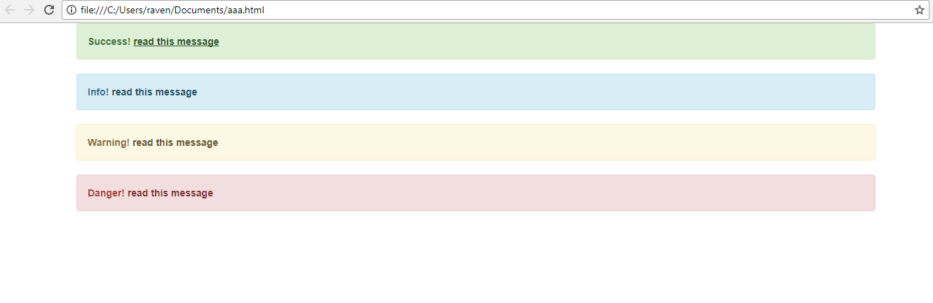 Wells:
A well class is simply used to add a grey box around some text with rounded corners and some padding. To add a well in your webpage just include the well class in a div element, then write the text you want to keep in the well and close the div tag.
HTML
<div class="well">This is a Well</div>
|
Output: Well Size: The default size of the well is medium but we can increase or decrease the size of the well using the class well-lg and well-sm respectively.
HTML
<div class="well well-lg">
This is a large Well
</div>
<div class="well well-sm">
This is a small Well
</div>
|
Output: Pagination:
We all have seen a website that has lots of webpages or when we search on google there are a lot of search results on different webpages which are numbered for 1. This feature can be easily added to a website using bootstrap. The predefined class used for pagination is pagination.
To add pagination to your website, include the pagination class inside a ul tag like this:
HTML
<ul class="pagination">
<li><a href="#">1</a></li>
<li><a href="#">2</a></li>
<li><a href="#">3</a></li>
<li><a href="#">4</a></li>
<li><a href="#">5</a></li>
</ul>
|
Output: Active Page: To display the active page, use the class active like this,
HTML
<ul class="pagination">
<li><a href="#">1</a></li>
<li class="active"><a href="#">2</a></li>
<li><a href="#">3</a></li>
<li><a href="#">4</a></li>
<li><a href="#">5</a></li>
</ul>
|
Output: Disabled Page: To disable a page to go to a certain link, use the class disabled like this,
HTML
<ul class="pagination">
<li><a href="#">1</a></li>
<li class="disabled"><a href="#">2</a></li>
<li><a href="#">3</a></li>
<li><a href="#">4</a></li>
<li><a href="#">5</a></li>
</ul>
|
Output: Pager:
We all have seen ‘previous’ and ‘next’ buttons on a webpage to navigate to other pages. Bootstrap provides a predefined class to implement this pager efficiently. A pager provides links to move to the next or previous page. To add a pager to your webpage, add a class ‘pager’ to a div element and provide the links for the previous and next pages like this,
HTML
<ul class="pager">
<li><a href="#">Previous</a></li>
<li><a href="#">Next</a></li>
</ul>
|
Output: To align these navigation buttons to the side of the webpage, use class ‘previous’ and ‘next’ with the links like this-
HTML
<ul class="pager">
<li class="previous">
<a href="#">Previous</a>
</li>
<li class="next">
<a href="#">Next</a>
</li>
</ul>
|
Output:
Share your thoughts in the comments
Please Login to comment...