Pygal Introduction
Last Updated :
16 Aug, 2023
Python has become one of the most popular programming languages for data science because of its vast collection of libraries. In data science, data visualization plays a crucial role that helps us to make it easier to identify trends, patterns, and outliers in large data sets. Pygal is best suited for Data visualizations. It is used to draw charts and plots such as bar plots, line charts, and box plots.
What is Pygal?
Pygal is open source Python library that is specifically designed to create interactive and visually appealing charts and plots. It is used to create a wide range of chart types, including bar charts, line charts, pie charts, radar charts, scatter plots, and more. We can customize the graphs using various styles, colors, and labels to make them more interactive. Pygal allows saving the output in SVG(Scalable Vector Graphics).
Key Features of Pygal Library
- In Pygal, we can create a wide range of charts and plots which include line charts, pie charts, bar plots, radar charts, and more. We can choose any of those that are best suited to represent and visualize our data set.
- Plots and Charts are more interactive in Pygal as it provides data point highlighting, tooltips, and zoom features that make them more informative to the users.
- Pygal connects seamlessly with a variety of data sources, including CSV files, databases, and API answers. This integration feature ensures that the data analysis workflow is as smooth and efficient as possible.
- Pygal allows extensive customization of colors, fonts, legends, and other visual elements while it also provides pre-designed themes that are best suited to the visualization.
Checking the Python Version
The Pygal library is available for Python 3.6, 3.7, 3.8, 3.9, and pypy. So, It is important to install Python 3.6 or a later version in our system we can also check the version already installed python version by executing the below command in the terminal.
python --version
Installing Pygal
To use the features of Pygal library it should be installed on our system. To install Pygal execute the below command in a terminal or command prompt and if pip command is not working refer to pip install.
pip install pygal
How to use Pygal in Python?
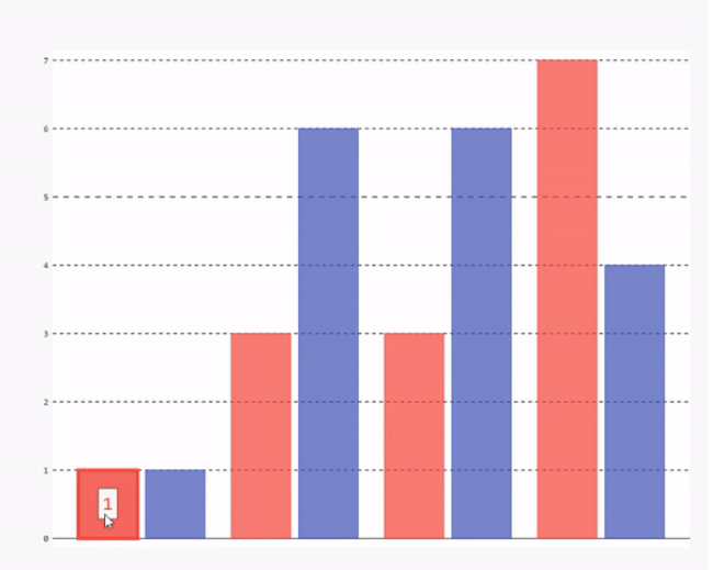
To use the Pygal library we have to first import it into our Python Program using the import command and then we have to create the instance of plot or chart. In the below example, we have created the instance of a bar plot using pygal.Bar() method. After that, we created the Bar Chart by passing adding some random data and saving the bar chart as a ‘BarPlot.svg’ file using the render_to_file() method.
Python3
import pygal
Bar_plot = pygal.Bar()
Bar_plot(1, 3, 3, 7)(1, 6, 6, 4).render_to_file('BarPlot.svg')
|
Output: We can see in the below output that when we hover over the bar it shows data of that bar.
Examples of Creating Charts and Plots using Pygal in Python
Now we will see some examples of creating interactive Charts and Plots using Pygal in Python.
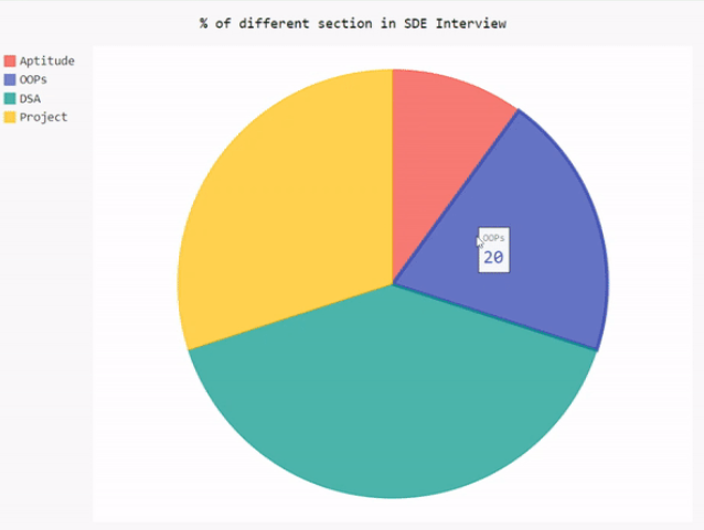
Create a Pie Chart using Pygal in Python
In the below example, we will draw a pie chart using the Pygal library. First, we import the Pygal library, and then create an instance of a pie chart using pygal.Pie() method. Set the title of a pie chart. Add data to the pie chart using add() method by passing the label name and value as an argument in it. Finally, save the output to the SVG file.
Python3
import pygal
pie_chart = pygal.Pie()
pie_chart.title = '% of different section in SDE Interview'
pie_chart.add('Aptitude', 10)
pie_chart.add('OOPs', 20)
pie_chart.add('DSA', 40)
pie_chart.add('Project', 30)
pie_chart.render_to_file('Pie_chart.svg')
|
Output:
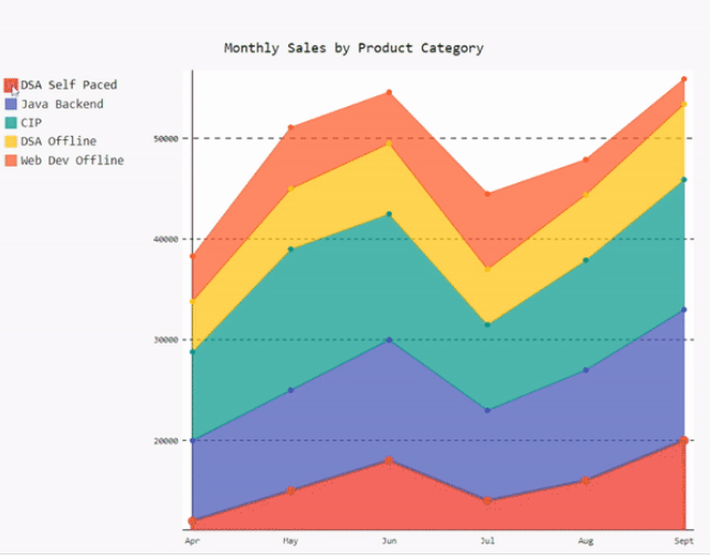
Create a Stacked Line Chart using Pygal in Python
In the below example, we will draw a stacked line chart using the Pygal library. First, we import the Pygal library and then create sample data of 6 months’ sales of various courses at GFG. Create an instance of a stacked line chart using pygal.StackedLine() method and set fill as true so that the area between two lines or a line and the x-axis is filled with color. Set the title of a pie chart and x-axis labels. Add data to the pie chart using add() method by passing the label name and value as an argument in it. Finally, save the output to the SVG file.
Python3
import pygal
months = ['Apr', 'May', 'Jun', 'Jul', 'Aug', 'Sept']
DSA_Self_Paced = [12000, 15000, 18000, 14000, 16000, 20000]
Java_Backend = [8000, 10000, 12000, 9000, 11000, 13000]
CIP = [8800, 14000, 12500, 8500, 10900, 12900]
DSA_Offline = [5000, 6000, 7000, 5500, 6500, 7500]
Web_Dev_Offline = [4500, 6100, 5100, 7500, 3500, 2500]
line_chart = pygal.StackedLine(fill=True)
line_chart.title = 'Monthly Sales by Product Category'
line_chart.x_labels = months
line_chart.add('DSA Self Paced', DSA_Self_Paced)
line_chart.add('Java Backend', Java_Backend)
line_chart.add('Complete Interview Preparation', CIP)
line_chart.add('DSA Offline', DSA_Offline)
line_chart.add('Web Dev Offline', Web_Dev_Offline)
line_chart.render_to_file('stacked_line_chart.svg')
|
Output:
Share your thoughts in the comments
Please Login to comment...