In this article, we are going to predict Diabetes using the K-Nearest Neighbour algorithm and analyze on Diabetes dataset using the R Programming Language.
What is the K-Nearest Neighbor algorithm?
The K-Nearest Neighbor (KNN) algorithm is a popular supervised learning classifier frequently used by data scientists and machine learning enthusiasts for model building. This algorithm operates on the principle that datapoints in close proximity to the query datapoint have labels that are similar. In Layman’s terms, KNN relies on the distance to determine the nearest neighbors and classify the query data point based on the majority class of its neighbors. It’s a handy tool for data scientists and computer systems to make decisions based on the company they keep.
To understand the workings of KNN, we first need to understand what exactly is a classifier.
What is a Classifier?
A Classifier is a machine learning algorithm that is used to classify data based on their features or attributes. The most common example of a classifier can be to categorize and identify an email as a Spam or Not Spam based on the content within it, repetition of words that induces a sense of urgency, etc. They’re like helpful assistants for computers that can sort and label things in many different situations. So, in a nutshell, classifiers are like digital detectives that make our digital lives easier by helping computers make sense of things.
How does K-Nearest Neighbor Work
The working of the KNN algorithm is very simple and based on the data points in its surroundings. As the name suggests, this algorithm works by identifying and analyzing the nearest K (numeric constant) neighbors of the fed-in data point. After identifying its neighbors the algorithm calculates the most common label among the neighbors and categorizes the fed in data point based on it. Taking the earlier example further, if a new email arrives and is to be predicted as Spam or Not Spam, then its nearest neighbors that are nothing but previously classified emails are analyzed and based on the labels of the majority of emails in its surroundings, the email is classified as either Spam or Not Spam.
Broadly, the Steps can be broken down as:
- Choosing a value of K: K is a numeric constant, which represents number of nearest neighbors to look at before making a prediction and it is very important to choose a wise value of k.
- Neighbour Identification: After choosing a value of K the algorithm start with identifying and analysing neighboring data points about the test data point.
- Majority Count: Now after analysing the near data points, it evaluates the categorical variable which is in majority about the test data point
- Final Prediction: Based on the majority count the algorithm finalise a categorical variable and gives output as a prediction to the test data point.
Understanding Diabetes Dataset
Dataset: Diabetes Dataset
It is the most common dataset that is used by ML learners to understand how the K-Nearest Neighbor algorithm works by using it on real-world problems and their dataset. This dataset contains the diagnostic measurements collected by the National Institute of Diabetes and Digestive and Kidney Diseases of the patients who were diagnosed with Diabetes and the ones who weren’t. This dataset is considered as a good resource to help us understand the working of Machine Learning algorithms in real world problems.
The dataset comprises of 9 columns (features) with labels like Glucose, Blood Pressure, Skin Thickness, etc.
All the features in the dataset are:
- Pregnancies: Number of times pregnant
- Glucose: Plasma glucose concentration a 2 hours in an oral glucose tolerance test
- BloodPressure: Diastolic blood pressure (mm Hg)
- SkinThickness: Triceps skin fold thickness (mm)
- Insulin: 2-Hour serum insulin (mu U/ml)
- BMI: Body mass index (weight in kg/(height in m)2)
- DiabetesPedigreeFunction: Diabetes pedigree function
- Age: Age (years)
- Outcome: Class variable (Binary result: 0 or 1)
Importing packages
For this project, we will need some packages that will make the whole process easier
- caret – Caret (Classification And REgression Training) is a very famous package used by machine learning community. It provides various methods and functions for training and evaluating machine learning model. Here, we are going to use this package to split our dataset into training and test data.
- class- Class library contains various machine learning training models, out of which K-Nearest Neighbour algorithm is a part of, which we are going to use in building this project.
- ggplot2 – ggplot2 is a widely used package by Machine Learners to plot and visualise their data into graphs and heatmaps to understand the data graphically.
Installing the packages
Though, these packages come build-in with R, if they are not present install them using following command in the R terminal
install.packages("caret")
install.packages("class")
install.packages("ggplot2")
This commands will install the packages for further use.
R
library(caret)
library(class)
library(ggplot2)
|
Here, two libraries have been imported, first one being caret to split the dataset intot training and testing set and class to import K-Nearest Neighbor Classifier in our Rscript.
- The libraries have been imported successfully in the project.
- Before starting to build the model, its always a good practice to first have insights about the dataset.
Exploratory Data Analysis (EDA)
First let’s import the dataset into the Rscript
R
data <- read.csv("diabetes.csv")
head(data)
summary(data)
|
Output:
  Pregnancies Glucose BloodPressure SkinThickness Insulin  BMI DiabetesPedigreeFunction Age
1           6     148            72            35       0 33.6                    0.627  50
2           1      85            66            29       0 26.6                    0.351  31
3           8     183            64             0       0 23.3                    0.672  32
4           1      89            66            23      94 28.1                    0.167  21
5           0     137            40            35     168 43.1                    2.288  33
6           5     116            74             0       0 25.6                    0.201  30
  Outcome
1       1
2       0
3       1
4       0
5       1
6       0
  Pregnancies        Glucose      BloodPressure    SkinThickness      Insulin
 Min.   : 0.000   Min.   :  0.0   Min.   :  0.00   Min.   : 0.00   Min.   :  0.0
 1st Qu.: 1.000   1st Qu.: 99.0   1st Qu.: 62.00   1st Qu.: 0.00   1st Qu.:  0.0
 Median : 3.000   Median :117.0   Median : 72.00   Median :23.00   Median : 30.5
 Mean   : 3.845   Mean   :120.9   Mean   : 69.11   Mean   :20.54   Mean   : 79.8
 3rd Qu.: 6.000   3rd Qu.:140.2   3rd Qu.: 80.00   3rd Qu.:32.00   3rd Qu.:127.2
 Max.   :17.000   Max.   :199.0   Max.   :122.00   Max.   :99.00   Max.   :846.0
      BMI        DiabetesPedigreeFunction      Age           Outcome
 Min.   : 0.00   Min.   :0.0780           Min.   :21.00   Min.   :0.000
 1st Qu.:27.30   1st Qu.:0.2437           1st Qu.:24.00   1st Qu.:0.000
 Median :32.00   Median :0.3725           Median :29.00   Median :0.000
 Mean   :31.99   Mean   :0.4719           Mean   :33.24   Mean   :0.349
 3rd Qu.:36.60   3rd Qu.:0.6262           3rd Qu.:41.00   3rd Qu.:1.000
 Max.   :67.10   Max.   :2.4200           Max.   :81.00   Max.   :1.000
Firstly, the dataset in imported into the Rscript for reading the dataset.
- Next, head( ) function in R by-default, returns the first 6 rows of the dataset.
- The summary( ) function in R return the statistic measures like mean, standard deviation, etc.
Checking for null values
Output:
             Pregnancies                  Glucose            BloodPressure
                       0                        0                        0
           SkinThickness                  Insulin                      BMI
                       0                        0                        0
DiabetesPedigreeFunction                      Age                  Outcome
                       0                        0                        0
Plotting Correlation Heatmap
To plot a correlation heatmap, first we need to understand what both these terms are:
Correlation
Correlation is a Statistical method to identify and analyse relationship between two variables. Basically, it means that if the change in value of one variable induces a change in value of other variable as well, then both the variables are in some sort of relation and analyses of this relationship is called as Correlation.
Heatmap
Heatmap is a two-dimensional representation of data which contains different values in different shades of colours. in Layman’s terms, heatmaps use colors to represent data values. Each cell’s color intensity corresponds to the value it represents, making it easier to identify patterns and trends.
Now, a correlation heatmap, is a combination of both these concepts, so in simple words, it is a heatmap that represents different values of correlation in different shades of colour to signify the relationship between variables.
Now, we are plotting a correlation heatmap, a heatmap that represents different values of correlation in different shades of colour to signify the relationship between variables.
R
correlation_matrix <- cor(data[, -9])
correlation_data <- reshape2::melt(correlation_matrix)
ggplot(data = correlation_data, aes(x = Var1, y = Var2, fill = value)) +
geom_tile() +
scale_fill_gradient2(low = "red", high = "green") +
labs(title = "Correlation Heatmap", x = "", y = "")+
theme(axis.text.x = element_text(angle = 45, hjust = 1, size = 10))
|
Output:
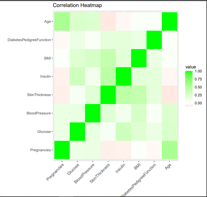
Here, first we are making a correlation matrix using cor function for all the columns except for Outcome (target) and then reshaping it to make it relevant for ggplot
- Next, using the correlation_data we are plotting the heatmap with negative variation in red color and positive variation in green color. Then we are giving title to plot as “Correlation Heatmap”) and making the labels as x axis to tilt by 45° to avoid overlap with other labels using theme function of ggplot.
- As it is evident from the plot, that red color shows negative correlation, white shows no correlation and green showing positive correlation. Different shades of colours are used to show different values of correlation, with dark shade of green showing a strong positive correlation and that of red showing strong negative correlation.
It can be concluded that the AGE variable and SkinThickness variable has a light negative correlation and BMI and SkinThickness variable has a positive correlation.
Scaling Data
Now, it is possible that some of the data points (features) may be too far away from others, so this might hamper the outputs and accuracy of our model, so it is important to scale the dataset to make every feature relevant for our model.
R
data_scaled <- scale(data[, -9])
head(data_scaled)
|
Output:
      Pregnancies    Glucose BloodPressure SkinThickness    Insulin        BMI
[1,]   0.6395305  0.8477713     0.1495433     0.9066791 -0.6924393  0.2038799
[2,]  -0.8443348 -1.1226647    -0.1604412     0.5305558 -0.6924393 -0.6839762
[3,]   1.2330766  1.9424580    -0.2637694    -1.2873733 -0.6924393 -1.1025370
[4,]  -0.8443348 -0.9975577    -0.1604412     0.1544326  0.1232213 -0.4937213
[5,]  -1.1411079  0.5037269    -1.5037073     0.9066791  0.7653372  1.4088275
[6,]   0.3427574 -0.1530851     0.2528715    -1.2873733 -0.6924393 -0.8108128
     DiabetesPedigreeFunction         Age
[1,]                0.4681869  1.42506672
[2,]               -0.3648230 -0.19054773
[3,]                0.6040037 -0.10551539
[4,]               -0.9201630 -1.04087112
[5,]                5.4813370 -0.02048305
[6,]               -0.8175458 -0.27558007
The data is scaled using scale function with columns upto Age (excluding Outcome) as Outcome attribute is a categorical variable (0 or 1). After scaling, the scaled_dataset’s first 6 rows are printed so as to have insights about the scaled dataset.
Building the model
Before actually starting to build the model, first we need to split the dataset into training and test set to train and build our model, using createDataPartition( ) function provided by caret package.
Splitting the dataset
R
set.seed(40)
index <- createDataPartition(data$Outcome, p = 0.85, list=FALSE)
train_data <- data_scaled[index, ]
test_data <- data_scaled[-index, ]
train_labels <- factor(data$Outcome[index], levels = c(0,1))
test_labels <- factor(data$Outcome[-index], levels = c(0,1))
|
Here, the the dataset is splitted between training and test set with a 85% of dataset as Train set and 15% as Test set and then they are assigned to train_data and test_data repectively. Then the labels of Outcome column (feature) of train set are assigned to train_labels, and test set are assigned to test_labels after being factored in the form (0,1).
Now we need to build the model using knn function provided byclass library.
R
for (i in 1:10){
cat("----------------- For k =", i, "-----------------\n")
k <- i
knn_model <- knn(train_data, test_data, train_labels, k=k)
confusion <- confusionMatrix(knn_model, test_labels)
confusion_table <- as.table(confusion)
accuracy <- confusion$overall["Accuracy"]
cat("Accuracy: ", accuracy, "\n")
incorrect_classified <- confusion_table[1, 2] + confusion_table[2, 1]
total <- sum(confusion_table)
error <- (incorrect_classified/total)*100
cat("The error rate is ", error, "%\n")
}
|
Output:
----------------- For k = 1 -----------------
Accuracy:  0.7130435
The error rate is  28.69565 %
----------------- For k = 2 -----------------
Accuracy:  0.7391304
The error rate is  26.08696 %
----------------- For k = 3 -----------------
Accuracy:  0.7478261
The error rate is  25.21739 %
----------------- For k = 4 -----------------
Accuracy:  0.773913
The error rate is  22.6087 %
----------------- For k = 5 -----------------
Accuracy:  0.7565217
The error rate is  24.34783 %
----------------- For k = 6 -----------------
Accuracy:  0.773913
The error rate is  22.6087 %
----------------- For k = 7 -----------------
Accuracy:  0.7652174
The error rate is  23.47826 %
----------------- For k = 8 -----------------
Accuracy:  0.7565217
The error rate is  24.34783 %
----------------- For k = 9 -----------------
Accuracy:  0.7391304
The error rate is  26.08696 %
----------------- For k = 10 -----------------
Accuracy:  0.7391304
The error rate is  26.08696 %
Here, we have initialized a for loop to traverse through all the values of k uptil 10, check for accuracy and error rate for the model.
- We are trying to train our model on different values of K and from the confusion matrix, we can calculate the accuracy and calculated error rate using the formula mentioned earlier.
- By doing this, we can get a value of K for which model is most accurate and have least error rate.
Now we take k value as 4 and again apply KNN algo on our model.
R
k <- 4
knn_model <- knn(train_data, test_data, train_labels, k=k)
confusion <- confusionMatrix(knn_model, test_labels)
confusion
|
Output:
Confusion Matrix and Statistics
          Reference
Prediction  0  1
         0 62 22
         1  6 25

               Accuracy : 0.7565
                 95% CI : (0.6677, 0.8317)
    No Information Rate : 0.5913
    P-Value [Acc > NIR] : 0.0001514

                  Kappa : 0.4683

 Mcnemar's Test P-Value : 0.0045864

            Sensitivity : 0.9118
            Specificity : 0.5319
         Pos Pred Value : 0.7381
         Neg Pred Value : 0.8065
             Prevalence : 0.5913
         Detection Rate : 0.5391
   Detection Prevalence : 0.7304
      Balanced Accuracy : 0.7218

       'Positive' Class : 0
Here, the confusion matrix also gave us the accuracy score of our model. More the accuracy score, better is our model
- Here, first we have set the value of k as 4 and proceeded with training of model. Here, 4 parameters are given to the knn function.
- This training model is passed on to a variable knn_model which is then used to evaluate the confusion matrix. Then the confusionMatrix function is given two parameters.
Now we need to find the error rate of our model
Finding Error rates
R
confusion_table <- as.table(confusion)
print("Confusion Table:")
confusion_table
incorrect_classified <- confusion_table[1, 2] + confusion_table[2, 1]
total <- sum(confusion_table)
error <- (incorrect_classified/total)*100
cat("The error rate is ", error, "%")
|
Output:
[1] "Confusion Table:"
Prediction  0  1
         0 62 22
         1  6 25
The error rate is  24.34783 %
First, we have fetched confusion table from the confusionMatrix function using as.table( ) function which converts the matrix into table and printing it.
Then we are assessing the sum of incorrect predictions made by our model (the False Positive and False Negative) by adding value in False Positive column and False Negative column located at [1,2] and [2,1] index respectively, in terms of a 2-Dimensional Matrix.
The we are calculating the error by divinding the incorrect values predicted by model with the total predictions and multiplying it by 100 to get rate.
Share your thoughts in the comments
Please Login to comment...