Power BI – Smart Narratives
Last Updated :
04 Nov, 2023
In this article, we will learn to implement Smart Narratives using Power BI. This discusses some important concepts used to create the very common smart narratives so as to make large business intelligence decisions made out of analyzing data trends in the form of text which is easy to understand and narrate. We will be discussing the following topics and their implementation in the Power BI desktop.
Smart Narratives
Smart narratives are textual summaries or data-driven storytellers of any report or group of charts for easy analysis of some data trends. It’s based on all of the visuals on the page.
- It gives a quick text summary of visuals and export.
- It also gives innovative customizable insights.
- It addresses key takeaways and provides data trends, and invisible insights formatting for a specific type of audience.
- It gets refreshed with every update and access.
When to use Smart Narratives
- To customize the text summary by adding the user’s own insights with dynamic values.
- Smart narratives are outcomes of AI that can map text to some fields
- To use natural language to define a new measure for a text-based summary.
- To add textual easy to read and understand information to any data or report.
- To add calculations without using DAX.
- To show values as current, specify decimal places and include separators for big numbers like thousands.
- To use previously defined values and save them for regular usage.
Features
Some of the features ar eself explanatory from the above information
- A hidden-summary symbol appears indicating that current data and filters produce no result for the value. They are visible while editing some text summary. It gets updated after editing is done.
- A summary output is always empty when no data insights are available.
- A summary is dynamic which is automatically generated once the user corss filters any datapoint.
- Smart narrative provides advance filtering and can generate upto four summaries per visual and upto 16 per page. It automatically avoids repeated type of summaries for different visuals.
Pre-requisite
You can refer to Power BI interactive dashboards for easy implementation of the following charts. We have already seen so many articles for creating different type of charts. Here we will be showing examples of smart narratives on ready made visuals. For creation , refer to already existing articles of Power BI charts. Let us understand from the following steps.
DataSet used
The dataset used is “SaleData.xlsx“. Upload the dataset in Power BI and refer to the dataset to follow along with the below-given sections of the article.
.webp)
A general idea about the fields or columns of the above dataset can be taken by having a look into it.
Load Data in the Desktop
Open Power BI Desktop
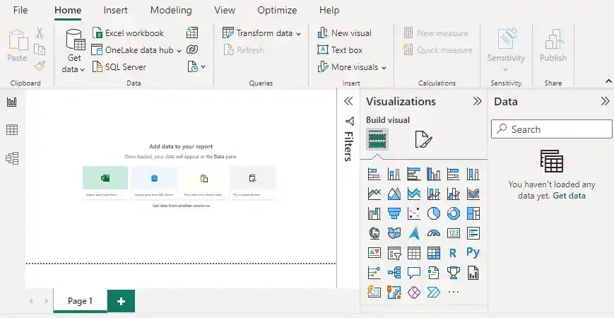
Click the “Get Data” option and select “Excel” for data source selection and extraction.
.webp)
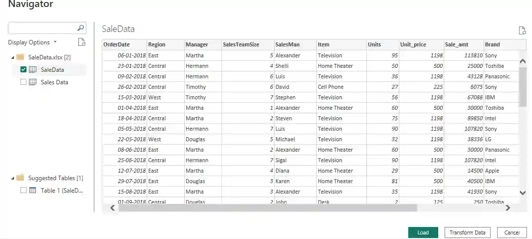
Select the relevant desired file from the folder for data load. In this case, the file is “SaleData.xls”. click the “Load” button once the preview is shown for the Excel data file.
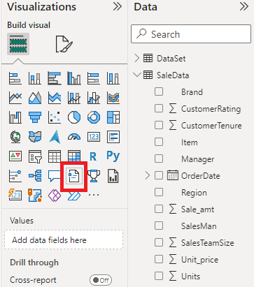
The dashboard is seen once the file is loaded with the “Visualizations” Pane and “Data fields” Pane which stores the different variables of the data file. Drag the red-colored square box to the main canvas where you want to show smart narratives for any particular visual or report or page.
The “SaleData.xls” dataset which is used for creating some reports or charts look like the following.
In the “Visualizations” pane, we can select the chart type or group of charts needed for our visual representation of business data. They can be dragged for the “Report” view for further process. We have already seen many Power BI chart types and its implementations. Further we will be showing the use of smart narratives in any of the already existing report view.
Smart narrative for a visual
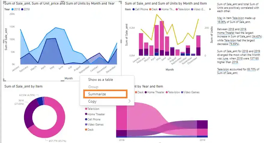
- Right-click the visual and select “Summarize” button.
- You can pin the summary to the report page.
Example 1
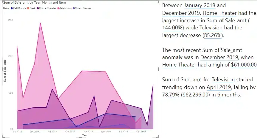
In the following example, consider the area chart for the above dataset showing sum of Sale_amt based on month and year and Items. The legends uses different item names for which the area chart is shown . When the smart narrative icon is dragged from the visual pane to report pane, the following output result is seen for quick analysis.
The following example shows Smart narrative for a visual. The following ouput shows that between the tipe period of Jan 2018 and Dec 2019, home theatre had the largest increase in sum of Sale_amt while television had the largest decrease. Sum of Sale_amt for television started trending downwards on April 2019 falling by 78.79% in 6 months.
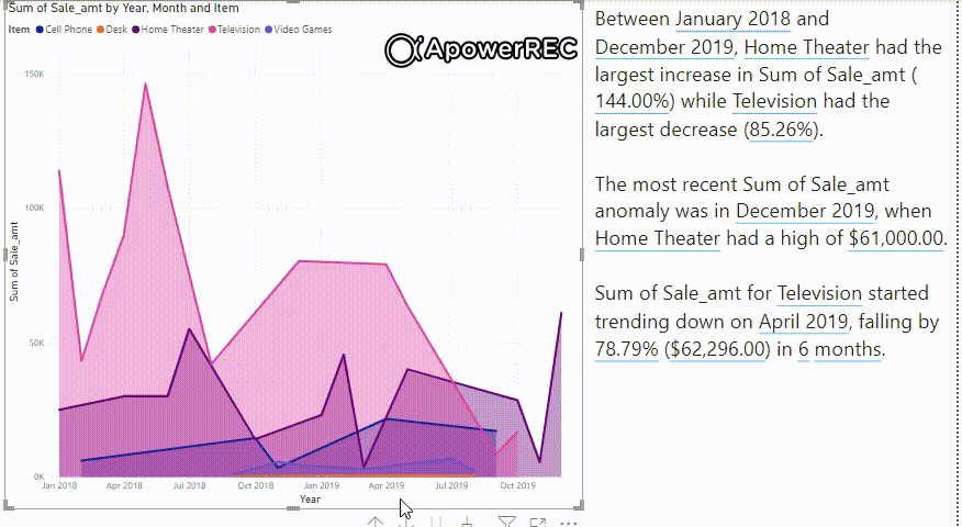
Video Output:
Smart narrative for a page
A smart narrative that’s based on all of the visuals on the page.
Example 2
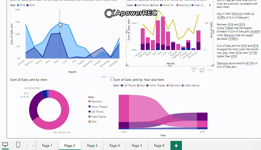
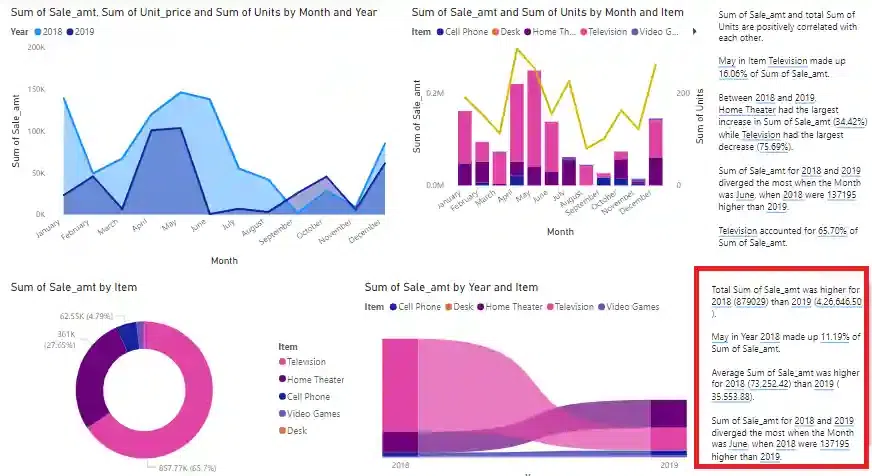
The same can be applied for a group of charts which creates a report dashboard showing various insights. Consider the following where different charts are shown like area chart, column chart, pie and ribbon charts. The implementation can be referred from the previous articles of Power BI. The insights for Sum of “Sale_amt” is shown taking different parameters like units, unit_price, month, year, item in various ways.
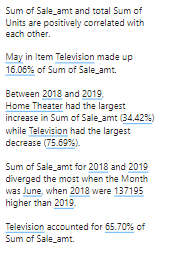
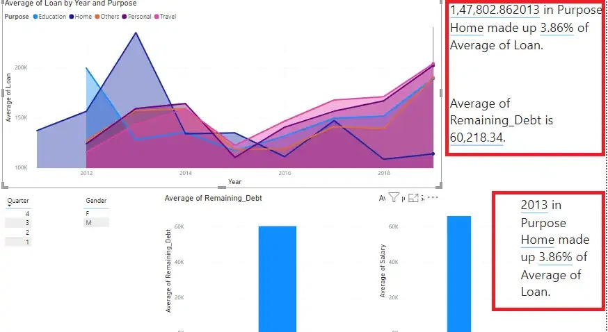
The red-colored box represents the smart narrative showing text insights for reports. The following example shows Smart narrative for a page. This narrative is based on all the visuals of the page. Sum of Sale_amt and total Sum of units are positively correlated with each other. Between 2018 and 1019. home theatre had the largest increase in sum of sale_amt and televison had the largest decrease as we can notice it in the ribbon chart visual. It even calculates the growth (sum of Sale_amt) of Televsion for 65.70%.
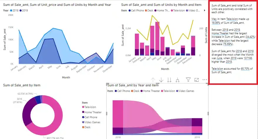
The red-colored box is smart narrative of the left hand side report
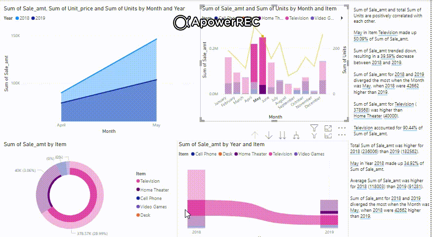
Video output: Keep hovering over different charts and change the datapoints for seeing the results in detail. The smart narrative changes dynamically once the user access some datapoints. It shows no summaries for empty information or charts for which there is not output produced.
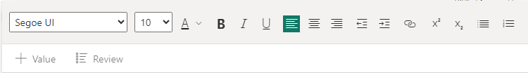
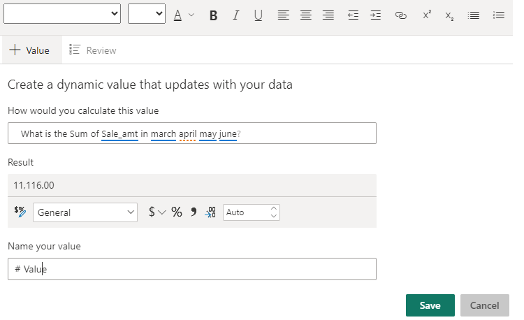
Edit box: For any editing inside the smart narative, if the user clicks on some text, the following edit box pops up for any changes or setting own values and store it for future use.
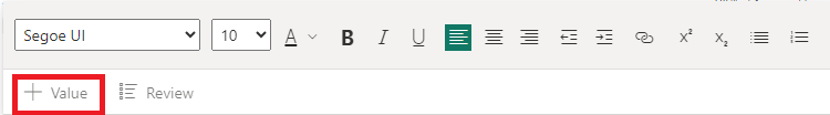
Dynamic value: For changing some value dynamically, click the following button in the above “Edit box”.
The smart narrative tool has AI feature to handle Q&A (questions and answers ) feature to provide some result as value based on the charts and dataset. This value can be stored and used later or the user can create some dynamic values also. Keep playing around to see different results and its usages.
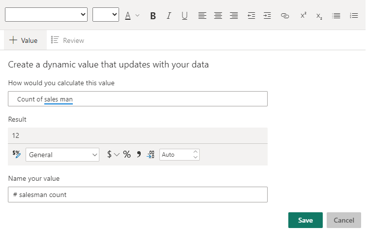
Set value dynamically:
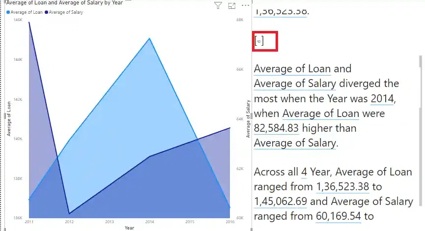
Hidden summary: In the “Features” section of this article, we have mentioned “hidden summary”, the following red icon shows the hidden summary in any text summary output.
After doing some editing to the smart narrative, the user can see many different results with convenient fonts and boldness.
The smart narrative tool can also be created by right click on any chart or visual and using the following “Summarize” button. This is another way of using the feature.
Another Smart narrative:
Video output:
Conclusion
The Smart Narrative visualization helps the users to quickly summarize relevant visuals and reports by also giving out intelligent out-of-the-box insights that are also customizable.
Share your thoughts in the comments
Please Login to comment...