Plotting of Data using Generic plots in R Programming – plot() Function
Last Updated :
19 Dec, 2023
In this article, we will discuss how we plot data using Generic plots in R Programming Language using plot() Function.
plot function
plot() function in R Programming Language is defined as a generic function for plotting. It can be used to create basic graphs of a different type.
Syntax: plot(x, y, type)
Parameters
- x and y: coordinates of points to plot
- type: the type of graph to create
Returns: different type of plots
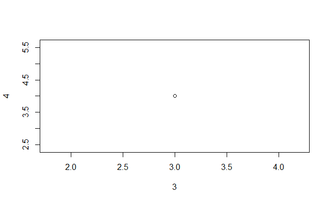
Draw Points using plot() Function in R
Output:
plot() Function in R
R
plot(c(1, 3, 4), c(4, 5 , 8))
|
Output:

plot() Function in R
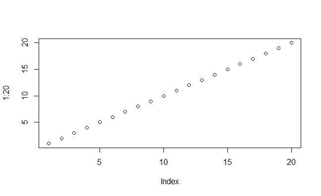
Draw Sequences of Points
Output:
plot() Function in R
R program to plot a graph
R
x <- 1:5
y <- x * x
plot(x, y, type = "l", col = "blue", lwd = 2, xlab = "X-axis",
ylab = "Y-axis", main = "Quadratic Function")
grid()
points(x, y, col = "red", pch = 16)
legend("topleft", legend = "y = x^2", col = "blue", lty = 1, lwd = 2, pch = 16)
|
Output:

plot() Function in R
In this code we creates a line plot with labeled axes, a title, grid lines, and additional points.
col: Specifies the color of the line,lwd: Sets the line width,xlab and ylab: Label the x-axis and y-axis, respectively.main: Adds a title to the plot,grid(): Adds grid lines to the plot,points(): Adds points to the plot to highlight the data.legend(): Adds a legend to the plot.
R program to Customize graph
R
x <- 1:5
y <- x * x
plot(x, y, type = "b", col = "blue", pch = 16, lty = 2,
main = "Quadratic Function", xlab = "X-axis", ylab = "Y-axis")
grid()
points(x, y, col = "red", pch = 16)
legend("topleft", legend = "y = x^2", col = "blue", pch = 16, lty = 2)
title(main = "Quadratic Function", sub = "y = x^2", col.main = "blue",
col.sub = "red", font.main = 4, cex.main = 1.2, cex.sub = 0.8)
|
Output:

plot() Function in R
In this code we creates a quadratic function plot with blue points connected by dashed lines. It includes a title, axis labels, grid lines, red-highlighted data points, and a legend indicating the equation 2y=x2. The main title and subtitle have custom colors and font styles for improved visualization.
Multiple Plots In R
R
x <- 1:5
y1 <- x * x
y2 <- 2 * x
y3 <- x^2 - 3
par(mfrow = c(2, 2))
plot(x, y1, type = "b", col = "blue", pch = 16,
main = "Plot 1", xlab = "X-axis", ylab = "Y-axis")
plot(x, y2, type = "o", col = "green", pch = 17,
main = "Plot 2", xlab = "X-axis", ylab = "Y-axis")
plot(x, y3, type = "l", col = "red", lty = 2,
main = "Plot 3", xlab = "X-axis", ylab = "Y-axis")
par(mfrow = c(1, 1))
|
Output:

plot() Function in R
par(mfrow = c(2, 2)) is like setting up a grid of 2 rows and 2 columns for your plots. This means we can create four plots, and they will be arranged in a 2×2 grid.
- Each time we use the
plot function after setting up the grid, it adds a new plot to one of the grid positions. Each plot can have different data and visual styles.
- This ensures that any future plots you make won’t be constrained to the grid; they’ll be displayed as standalone plots.
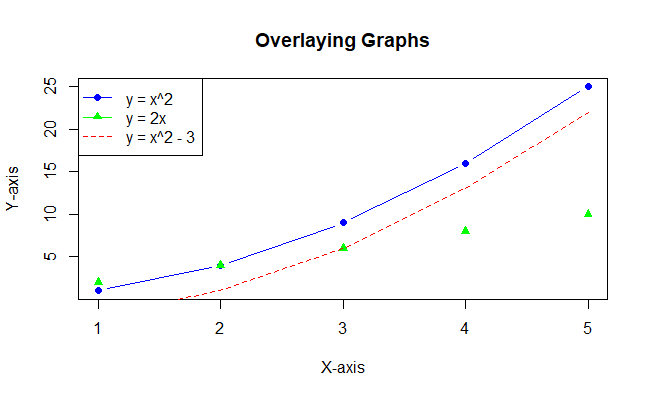
Overlaying Graphs using plot function
R
x <- 1:5
y1 <- x * x
y2 <- 2 * x
y3 <- x^2 - 3
plot(x, y1, type = "b", col = "blue", pch = 16, main = "Overlaying Graphs",
xlab = "X-axis", ylab = "Y-axis")
points(x, y2, col = "green", pch = 17)
lines(x, y3, col = "red", lty = 2)
legend("topleft", legend = c("y = x^2", "y = 2x", "y = x^2 - 3"),
col = c("blue", "green", "red"), pch = c(16, 17, NA), lty = c(1, 1, 2))
|
Output:
plot() Function in R
In this example the plot function is used to create the first graph. the points function overlays points from the second graph on the existing plot.
The lines function overlays a line from the third graph on the existing plot. legend adds a legend to distinguish between different datasets.
Share your thoughts in the comments
Please Login to comment...