Area Line Plot
Last Updated :
09 Nov, 2023
Area line plots are an effective tool in the data visualization toolbox for illustrating relationships and trends across time. They provide a comprehensive and visually captivating method of presenting numerical data by expertly combining the readability of line charts with the eye-catching attractiveness of filled areas.
In this article, we will learn more about creating an area line chart in Python. As Area line plots offer a valuable tool for data visualization, providing a clear and engaging way to convey trends and relationships over time.
What is an Area Line Plot?
An Area Line Plot, also known as an Area Chart or Stacked Area Chart, is a data visualization technique that is used to represent data over time or across categories. It is an extension of the basic line chart and is particularly useful when you want to show the composition of a whole, along with the individual components, as well as how they change over time or across categories. In this article, we will explore how to create area line plots in Python using the matplotlib library and explain their significance in visualizing data.
Here are the key components and characteristics of an Area Line Plot.
X-Axis: The horizontal axis represents the independent variable, typically time or categories. It is a continuous or categorical scale that provides context for the data points.
Y-Axis: The vertical axis represents the dependent variable, usually a numeric value that measures the quantity or magnitude of what you are visualizing.
Lines: The individual lines in an area line plot represent different categories, groups, or components. Each line starts at the baseline (usually the X-axis) and goes up to show the value of that category or component at a particular point in time or along the category axis.
Area Filling: The area between the line and the baseline is filled with colour to make it visually distinct. The area’s colour is often used to represent the category or component it represents.
Stacking: In a stacked area chart, each line is stacked on top of the previous one. This stacking illustrates how the total changes over time or across categories, as well as the contribution of each category to the whole.
Creating an Area Line Plot
First, let’s make a basic area line plot using Python. To create the plot and show how various categories change over time, we will use Matplotlib.
Python3
import pandas as pd
import matplotlib.pyplot as plt
df = pd.DataFrame({
'x': list(range(1, 11)),
'y': [1, 3, 2, 4, 5, 7, 6, 8, 9, 10]
})
plt.fill_between(df['x'], df['y'], color='blue', alpha=0.2)
plt.plot(df['x'], df['y'], color='red', alpha=0.5, linewidth=0.9)
plt.title("Area Line Plot")
plt.xlabel("X-axis")
plt.ylabel("Y-axis")
plt.show()
|
Output:
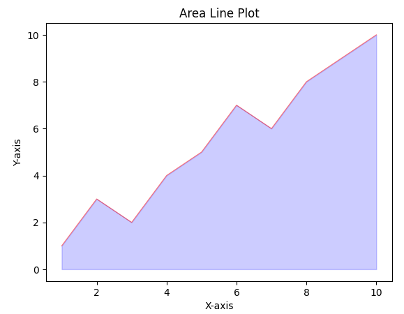
Area line Plot
Area Line Plot with markers and Labels
Add some more function to make it attractive
- Import necessary libraries: pandas for data manipulation and matplotlib.pyplot for data visualization.
- Prepare sample data: Create a DataFrame with columns for ‘x’ and ‘y’ containing numerical values.
- Generate area line plot: Use plt.fill_between() to create a semi-transparent blue area line plot and plt.plot() to create a faint red line.
- Enhance plot with markers and labels: Add red circular markers (s=30) at data points using plt.scatter(). Add black labels above each data point using plt.text(), positioning them horizontally centered (ha=’center’) and vertically aligned at the bottom (va=’bottom’). Customize axes, add title, and display the plot.
Python3
import pandas as pd
import matplotlib.pyplot as plt
df = pd.DataFrame({
'x': list(range(1, 11)),
'y': [1, 3, 2, 4, 5, 7, 6, 8, 9, 10]
})
plt.fill_between(df['x'], df['y'], color='blue', alpha=0.5)
plt.plot(df['x'], df['y'], color='red', alpha=0.1)
plt.scatter(df['x'], df['y'], color='red', s=30)
for i, row in df.iterrows():
plt.text(row['x'], row['y'], str(row['y']), ha='center', va='bottom', color='black', size=10)
plt.title("Area Line Plot with Markers and Labels")
plt.xlabel("X-axis")
plt.ylabel("Y-axis")
plt.show()
|
Output:
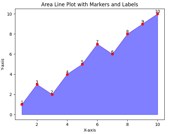
Area Line Plot
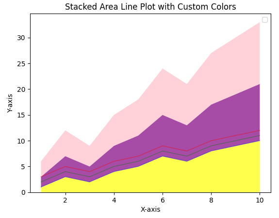
Stacked Area Line Plot
- Import necessary libraries: pandas for data manipulation and matplotlib.pyplot for data visualization.
- Prepare sample data: Create a DataFrame with columns for ‘x’, ‘Category A’, ‘Category B’, and ‘Category C’ containing numerical values.
- Define custom colors: Define a list of colors (‘yellow’, ‘purple’, ‘pink’) to be used for each category.
- Generate stacked area line plot: Use plt.stackplot() to create a stacked area line plot with the defined colors and transparency. Additionally, plot individual lines for each category with different colors, linewidths, and transparency. Add labels, customize axes, and display the plot.
Python3
import pandas as pd
import matplotlib.pyplot as plt
df = pd.DataFrame({
'x': list(range(1, 11)),
'Category A': [1, 3, 2, 4, 5, 7, 6, 8, 9, 10],
'Category B': [2, 4, 3, 5, 6, 8, 7, 9, 10, 11],
'Category C': [3, 5, 4, 6, 7, 9, 8, 10, 11, 12]
})
colors = ['yellow', 'purple', 'pink']
plt.stackplot(df['x'], df['Category A'], df['Category B'], df['Category C'], colors=colors, alpha=0.7)
plt.plot(df['x'], df['Category A'], color='blue', alpha=0.5, linewidth=0.9)
plt.plot(df['x'], df['Category B'], color='green', alpha=0.5, linewidth=0.9)
plt.plot(df['x'], df['Category C'], color='red', alpha=0.5, linewidth=0.9)
plt.title("Stacked Area Line Plot with Custom Colors")
plt.xlabel("X-axis")
plt.ylabel("Y-axis")
plt.legend()
plt.show()
|
Output:
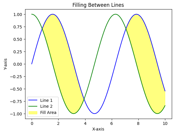
Filling between lines
- Import necessary libraries: matplotlib.pyplot for data visualization and numpy for numerical operations.
- Prepare sample data: Generate x-axis values using np.linspace and calculate corresponding y-values using sin and cos functions.
- Create plot elements: Create a figure and axis using plt.subplots() and plot two lines using ax.plot() with different colors and labels.
- Fill between lines: Use ax.fill_between() to fill the area between the lines with a specific color and transparency, applying conditions and interpolation. Add labels, customize axes, and display the plot.
Python3
import matplotlib.pyplot as plt
import numpy as np
x = np.linspace(0, 10, 100)
y1 = np.sin(x)
y2 = np.cos(x)
fig, ax = plt.subplots()
ax.plot(x, y1, label='Line 1', color='blue')
ax.plot(x, y2, label='Line 2', color='green')
ax.fill_between(x, y1, y2, where=(y1 > y2), interpolate=True, alpha=0.5, color='yellow', label='Fill Area')
ax.set_xlabel('X-axis')
ax.set_ylabel('Y-axis')
ax.set_title('Filling Between Lines')
ax.legend()
plt.show()
|
Output:
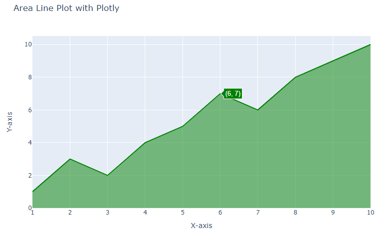
Area Line plot with Plotly
- Import essential libraries: Plotly Express for creating charts and Pandas for data manipulation.
- Prepare sample data: Create a DataFrame with ‘x’ and ‘y’ columns containing integer values.
- Generate area line plot: Use px.area() to create an area line plot with fill-to-zero, linear line shape, and green line color.
- Customize layout: Add title, axis labels, and hide legend using update_layout().
Python3
import plotly.graph_objects as go
import pandas as pd
df = pd.DataFrame({
'x': list(range(1, 11)),
'y': [1, 3, 2, 4, 5, 7, 6, 8, 9, 10]
})
fig = go.Figure(data=go.Scatter(x=df['x'], y=df['y'], fill='tozeroy', mode='lines', line=dict(color='green')))
fig.update_layout(
title="Area Line Plot with Plotly",
xaxis_title="X-axis",
yaxis_title="Y-axis",
showlegend=False
)
fig.show()
|
Output:
Conclusion
In summary, area line plots are effective for displaying trends, comparisons, and part-to-whole relationships in data over time or across categories. They provide a visually compelling way to understand how different components contribute to the whole and how these contributions change over the chosen axis (time or categories).
Share your thoughts in the comments
Please Login to comment...