Make Violinplot with data points using Seaborn
Last Updated :
17 Nov, 2022
A violin plot plays a similar activity that is pursued through whisker or box plot do. As it shows several quantitative data across one or more categorical variables. It can be an effective and attractive way to show multiple data at several units. A “wide-form” Data Frame helps to maintain each numeric column which can be plotted on the graph. It is possible to use NumPy or Python objects, but pandas objects are preferable because the associated names will be used to annotate the axes.
In this article, we will see how to make Violinplot and plot data points.
Method 1#: Using Inner attributes of violinplot
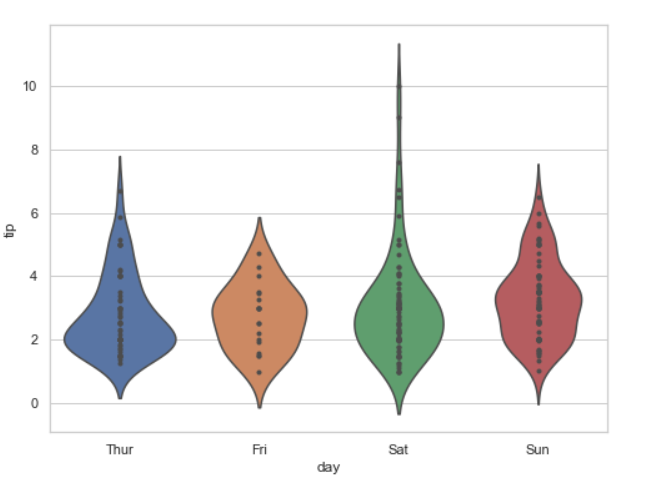
Example 1: Creating violinplot and use inner attributes. Inner Representation of the datapoints in the violin interior, If point or stick, show each underlying datapoint.
Syntax: seaborn.violinplot( x, y, data, inner = “points”)
Python3
import seaborn
seaborn.set(style = 'whitegrid')
tip = seaborn.load_dataset('tips')
plt.figure(figsize=(4,7))
seaborn.violinplot(x ='day', y ='tip',
data = tip,
inner="points")
|
Output:
Example 2:
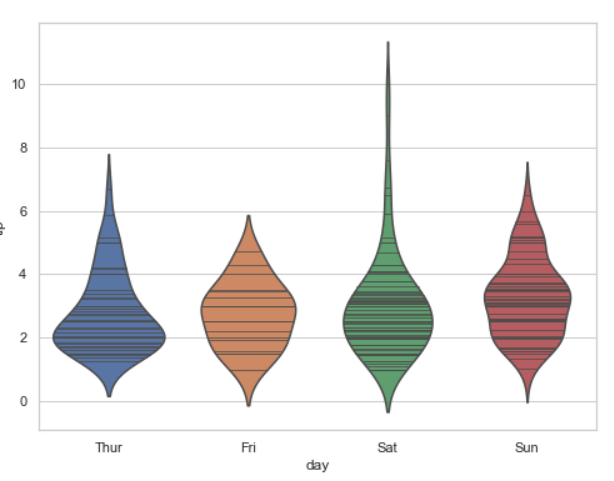
We see the above implementation, let’s do the same thing for the “stick”. This option show data as lines on violin plot.
Python3
import seaborn
seaborn.set(style = 'whitegrid')
tip = seaborn.load_dataset('tips')
plt.figure(figsize=(4,7))
seaborn.violinplot(x ='day', y ='tip',
data = tip,
inner="stick")
|
Output:
Example 3:
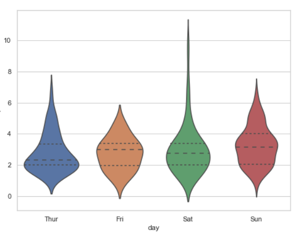
Using quartile draw the quartiles of the distribution.
Python3
import seaborn
seaborn.set(style = 'whitegrid')
tip = seaborn.load_dataset('tips')
plt.figure(figsize=(4,7))
seaborn.violinplot(x ='day', y ='tip',
data = tip,
inner="quartile")
|
Output:
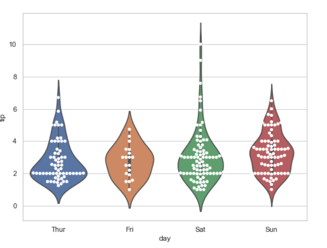
Method 2#: Using swarmplot().
Using swarmplot we can show the data point inside in a violinplot.
Python3
import seaborn
seaborn.set(style = 'whitegrid')
tip = seaborn.load_dataset('tips')
plt.figure(figsize=(4,7))
seaborn.violinplot(x ='day', y ='tip', data = tip)
seaborn.swarmplot(x ='day', y ='tip', data = tip,color= "white")
|
Output:
Share your thoughts in the comments
Please Login to comment...