Introduction to 3D Plotting with Matplotlib
Last Updated :
20 Feb, 2023
In this article, we will be learning about 3D plotting with Matplotlib. There are various ways through which we can create a 3D plot using matplotlib such as creating an empty canvas and adding axes to it where you define the projection as a 3D projection, Matplotlib.pyplot.gca(), etc.
Creating an Empty 3D Plot:
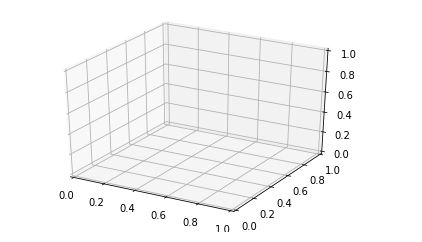
In the below code, we will be creating an empty canvas at first. After that, we will be defining the axes of our 3D plot where we define that the projection of the plot will be in “3D” format. This helps us to create the 3D empty axes figure in the canvas. After this, if we show the plot using plt.show(), then it would look like the one shown in the output.
Example: Creating an empty 3D figure using Matplotlib
Python3
import numpy as np
import matplotlib.pyplot as plt
fig = plt.figure()
ax = plt.axes(projection="3d")
plt.show()
|
Output:
Now, we have a basic idea about how to create a 3D plot on an empty canvas. Let us move to some 3D plotting examples.
Examples of 3D plotting:
Example 1:
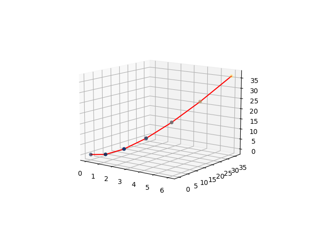
In the below example, we will be taking a simple curve in our 3D plot. Along with that, we will be plotting a range of points that have X-coordinate, Y-coordinate as well as Z-coordinate.
Python3
import numpy as np
import matplotlib.pyplot as plt
from mpl_toolkits import mplot3d
fig = plt.figure()
ax = plt.axes(projection="3d")
x=[0,1,2,3,4,5,6]
y=[0,1,4,9,16,25,36]
z=[0,1,4,9,16,25,36]
ax.plot3D(x, y, z, 'red')
ax.scatter3D(x, y, z, c=z, cmap='cividis');
plt.show()
|
Output:
Explanation:
- In the above example, first, we are importing packages from the python library in order to have a 3D plot in our empty canvas. So, for that, we are importing numpy, matplotlib.pyplot, and mpl_toolkits.
- After importing all the necessary packages, we are creating an empty figure using plt.figure().
- After that, we are defining the axis of the plot where we are specifying that the plot will be of 3D projection.
- After that, we are taking 3 arrays with a wide range of arbitrary points which will act as X, Y, and Z coordinates for plotting the graph respectively. Now after initializing the points, we are plotting a 3D plot using ax.plot3D() where we are using x,y,z as the X, Y, and Z coordinates respectively and the color of the line will be red.
- All these things are sent as parameters inside the bracket.
- After that, we are also plotting a scatter plot with the same set of values and as we progress with each point, the color of the points will be based on the values that the coordinates contain.
- After this, we are showing the above plot.
Example 2:
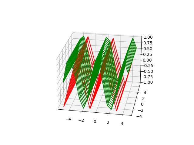
In this example, we will be learning about how to do 3D plotting using figure.gca(). Here we will be creating a sine curve and a cosine curve with the values of x and y ranging from -5 to 5 with a gap of 1. Let us look at the code to understand the implementation.
Python3
import matplotlib.pyplot as plt
import numpy as np
x = np.arange(-5,5,1)
y = np.arange(-5,5,1)
x1= np.arange(-5,5,0.6)
y1= np.arange(-5,5,0.6)
x, y = np.meshgrid(x, y)
x1,y1= np.meshgrid(x1,y1)
z = np.sin(x * np.pi/2 )
z1= np.cos(x1* np.pi/2)
fig = plt.figure()
ax = fig.gca(projection="3d")
surf = ax.plot_wireframe(x, y, z, color="red")
surf1 =ax.plot_wireframe(x1, y1, z1, color="green")
plt.show()
|
Output:
Explanation:
- In this example, we are importing two packages matplotlib.pyplot and NumPy from python.
- After that, we are creating a wide range of values with various variables such as x, y,x1,x2. Now there is a catch over here. The first set of x,y have values from -5 to 5 with each of the elements having a difference of 1 from each other. The second set of elements also ranges from -5 to 5 with each element having a difference of 0.6 from each other. The difference that it creates is, the first graph will have steep curves since the difference between the points is more, whereas, in the second set, the graph will be smoother as compared to the first one because we are taking a wide range of points more than x and y. That’s why the second curve(cosine curve) is smoother than the first curve.
- Using meshgrid, we are returning coordinate matrices from coordinate vectors. MeshGrid makes N-D coordinate arrays for vectorized evaluations of N-D scalar/vector fields over N-D grids, where there is a 1-Dimensional array. Now, we are creating the sine and the cosine curves with the help of z and z1 respectively.
- After that, we are creating an empty figure where we will be plotting out 3D plot. Using fig.gca, we are defining that the plots that we are going to make will be of 3D projection using projection=’3d’. Using plot_wireframe we are creating a 3D sine and cosine curve(of different colors) with the above points created by us. Finally, we are showing the above plot.
Example 3:
In the last and the final example, we will be creating two 3D graphs in a single figure/canvas, where we will be our 3D points. So let us move into our code implementation.
Python3
import matplotlib.pyplot as plt
import numpy as np
fig = plt.figure()
ax = fig.add_subplot(1, 2, 1, projection='3d')
X = np.arange(12)
Y = np.linspace(12, 1)
X, Y = np.meshgrid(X, Y)
Z = X*2+Y*3;
ax.plot_wireframe(X, Y, Z)
ax = fig.add_subplot(1, 2, 2, projection='3d')
X1 = [1,2,1,4,3,2,7,5,9]
Y1 = [8,2,7,4,3,6,1,8,9]
Z1 = [1,2,4,7,9,6,7,6,9]
ax.plot(X1, Y1, Z1,color='green')
plt.show()
|
Output:
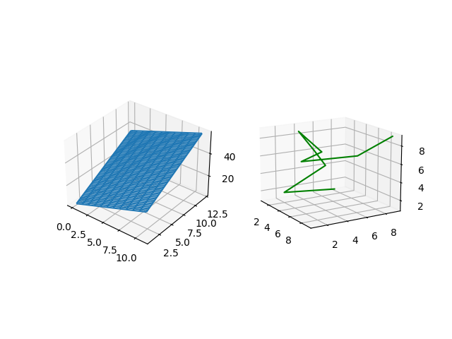
Explanation:
- In the above example, we will be working with 2 3D graphs. So for that, we will be creating two subplots in a single canvas or figure. In the code, we have initialized the packages matplotlib.pyplot, and NumPy from python as usual.
- Then we are creating an empty figure where two 3D plots will be plotted. Now we are creating the first subplot.
- After that, we are taking X, Y which contain a series of points, and with them, we are creating a meshgrid which is made up of two 1D dimensional arrays and is used for matrix indexing to create an nD array.
- Then, using the values of X and Y, we are creating Z by forming an expression. Using plot_wireframe we are plotting the points in the 3D axis.
- After that, we move to the second plot, where we define the 2nd subplot parameters.
- Then, we are creating a wide range of elements and storing them in the form of arrays in X1, Y1, and Z1.
- After that, we are plotting the graph with the above points, and later we are showing the figure containing the 2 3D graphs.
Key 3D Plots using Matplotlib:
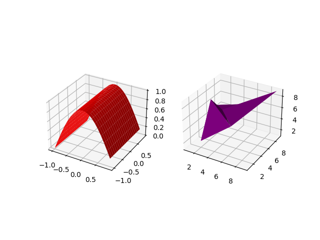
Surface Plot and Tri-surface plots
Here we will look at how to create a surface plot and a tri-surface plot. Here, we are integrating both the plots into a single figure so that we can understand the concept of subplots along with that of plots for a wide range of points to be plotted. So let us move to the implementation of the concept. Unlike wireframe plots, these plot’s surfaces will be filled with color.
Example:
Python3
import matplotlib.pyplot as plt
import numpy as np
fig = plt.figure()
ax = fig.add_subplot(1, 2, 1, projection='3d')
x1= np.arange(-1,1,0.1)
y1= np.arange(-1,1,0.1)
x1,y1= np.meshgrid(x1,y1)
z1= np.cos(x1* np.pi/2)
ax.plot_surface(x1, y1, z1, color="red")
ax = fig.add_subplot(1, 2, 2, projection='3d')
X1 = [1,2,1,4,3,2,7,5,9]
Y1 = [8,2,7,4,3,6,1,8,9]
Z1 = [1,2,4,7,9,6,7,6,9]
ax.plot_trisurf(X1, Y1, Z1,color='purple')
plt.show()
|
Output:
Explanation:
- After importing all the necessary packages(numpy,matplotlib.pyplot), we are creating an empty figure using plt.figure(), we are adding subplots to the above figure where we are taking 1,2,1 as parameters along with the projection as 3D. This enables us to create a plot of 1×2 size, and we define it as the first plot.
- Then we are creating a wide range of values from -1 to 1, evenly spaced with a difference of 0.1and storing them in x1 and y1.
- Then, using meshgrid, we are creating an nD array for both x1 and y1.
- Using the values of x1 we are creating a cosine curve and storing the set of values in z1.
- With the help of ax.plot_surface(), we are plotting a surface plot defining x1,y1, and z1 points along with the color of the surface plot as red.
- After that, we are defining the second plot with the same size i.e 1×2, and defining it as the second plot. We are using variables X1, Y1, and Z1 to create a set of points and store them in these lists.
- Using ax.plot_trisurf() we are defining the points of X1, Y1, and Z1 and the color of the graph as purple. Finally, we are showing the above plot.
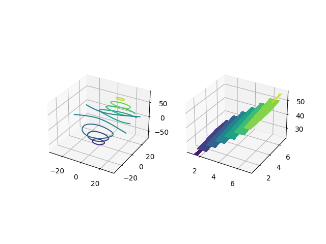
Contour plots and Filled Contour plots
Here, we will be looking at contour and filled contour plots. Since both the plots are similar type, we are using a subplot again for plotting the points. Contour plot is a way of showing a 3D graph by plotting constant z-slices. Filled contour fills the areas that were shown by the line in contour plots.
Python3
from mpl_toolkits.mplot3d import axes3d
import matplotlib.pyplot as plt
import numpy as np
fig = plt.figure()
ax = fig.add_subplot(1,2,1, projection='3d')
X, Y, Z = axes3d.get_test_data(0.07)
plot = ax.contour(X, Y, Z)
ax=fig.add_subplot(1,2,2,projection='3d')
X1=[1,2,3,4,5,6,7]
Y1=[1,2,3,4,5,6,7]
X1, Y1 = np.meshgrid(X1,Y1)
Z1=(X1+4)*5+(Y1-5)/2
plot2 = ax.contourf(X1, Y1, Z1)
plt.show()
|
Output:
Explanation:
- The first step is to import all the necessary packages for plotting the above plot. Apart from matplotlib.pyplot and NumPy, we are importing another package which is mpl_toolkits.mplot3d.
- After that, we are creating an empty figure where we will have our 2 3D subplots.
- After that, we are adding the first subplot of the size 1×2 and define the first subplot.
- After that, we use 3 variables and with the help of get_test_data we are creating an automated meshgrid that will help us to plot the points in the plot. Using ax.contour(X,Y,Z) we are creating a contour plot with the following range of values.
- After that, we define the 2nd plot of the same size. A filled contour plot does not require a meshgrid. It can be created with a simple range of values in X1, Y1, Z1. Z1 is formed with the help of an expression created using X1 and Y1. Using ax.contourf(X1,Y1,Z1) we are plotting a filled contour plot.
- In the end, we are showing the above figure with 2 subplots.
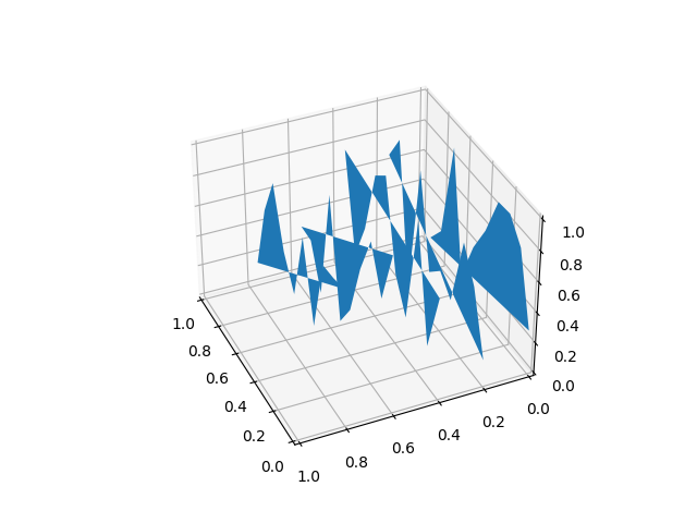
Polygon plots
Here, we will be exploring a polygon plot. This plot is different from the ones that were plotted in the earlier examples. In this plot, we will be plotting a continuous set of points at different axes points of z. Let’s move to the implementation.
Example:
Python3
from mpl_toolkits.mplot3d import Axes3D
from matplotlib.collections import PolyCollection
import matplotlib.pyplot as plt
import numpy as np
fig = plt.figure()
ax = fig.gca(projection='3d')
xs = np.arange(0, 1, 0.1)
verts = []
zs = [0.0, 0.2, 0.4, 0.6,0.8]
for z in zs:
ys = np.random.rand(len(xs))
verts.append(list(zip(xs, ys)))
poly = PolyCollection(verts)
ax.add_collection3d(poly,zs=zs,zdir='y')
plt.show()
|
Output:
Explanation:
- In this example, we need to import 4 different packages to create this plot(Numpy, matplotlib.pyplot, polycollection,Axes3d).
- After that, we will be creating an empty figure where we will plot the above graph. Using arange and a series of some of the arbitrary values we are creating a list of values in x and z.now we are loopinf through z where for each value of z we are getting a random list of numbers for y of the same length as that of x.
- Now for each z, we are plotting x vs y along the line. Using PolyCollection , we are taking all the plots together with the same color in each of the plot. With the help of add_collection3d we are determining that the plot is to be plotted in the x-z axis and also defining zs=0.
- Finally, we are showing the above plot.
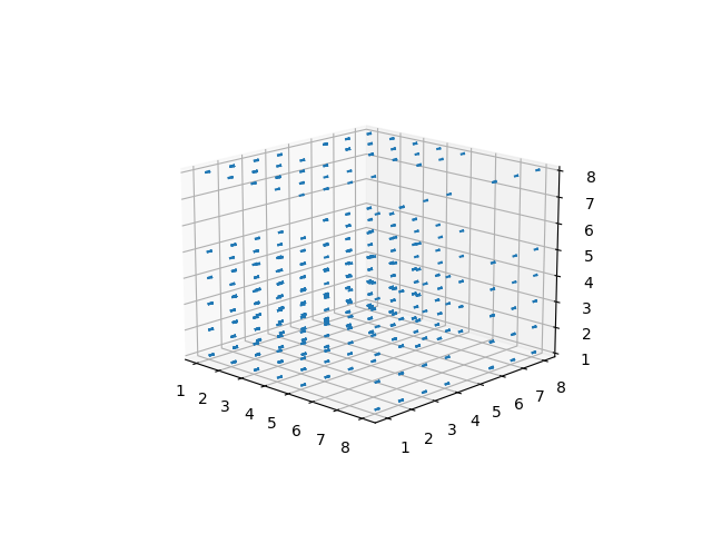
Quiver plots
Here, we will be learning about the quiver plot in matplotlib. A quiver plot helps us to plot a 3d field of arrows in order to define the specified points. We can customize the arrows in various ways. Let us look into the code implementation.
Example:
Python3
from mpl_toolkits.mplot3d import axes3d
import matplotlib.pyplot as plt
import numpy as np
fig = plt.figure()
ax = fig.gca(projection='3d')
x, y, z = np.meshgrid([1,2,5,2,4,8,3,3,1],[6,4,3,1,6,2,7,8,2],[1,2,5,2,4,8,3,3,1])
u = x*2+y*3+z*3
v = (x+3)*(y+5)*(z+7)
w = x+y+z
ax.quiver(x, y, z, u, v, w, length=0.2, normalize=True)
plt.show()
|
Output:
Explanation:
- In the above code, we are importing all the necessary packages at the top(matplotlib.pyplot,numpy,mpl_toolkit.mplot3d).
- Then we are creating an empty figure with the help of plt.figure(). With the help of fig.gca(projection=’3d’), we are specifying the projection as 3D i.e 3D plotting.
- Using meshgrid we are creating an N-D array with X, Y, and Z. In the quiver plot, plotting the points is not the only task. We need to specify the components of the direction of vectors. So for that, we are taking u,v,z which are formed through different expressions created using X, Y, and Z.
- Using ax.quiver() we are plotting the quiver plot where we specify the length of each quiver as 0.1 and in order for arrows to be of the same length, we define normalize as True.
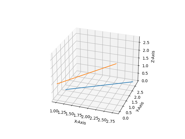
2D data to be plotted in 3D plots
Here, we will be taking a set of 2D points to be plotted in a specific axis in our 3D plot because we cannot plot a 2D point in a 3D plane with all the coordinates. So a specific axis needs to be defined for plotting the 2D points. So let’s see the code of the plot.
Python3
import numpy as np
import matplotlib.pyplot as plt
fig = plt.figure()
ax = fig.gca(projection='3d')
ax.set_xlabel('X-Axis')
ax.set_ylabel('Y-Axis')
ax.set_zlabel('Z-Axis')
x = [1,1.2,1.4,1.6,1.8,2.0,2.2,2.4,2.6,2.8]
y = [1,1.2,1.4,1.6,1.8,2.0,2.2,2.4,2.6,2.8]
z=[1,2,4,5,6,7,8,9,10,11]
ax.plot(x, y, zs=0, zdir='z')
ax.plot(x, y, zs=0, zdir='y')
plt.show()
|
Output:
Explanation:
- In this example, we are plotting 2D data on a 3D plot in Matplotlib. For this, we need NumPy and matplotlib.pyplot for creating the set of values and plotting them in 3D projection. After importing all the necessary packages, we are creating a wide range of values in X, Y, and Z.
- Now with the help of ax.plot() we are plotting our 2D points, where we specify the two sets to be plotted as a parameter inside ax.plot() along with the axis in which they are to be plotted.
Share your thoughts in the comments
Please Login to comment...