HTML and CSS are the dynamic combo that give digital experiences life in the world of web design. Designing websites that not only impress the eye but also save lives by guaranteeing easy navigation and engagement requires designers to manage the always-changing terrain of user expectations.
In this article we’ll be looking at the top 10 invaluable HTML/CSS tips that designers can utilize to execute their profession masterfully, improving user engagement, accessibility, and general satisfaction. Buckle up as we examine the arsenal that turns designers into digital lifesavers, from responsive design marvels to accessibility advances.
How and Why Knowing HTML/CSS Would Help Designs?
Knowing HTML and CSS helps designers communicate with developers better throughout the implementation process and helps them produce more effective and aesthetically pleasing designs.
- Collaborate effectively with developers.
- Understand web design practicalities.
- Prototype and iterate designs faster.
- Create unique, personalized designs.
- Bridge the gap between design and development.
- Boost creativity and innovation.
- Enhance career opportunities.
Top 15 Lifesaving HTML/CSS Tricks For Designers
So now we have some fine ideas about how HTML/CSS knowledge can help designers to think, work and collaborate better with developers. Now let’s look into 15 tricks which you as a designer can use on your own. Being aware of these tricks you as a designer could also tweak your own portfolios and if it interests you, then you can dive deep into the HTML/CSS world.
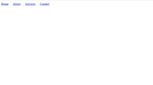
Responsive web design is an important technique in modern web development. Media queries are CSS rule that help to create responsive designs that can be adjusted for different screen sizes and gadgets. This makes sure that your website appears good and works properly on PCs, tablets, and mobile devices.
Code Example: On screens that are narrower than 768 pixels in this case, the menu is hidden. Here we are using media queries.
@media (max-width: 768px) {
/* Styles for smaller screens */
.menu {
display: none;
}
}
Output:
2. The Miracle Layout Setup
It’s a special CSS technique that can help you avoid the majority of HTML bad-layout issues. it as a way to tackle those tricky layout issues that often pop up in web design. We have to make sure that all the element behave just the way we expect.
Code Example:
* {
padding: 0;
margin: 0;
max-width: 100%;
overflow-x: hidden;
position: relative;
display: block;
}
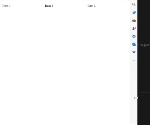
3. Flexbox for Layout
Flexbox, short for “Flexible Box Layout” offering effective element alignment and distribution along a single axis (row or column), Flexbox makes it easier to create flexible and responsive layout in web design. We can apply these rule to a container and it’s children.
Code Example: In this case, the items inside the.container will be vertically and horizontally aligned.
.container {
display: flex;
justify-content: center;
align-items: center;
}
Output:
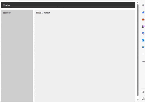
4. CSS Grid for Grid Layouts
CSS Grid create grid-based layouts for web pages. We can control the position of element in two dimensional grid. It is useful to control the position of element in row wise and colomn wise. We can create responsive design using this.
Code Example: The grid container created by this code has three columns of varied widths and a 10px space between cells.
.grid-container {
display: grid;
grid-template-columns: 1fr 2fr 1fr;
grid-gap: 10px;
}
Output:
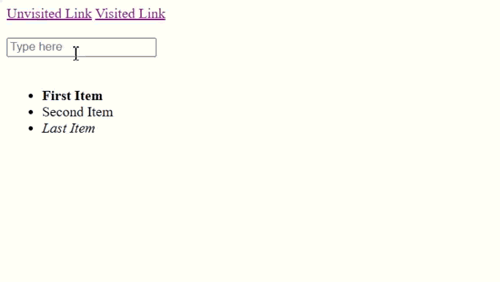
5. Pseudo-Class and Pseudo-Elements
You can apply styles to particular states or portions of elements using pseudo-classes and pseudo-elements without changing the HTML structure.
Code Example: Here, a “>>” is added before the content of a.section element, and the background color of the button changes as it is hovered over.
.button:hover {
background-color: #ff9900;
}
.section::before {
content: “>>”;
}
Output:
6. CSS Transitions and Animations
CSS transitions enable us to smoothly change the property values of an element over a specified duration when a trigger event occurs. This transition from one state to another can be changed by various user interactions like hovering over an element, clicking on it, or even when the page loads.
Code Example: With a transition effect that gradually changes the backdrop color over 0.3 seconds, an element is brought into focus while fading in thanks to keyframe animation.
.box {
transition: background-color 0.3s ease;
}
@keyframes slide-in {
0% { transform: translateX(-100%); opacity: 0; }
100% { transform: translateX(0); opacity: 1; }
}
7. Font Icons or SVGs for Scalability
Scalability is achieved by using typeface icons or SVGs rather than images, which guarantees that graphics will stay clear and scalable across a range of devices.
Code Example: It is simple to style and resize an inline SVG or an icon font class without losing quality.
<i class=”fas fa-heart”></I>
<svg>…</svg>
Output:
8. CSS Reset or Normalize
By deleting the default styles, a CSS reset or normalization ensures uniform styling across various browsers. It often removes margins, paddings, list styles, and other default styles applied by different browsers.
Code Example: While normalize offers an identical starting point across all browsers, reset removes the default margins and paddings.
/* CSS Reset */
body, h1, p {
margin: 0;
padding: 0;
}
/* Normalize */
/* Include a link to normalize.css */
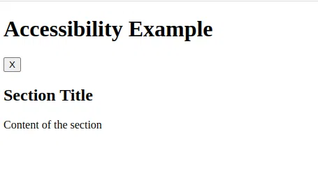
9. Accessibility Enhancements
Web accessibility is improved for people with disabilities by implementing ARIA responsibilities and characteristics. It ensures that everyone, regardless of their abilities or disabilities, can access and interact with web content effectively.
Code Example: Screen readers can more easily grasp and navigate your content by using ARIA attributes and roles.
<button aria-label=”Close” role=”button”>
<span aria-hidden=”true”>×</span>
</button>
Output:
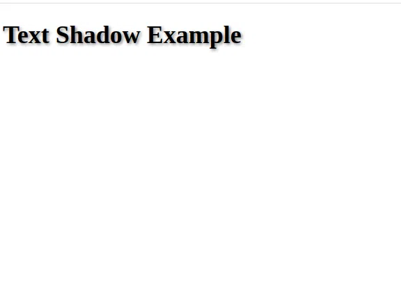
10. Gradient Backgrounds and Shadows
Gradient Backgrounds and Shadows are popular design tools in web development. Backgrounds with gradients and box shadows give items depth and visual appeal.
Code Example: Vertical colour blending is achieved by the gradient background, whilst a soft shadow is produced by the box shadow.
.box {
background: linear-gradient(to bottom, #ff9900, #ff5500);
text-shadow: 0 2px 4px rgba(0, 0, 0, 0.1);
}
Output:
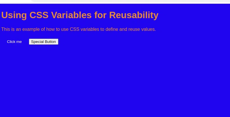
11. CSS Variables for Reusability
CSS variables (custom properties) allow you to define values that can be repeated throughout your stylesheets, making them useful for reuse. it act as placeholders for values that can be reused throughout your CSS code.
Code Example: You may quickly apply the same color to numerous items by establishing a primary color variable.
:root {
–primary-color: #007bff;
}
.button {
background-color: var(–primary-color);
}
Output:
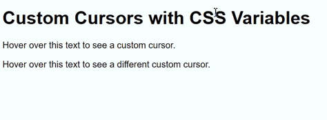
12. Custom Cursors
Custom Cursors can be used to customize the way interactive elements cursors look. We can replace the mouse cursor with unique visuals.
Code Example: Using a custom cursor, this code would change the appearance of how the cursor would appear – in this case it would appear as a pointer.
.custom-cursor {
cursor: pointer;
}
Output:
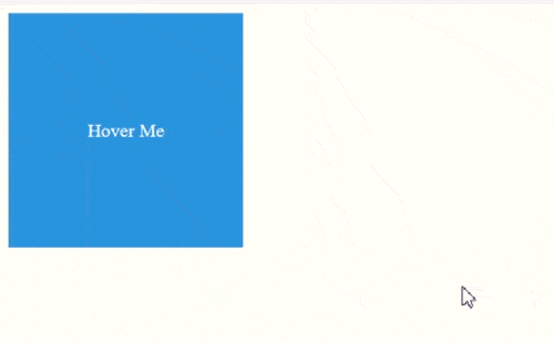
13. Hover Effects with Transition
Hover Effects with Transition is a popular way to create website design with an extra layer of interactivity. When user hover their cursor over an element, it create a transition on that. This hack lets you design components with hovering transitions that should be seamless.
Code Example: You’ll see that as you move the cursor away from the button, the backdrop color changes subtly from a color to different color.
.button {
background-color: #007bff;
color: #fff;
transition: background-color 0.3s ease;
}
.button:hover {
background-color: #0056b3;
}
Output:
14. CSS Blend Modes
Blend modes in CSS combine foreground and background components to create artistic effects. this can enhanced our web design.
Code Example: The code is frequently applied to change the interaction between two layers by adding a visual layer on top of a backdrop color or image.
.overlay {
background-image: url(‘overlay-image.jpg’);
background-blend-mode: multiply;
}
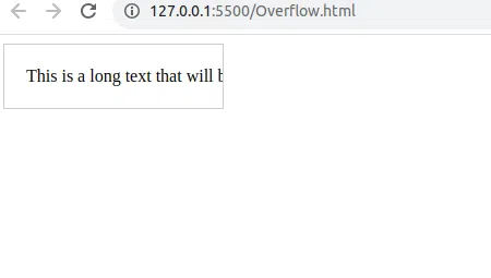
15. Overflow and Text Ellipsis
It is frequently used to deal with situations where lengthy content needs to be truncated with an ellipsis (…) when it cannot fit within its contained element. Using ellipsis to handle overwhelming content and truncate text.
Code Example: The code gives the impression that there is more information while saving space and keeping the text from obstructing the layout or filling the container.
.description {
overflow: hidden;
text-overflow: ellipsis;
white-space: nowrap;
}
Output:
Conclusion
HTML and CSS are the dynamic combo that give digital experiences life. Being an expert in HTML and CSS is like having a digital magic wand in the always changing world of web design. This tour of the most helpful HTML/CSS tips reveals a wealth of tricks that take designers’ creativity and functionality to new heights. Designers may create coherent designs that enthrall and effortlessly guide people by utilizing these techniques.
These aren’t just 15 pieces of code; they’re also the foundation of digital artwork, allowing creators to create captivating and user-focused virtual worlds. So its a wrap, hope you found this article useful!
Share your thoughts in the comments
Please Login to comment...