How to Plot the Linear Regression in R
Last Updated :
06 Oct, 2023
In this article, we are going to learn to plot linear regression in R. But, to plot Linear regression, we first need to understand what exactly is linear regression.
What is Linear Regression?
Linear Regression is a supervised learning model, which computes and predicts the output implemented from the linear relationship the model established based on the data it gets fed with. The aim of this model is to find the linear equation that best fits the relationship between the independent variables (features) and the dependent variable (target). This was some basic insight into the concept of Linear Regression. With this, now we can dive into how to plot linear regression in R.
Now we need to understand, why we chose R for this purpose, as we can go with any other language like Python which also has a number of libraries for machine learning and data analysis.
Equation for Linear Regression
The Equation for Linear Regression is very simple which was covered in our primary standards,
y = bx + a
Here,
a: y-Intercept
b: Slope of the regression line (line of best fit)
x: independent variable or features
y: dependent variable or target
Now for a dataset Slope and Intercept can be calculated with the following formulas
Slope = sample covariance/sample variance
Intercept = ymean – slope* xmean
Loss Function
Loss function, often referred as Cost Function is basically the difference between the true value (y) and the value predicted by our Machine Learning model (ŷ) which is called error in general terms. This can be calculated using Mean Squared Error method which is a commonly used method in statistics to find out errors.
Calculation of Mean Squared Error
Mean Squared Error or MSE can be calculated by squaring the difference between the predicted and true value for the whole dataset and then calculating its mean by dividing it by the total number of observations
Cost Function = Mean Squared Error = 
Why R?
R is a popular programming language that was developed solely for statistical analysis and data visualization. Some of the machine learning models we use are already pre-trained into R (no need for installation of external libraries) including Linear Model (or Regression). Also, this language comes with a huge community and one of the best tools and libraries for Machine Learning, which makes it the first choice for Data Science and Machine Learning enthusiasts.
Now, let’s start with plotting linear regression.
Plotting Linear Regression in R
The dataset we are using for this is: placement.csv
R
SalaryData <- read.csv("placement.csv")
model <- lm(package ~ cgpa, data = SalaryData)
summary(model)
png(file = "placement_stats.png")
plot(SalaryData$cgpa, SalaryData$package, col = "blue",
main = "CGPA and Package regression",
abline(model), cex = 1.3, pch = 16,
xlab = "CGPA", ylab = "Package (LPA)")
|
Output:
Call:
lm(formula = package ~ cgpa, data = SalaryData)
Residuals:
    Min      1Q  Median      3Q     Max
-15.517  -9.794  -4.762   2.376  53.174
Coefficients:
            Estimate Std. Error t value Pr(>|t|)
(Intercept)  -94.141     47.167  -1.996   0.0613 .
cgpa          17.415      6.704   2.598   0.0182 *
---
Signif. codes:  0 ‘***’ 0.001 ‘**’ 0.01 ‘*’ 0.05 ‘.’ 0.1 ‘ ’ 1
Residual standard error: 16.56 on 18 degrees of freedom
Multiple R-squared:  0.2726,    Adjusted R-squared:  0.2322
F-statistic: 6.747 on 1 and 18 DF,  p-value: 0.01819
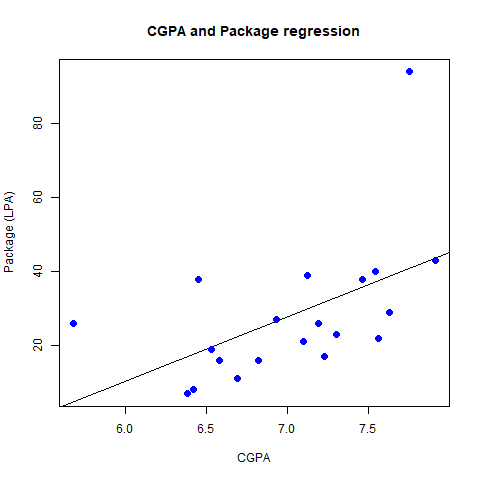
placement_stats.png
- Here, first we are importing the dataset (placement.csv) available in csv (Comma Separated Values) format using read.csv function in R and assigning it to a variable SalaryData.
- Next we are using the pre-built Linear Regression model using lm, feeding x, y and our dataset to the function as arguments.
- Next, we are creating a png file to store the graph plotted using png function which takes the file name as the argument.
- Finally, we are using the plot function given by R to plot the graph for the data.
Running this script, will create a file “placement_stats.png” which has the plotted graph for the dataset in the current directory
Changing pch
R
SalaryData <- read.csv("placement.csv")
model <- lm(package ~ cgpa, data = SalaryData)
summary(model)
png(file = "placement_stats.png")
plot(SalaryData$cgpa, SalaryData$package, col = "blue",
main = "CGPA and Package regression",
abline(model), cex = 1.3, pch = 17,
xlab = "CGPA", ylab = "Package (LPA)")
|
Output:
Call:
lm(formula = package ~ cgpa, data = SalaryData)
Residuals:
    Min      1Q  Median      3Q     Max
-15.517  -9.794  -4.762   2.376  53.174
Coefficients:
            Estimate Std. Error t value Pr(>|t|)
(Intercept)  -94.141     47.167  -1.996   0.0613 .
cgpa          17.415      6.704   2.598   0.0182 *
---
Signif. codes:  0 ‘***’ 0.001 ‘**’ 0.01 ‘*’ 0.05 ‘.’ 0.1 ‘ ’ 1
Residual standard error: 16.56 on 18 degrees of freedom
Multiple R-squared:  0.2726,    Adjusted R-squared:  0.2322
F-statistic: 6.747 on 1 and 18 DF,  p-value: 0.01819
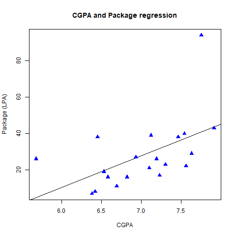
triangular plotting points
Changing the pch value from 16 to 17 changed the shape of plotting points from solid circles to triangles, while keeping everything same.
Changing col
R
SalaryData <- read.csv("placement.csv")
model <- lm(package ~ cgpa, data = SalaryData)
png(file = "placement_stats.png")
plot(SalaryData$cgpa, SalaryData$package, col = "red",
main = "CGPA and Package regression",
abline(model), cex = 1.3, pch = 16,
xlab = "CGPA", ylab = "Package (LPA)")
|
Output:
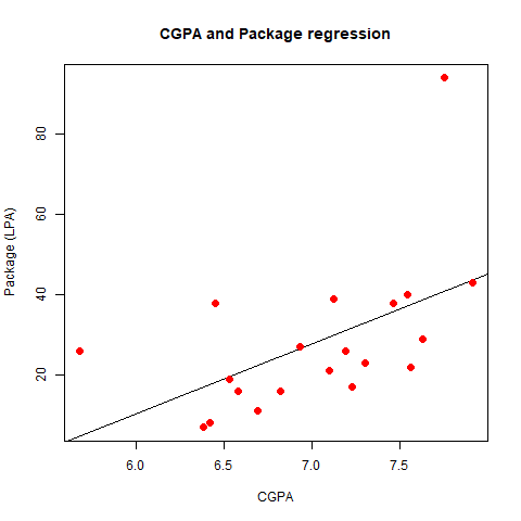
red plotting points
Changing the col from blue to red lead to change in the color of plotting points from blue (initial) to red (new), while keeping everything the same.
Additionally, abline function is used to add the regression line (line of best fit) to the plot.
Removing it will result in a scatterplot.
Removing abline parameter
R
SalaryData <- read.csv("placement.csv")
model <- lm(package ~ cgpa, data = SalaryData)
png(file = "placement_stats.png")
plot(SalaryData$cgpa, SalaryData$package, col = "blue",
main = "CGPA and Package regression",
cex = 1.3, pch = 16,
xlab = "CGPA", ylab = "Package (LPA)")
|
Output:
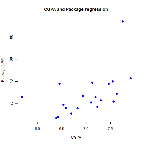
When abline parameter is removed from the call of plot function, the line of best fit disappears from the grap, hence making it a scatterplot, while keeping everything the same.
This can also be plotted by using external libraries like ggplot2.
Plotting using ggplot2
First, we need to install the library using following command
install.packages("ggplot2")
- ggplot is a popular data visualization package in R programming.
Then we can use it as usual by importing the library into script.
R
library(ggplot2)
SalaryData <- read.csv("placement.csv")
model <- lm(package ~ cgpa, data = SalaryData)
png(file = "placement_stats.png")
ggplot(SalaryData, aes(x = cgpa, y = package)) +
geom_point() +
geom_smooth(method = "lm", se = FALSE) +
labs(title = "CGPA and Package regression", x = "CGPA", y = "Y")
|
Output:
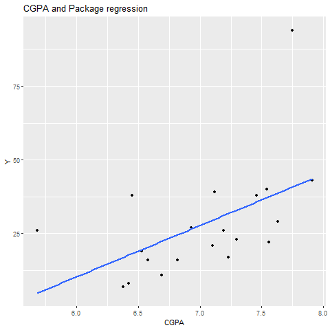
It works in similar manner as previous one, both line of best fit and points are plotted on the graph
Without geom_point (plotting points absent)
R
library(ggplot2)
SalaryData <- read.csv("placement.csv")
model <- lm(package ~ cgpa, data = SalaryData)
png(file = "placement_stats.png")
ggplot(SalaryData, aes(x = cgpa, y = package)) +
geom_smooth(method = "lm", se = FALSE) +
labs(title = "CGPA and Package regression", x = "CGPA", y = "Y")
|
Output:
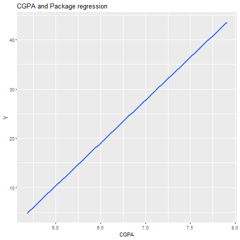
plotting points absent
When removing geom_point parameter the plotting points are not displayed on the graph while keeping everything same.
Without geom_smooth (line absent)
R
library(ggplot2)
SalaryData <- read.csv("placement.csv")
model <- lm(package ~ cgpa, data = SalaryData)
png(file = "placement_stats.png")
ggplot(SalaryData, aes(x = cgpa, y = package)) +
geom_point()+
labs(title = "CGPA and Package regression", x = "CGPA", y = "Y")
|
Output:
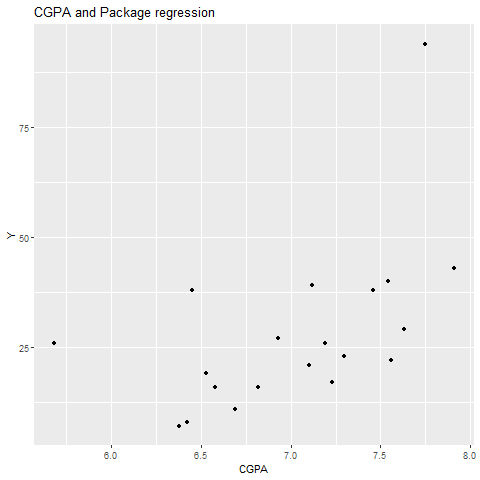
line absent
When removing geom_smooth parameter the line of best fit is not displayed on the graph while keeping everything same.
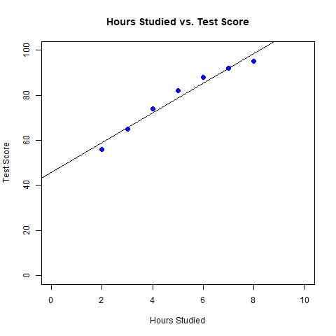
Exploring the Relationship Between Hours Studied and Test Scores
R
library(ggplot2)
data <- data.frame(
Hours_Studied = c(2, 3, 4, 5, 6, 7, 8),
Test_Score = c(56, 65, 74, 82, 88, 92, 95)
)
model <- lm(Test_Score ~ Hours_Studied, data = data)
summary(model)
png(file = "score_stats.png")
plot(data$Hours_Studied, data$Test_Score, col = "blue",
main = "Hours Studied vs. Test Score",
xlab = "Hours Studied", ylab = "Test Score",
cex = 1.3, pch = 16,
abline(model))
|
Output:
Call:
lm(formula = Test_Score ~ Hours_Studied, data = data)
Residuals:
       1        2        3        4        5        6        7
-3.03571 -0.64286  1.75000  3.14286  2.53571 -0.07143 -3.67857
Coefficients:
              Estimate Std. Error t value Pr(>|t|)
(Intercept)    45.8214     2.9683   15.44 2.07e-05 ***
Hours_Studied   6.6071     0.5512   11.99 7.13e-05 ***
---
Signif. codes:  0 ‘***’ 0.001 ‘**’ 0.01 ‘*’ 0.05 ‘.’ 0.1 ‘ ’ 1
Residual standard error: 2.917 on 5 degrees of freedom
Multiple R-squared:  0.9664,    Adjusted R-squared:  0.9596
F-statistic: 143.7 on 1 and 5 DF,  p-value: 7.128e-05
score_stats.png
A graph has been plotted with the number of Hours studied on the X-axis and Score in the Test on the Y-axis along with a line of best fit.
Share your thoughts in the comments
Please Login to comment...