Create Responsive Sidebar Menu to Top Navbar in Bootstrap
Last Updated :
29 Apr, 2024
Bootstrap’s responsive sidebar streamlines navigation across devices. It features links to the Home, About Us, and Contact Us sections. The page displays sample content like images and welcoming messages, ensuring user-friendly browsing experiences. By toggling seamlessly, users can access information effortlessly across different screen sizes.
Sidebar on Small Screen
- Include Bootstrap CSS and JavaScript files in the <head> section of your HTML document.
- Bootstrap class “
navbar class” used to create a navigation bar. This class “navbar-expand-lg" makes the navbar expandable (collapsible) for large screens and smaller ones. It ensures that the navbar collapses into a hamburger icon on smaller screens. Element with class "collapse navbar-collapse" and id "navbarSupportedContent" defines a collapsible navbar content area.Element with class "offcanvas offcanvas-start" with tabindex "-1" and id "sidebar" initializes an off-canvas sidebar menu that slides in from the left on smaller screens.Element with class "offcanvas-header" defines the header section of the offcanvas sidebar.
Example: Illustration of responsive sidebar menu to top navbar in Bootstrap 5
HTML
<!DOCTYPE html>
<html lang="en">
<head>
<meta charset="UTF-8">
<meta name="viewport" content="width=device-width, initial-scale=1.0">
<title>Responsive Sidebar Menu</title>
<link href=
"https://cdn.jsdelivr.net/npm/bootstrap@5.3.0-alpha1/dist/css/bootstrap.min.css"
rel="stylesheet">
</head>
<body>
<!-- Navbar Setup -->
<nav class="navbar navbar-expand-lg navbar-light bg-success">
<div class="container-fluid">
<!-- Navbar brand -->
<a class="navbar-brand text-light" href="#">
GeeksforGeeks
</a>
<!-- Navbar toggle button -->
<button class="navbar-toggler"
type="button"
data-bs-toggle="offcanvas"
data-bs-target="#sidebar"
aria-controls="sidebar">
<span class="navbar-toggler-icon"></span>
</button>
<!-- Top menu in navbar -->
<div class="collapse navbar-collapse"
id="navbarSupportedContent">
<ul class="navbar-nav me-auto mb-2 mb-lg-0">
<li class="nav-item">
<a class="nav-link active text-light"
aria-current="page" href="#">
Home
</a>
</li>
<li class="nav-item">
<a class="nav-link text-light" href="#">
About Us
</a>
</li>
<li class="nav-item">
<a class="nav-link text-light" href="#">
Contact Us
</a>
</li>
</ul>
</div>
</div>
</nav>
<!-- Sidebar Setup -->
<div class="offcanvas offcanvas-start"
tabindex="-1" id="sidebar">
<div class="offcanvas-header">
<h5 class="offcanvas-title text-success">
Menu
</h5>
<button type="button"
class="btn-close text-reset"
data-bs-dismiss="offcanvas"
aria-label="Close">
</button>
</div>
<div class="offcanvas-body bg-success">
<ul class="navbar-nav">
<li class="nav-item">
<a class="nav-link text-light" href="#">
Home
</a>
</li>
<li class="nav-item">
<a class="nav-link text-light" href="#">
About Us
</a>
</li>
<li class="nav-item">
<a class="nav-link text-light" href="#">
Contact Us
</a>
</li>
</ul>
</div>
</div>
<!-- Content Below Navbar and Sidebar Menu -->
<div class="container-fluid">
<div class="row">
<!-- First column for content -->
<div class="col-lg-6">
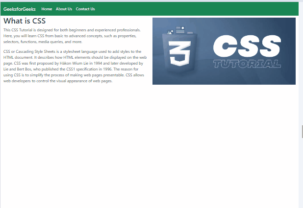
<h2>What is CSS</h2>
<p>
This CSS Tutorial is designed for
both beginners and experienced
professionals. Here, you will learn
CSS from basic to advanced concepts,
such as properties, selectors,
functions, media queries, and more.
</p>
<p>
CSS or Cascading Style Sheets is a
stylesheet language used to add styles
to the HTML document. It describes how
HTML elements should be displayed on the
web page. CSS was first proposed by Håkon
Wium Lie in 1994 and later developed by Lie
and Bert Bos, who published the CSS1
specification in 1996. The reason for using
CSS is to simplify the process of making web
pages presentable. CSS allows web developers
to control the visual appearance of web pages.
</p>
</div>
<!-- Second column for content -->
<div class="col-lg-6">
<img src=
"https://media.geeksforgeeks.org/wp-content/uploads/20230427130955/CSS-Tutorial.webp"
class="img-fluid my-2">
</div>
</div>
</div>
<!-- Include Bootstrap JavaScript -->
<script src=
"https://cdn.jsdelivr.net/npm/@popperjs/core@2.11.6/dist/umd/popper.min.js">
</script>
<script src=
"https://cdn.jsdelivr.net/npm/bootstrap@5.3.0-alpha1/dist/js/bootstrap.min.js">
</script>
</body>
</html>
Output:
Responsive Sidebar Menu to Top Navbar in Bootstrap Example Output
- Add the Bootstrap CSS and JavaScript files within the <head> section of your HTML document.
- Use the Bootstrap navbar component for the navbar structure. Add a toggle button for small screen devices using a navbar-toggler.
- The sidebar is implemented using Bootstrap’s offcanvas component. It slides in from the left when triggered by the navbar toggle button. It has a background color of green (
bg-success) and is hidden (d-md-block) on screens larger than medium (d-md-block). - Inside the sidebar, there’s an offcanvas header with the title “GFG Sidebar” and a close button (
btn-close). The body of the sidebar contains a vertical list of links (nav-link) for navigation. - The main content and sidebar menu are placed within a container-fluid (
container-fluid) to ensure responsiveness. - The sidebar menu is placed inside a navigation element (
nav) with the class sidebar and positioned sticky (position-sticky) to remain visible while scrolling.
Example: Illustration of responsive sidebar menu to top navbar in Bootstrap 5
HTML
<!DOCTYPE html>
<html lang="en">

<head>
    <meta charset="UTF-8">
    <meta name="viewport"
        content="width=device-width, initial-scale=1.0">
    <title>Left Sidebar Example</title>
    <!-- Bootstrap CSS -->
    <link href=
"https://cdn.jsdelivr.net/npm/bootstrap@5.3.0-alpha1/dist/css/bootstrap.min.css"
        rel="stylesheet">
    <style>
        /* Hide toggle button on larger screens */
        @media (min-width: 768px) {
            .navbar-toggler {
                display: none;
            }
        }
    </style>
</head>

<body>

    <nav class="navbar navbar-light
                bg-success border-bottom-0">
        <!-- Navbar toggle button (hamburger icon) -->
        <button class="navbar-toggler d-block d-md-none"
                type="button" data-bs-toggle="offcanvas"
                data-bs-target="#sidebar"
                aria-controls="sidebar">
            <span class="navbar-toggler-icon"></span>
        </button>
    </nav>

    <div class="offcanvas offcanvas-start
                bg-success d-md-block"
        tabindex="-1" id="sidebar"
        aria-labelledby="sidebarLabel">
        <div class="offcanvas-header">
            <h5 class="offcanvas-title text-light"
                id="sidebarLabel">GFG Sidebar</h5>
            <button type="button"
                    class="btn-close text-reset"
                    data-bs-dismiss="offcanvas"
                    aria-label="Close">
            </button>
        </div>
        <div class="offcanvas-body">
            <ul class="nav flex-column">
                <li class="nav-item">
                    <a class="nav-link active text-light"
                    href="#">
                    Home
                    </a>
                </li>
                <li class="nav-item">
                    <a class="nav-link text-light"
                    href="#">
                    About Us
                    </a>
                </li>
                <li class="nav-item">
                    <a class="nav-link text-light"
                    href="#">
                    Contact Us
                    </a>
                </li>
            </ul>
        </div>
    </div>

    <div class="container-fluid">
        <div class="row">
            <nav id="sidebarMenu"
                class="col-md-3 col-lg-2 d-none
                        d-md-block bg-light sidebar">
                <div class="position-sticky
                            bg-success vh-100">
                    <div class="pt-3">
                        <h6 class="sidebar-heading d-flex
                                justify-content-between
                                align-items-center px-3
                                mt-4 mb-1 text-muted">
                            <span class="text-light">
                                GFG sidebar
                            </span>
                        </h6>
                        <ul class="nav flex-column">
                            <li class="nav-item">
                                <a class="nav-link active
                                        text-light"
                                href="#">
                                    Home
                                </a>
                            </li>
                            <li class="nav-item">
                                <a class="nav-link text-light"
                                href="#">
                                    About Us
                                </a>
                            </li>
                            <li class="nav-item">
                                <a class="nav-link text-light"
                                href="#">
                                    Contact Us
                                </a>
                            </li>
                        </ul>
                    </div>
                </div>
            </nav>
            <main class="col-md-9 ms-sm-auto
                        col-lg-10 px-md-4 ">
                <div class="pt-3">
                    <h2 class="text-primary">
                    TypeScript
                    </h2>
                    <p class="text-success">
                    Responsive sidebar menu to
                    top navbar in Bootstrap 5
                    </p>
                    <p class="text-success">
                        TypeScript is a strict superset
                        of JavaScript, which means anything
                        that is implemented in JavaScript
                        can be implemented using TypeScript
                        along with the choice of adding
                        enhanced features. It is an Open Source
                        Object Oriented programming language and
                        strongly typed language. As TS code is
                        converted to JS code it makes it easier
                        to integrate into JavaScript projects.
                        The TypeScript Tutorial provides the
                        complete guide from beginner to
                        advanced level.
                    </p>
                </div>
            </main>
        </div>
    </div>

    <!-- Bootstrap Bundle with Popper -->
    <script src=
"https://cdn.jsdelivr.net/npm/bootstrap@5.3.0-alpha1/dist/js/bootstrap.bundle.min.js">
    </script>
</body>

</html>
Output:

Responsive Sidebar Menu to Top Navbar in Bootstrap Example Output
Share your thoughts in the comments
Please Login to comment...