How to Make Scalable Layout?
Last Updated :
12 Dec, 2023
In the fast-changing world of the internet, people use all sorts of devices to browse. We want our websites to look awesome and work well for everyone, whether they’re on a big computer or a small phone. So, by understanding adaptive and responsive design, we can create websites that not only look great now but can adapt gracefully as technology keeps evolving.

Scalable Layout
What is Adaptive Design?
Adaptive design means making a website or app that can change itself to fit different users and devices. This is commonly accomplished by creating a website or application layout and content that dynamically adapts and reorganizes itself according to the device or browser utilized for access.
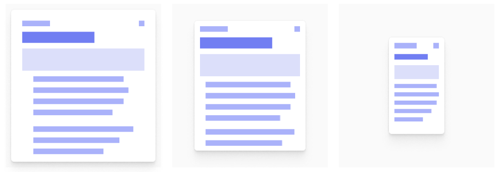
Adopting adaptive design becomes advantageous when revamping an existing website to enhance its compatibility with mobile phones. This empowers you to manage the design and web development for distinct viewports, enabling the creation of unique user experiences across six prevalent screen sizes. These sizes range from small to large: 320px, 480px, 760px, 960px, 1200px, and 1600px. To streamline the website design process and save time, it’s practical to focus on specific screen sizes rather than attempting to accommodate six different ones. This approach involves leveraging user analytics from the current site version to identify the predominant screen sizes that users commonly employ to access the site.

Adaptive Design Layouts
For example, if the analytics show that a majority of users utilize the site on their iPad and their mobile phone, you would design the user experience for those two screen sizes specifically rather than attempting to accommodate all six potential screen sizes.
What is Responsive Design?
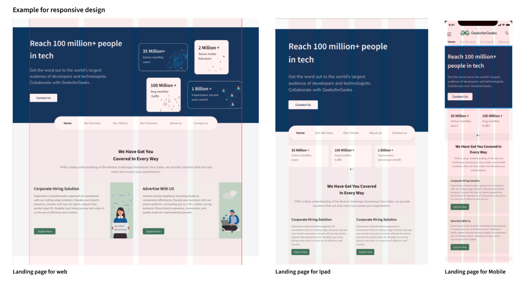
Responsive designs adapt to changes in the browser width by repositioning design elements to accommodate the available space. A responsive website dynamically adjusts its content presentation depending on the current browser dimensions. If you open a responsive site on the desktop and then change the size of the browser window, the content will move dynamically to arrange itself optimally for the browser window.
Responsive design layouts
Responsive design on mobile phones occurs automatically as the site assesses available space and adapts for an optimal layout. Its fluid nature ensures users can seamlessly access and enjoy your online content on handheld devices just as they would on a larger monitor. Achieving this relies on a solid conceptualization of the site and a thorough understanding of end users’ needs and preferences.
Difference Between Adaptive and Responsive
Responsive design and adaptive design are both strategies for creating websites or applications that can accommodate various devices and screen sizes, but they differ in their approaches:
Flexible vs. Fixed Layouts:
- Responsive Design: Uses fluid grids, flexible images, and media queries to create a layout that can adapt to different screen sizes. The design responds dynamically to changes in the viewport width, ensuring a smooth user experience across various devices.
- Adaptive Design: Involves creating multiple fixed layout sizes to target specific device breakpoints. Each layout is designed for a particular screen size, and the system serves the appropriate layout based on the device detected.
Example of Responsive Design:
GFG Website_Responsive layout
Example of Adaptive Design:

GFG Explore Page_ Adaptive Design
Media Queries vs. Device Detection:
- Responsive Design: Primarily relies on CSS media queries to adjust the styling and layout based on the characteristics of the device, such as screen width, height, or orientation.
- Adaptive Design: Uses server-side techniques to detect the user’s device and serve a pre-designed layout that best fits that specific device. This often involves detecting the device’s user agent or capabilities.
Performance:
- Responsive Design: Generally lighter on resources as it loads a single set of HTML and CSS that adjusts based on the device’s characteristics. This can contribute to faster initial load times.
- Adaptive Design: May require loading additional resources for different layouts, potentially leading to slightly longer initial load times, especially if multiple layouts are designed for various devices.
Flexibility:
- Responsive Design: Offers a more flexible and future-proof solution as it can adapt to a wide range of devices, including those that may be released in the future, without the need for major changes.
- Adaptive Design: Requires creating specific layouts for targeted devices, which may need updating or adding new layouts as new devices with different screen sizes enter the market.
In summary, while both responsive and adaptive designs aim to provide a better user experience across devices, responsive design achieves this through a flexible, fluid layout, and adaptive design through multiple fixed layouts targeted at specific devices. The choice between them often depends on the project’s specific requirements and the preferences of the development team.
The Pros and Cons of Adaptive Design
Pros of Adaptive Design:
- Better User Experience: Tailors the interface for each device, ensuring an optimized user experience.
- Performance Optimization: Can lead to better performance on specific devices by creating layouts optimized for each.
- Device-Specific Features: Utilizes unique features of different devices for an enhanced user experience.
- Easier Maintenance: Updating layouts for specific devices is more straightforward, allowing for easier maintenance.
- Greater Control: Provides designers and developers with more control over how content is presented on various devices.
Cons of Adaptive Design:
- Increased Development Time: Creating multiple layouts takes time, especially with the growing number of devices.
- Higher Development Costs: More layouts and testing lead to higher development costs compared to responsive design.
- Limited Future-Proofing: May require updates for new devices, making it less future-proof compared to responsive design.
The Pros and Cons of Responsive Design
Pros of Responsive Design:
- Works Everywhere: Looks good and functions well on all devices – computers, phones, and tablets.
- Ready for the Future: Can handle new devices without needing big changes. It’s like a design that grows with technology.
- Saves Money: Costs less because you don’t need different versions for each device.
- Google Likes It: Google prefers responsive design, making it easier for people to find your website.
- Easy to Update: Making changes is simpler because you only have one set of code to manage.
- Happy Users: People enjoy a smooth experience, no matter what device they’re using.
Cons of Responsive Design:
- Can be Slow: Might take longer to load, especially on phones, because it loads everything for all devices.
- Can Get Complicated: Making a design that fits all screens can be hard, especially for big and complex websites.
- Design Compromises: Sometimes, you have to make compromises as the same design needs to fit both big and small screens.
- Too Much Loading: Some things designed for big screens might still load on small devices, adding unnecessary stuff.
- Personalization Challenges: It’s a bit tricky to make a unique experience based on the capabilities of each device.
- Slow on Slow Internet: People with slow internet might have to wait longer for the website to load, especially the first time.
In short, responsive design is great for making your website work everywhere, but it can be a bit slow and tricky to get right for all devices. It’s a balance between flexibility and performance.
Conclusion
The combination of adaptive and responsive design provides a powerful solution for crafting web designs that endure the test of time. By leveraging the strengths of both methodologies, developers can ensure a seamless and captivating user experience across diverse devices. This knowledge equips us to create visually stunning and inherently scalable designs that not only meet current standards but also gracefully adapt to future innovations. Here’s to a future where our digital creations evolve with the same fluidity and adaptability as the technologies that inspire them.
Share your thoughts in the comments
Please Login to comment...