How to Make attractive buttons in Figma?
Last Updated :
14 May, 2024
Buttons are one of the most important UI elements on web pages and apps because they allow users to take actions and do something, and they can really make a difference in the attractiveness and User Experience of a page.
In order to Design an attractive button, first you should know about its build. A button can have various shapes and forms but its simplest form is just ‘1plain short text’, it could also have a border or solid color as its background. Sometimes you could have seen Circular Buttons like in Gmail there is a button for composing in a circular shape which is floating so that button is called Floating Action Button.
There are basically 4 types of Buttons:
- Contained or Filled Button: have a solid color
- Outline Button: have a border
- Text Button: used for links and less important work
- Toggle Button: which allow us to switch between different States
So as per your requirements you can choose between them and also sometimes buttons include icon for users to better understand their functionality.
- First-most thing is to pay Attention to the ‘ Size ‘ of Button, its Important to design a button in away in which it is easily accessible. Sometimes Many designer forget that we use fingertips on mobile and tablet screen so we can’t make the size of button tiny .The Recommended minimum Height for a button is round 34px and it can be larger than that but try to not go above 72px.
- Second thing is the ‘Shape‘ of Button, whether you should choose sharp edge or round edges or even completely rounded button, it depends as sharp edge buttons look more professional where as fully round buttons look friendly and round edge look both professional and friendly. you can choose between shapes according to the requirements of company or brand.
- Third point is about ‘hierarchy’ when using different types of buttons ,it is important have a good hierarchy so that different buttons can have different type of importance. we can have low, medium and high emphasis .lastly make sure to design different states of a button like hover, tapped, disabled etc.
How to Apply?
Its very easy to apply the above the above types and rules to make attractive buttons in Figma.
Step 1: Firstly go to a new figma file, place text on screen and type anything you want for example type “button”.
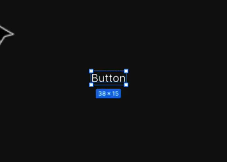
write button after placing text
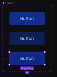
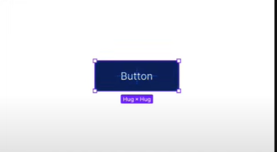
Step 2: Next thing we want to do is put it in a frame and we will not be using normal frame ,we will be putting it in auto layout as button has to increase as we add text in it .To do it press ‘ Shift + A ‘ or right click on button and click Add auto layout. Once doing it we have to add some fill to it so go to right-most side and click on ‘+’ sign near fill icon. then add the color you like. Then add some rounded corner to it so it look good by going to frame .
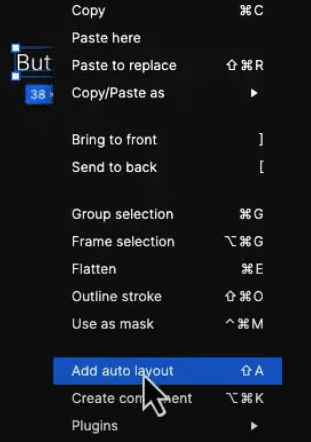
click on Add auto layout
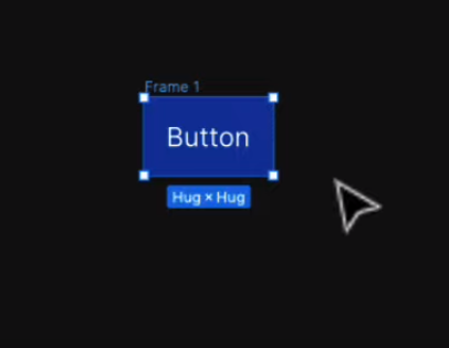
you can see after giving layout and filling color how it looks
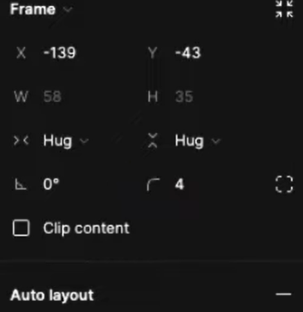
click on right bottom side where 4 is written to adjust round corner
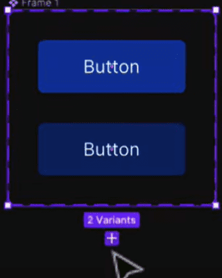
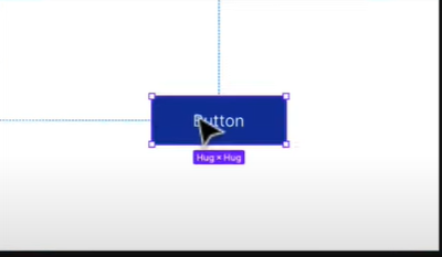
Step 3: Add some padding to right and left lets say 30,then it will look like a proper button. Now we have to create component so that we can add more variants. now go to top and click on create component “diamond like icon”. now that we have created component so we have to add variant again go to top and click add variant.
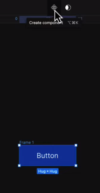
click on create component
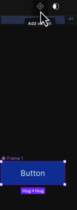
click on add variant
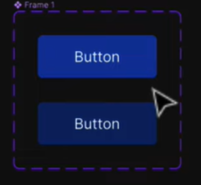
Step 4: Now you can see main component which has multiple variant inside it so base part of it is ready.
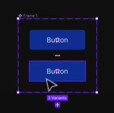
you can see main component having two variants
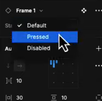
Step 5: Click on component then you will see on right side there is properties in which you can add property or as some people prefer to say state.so we will allocate 1st one default and second one pressed states.
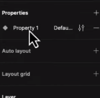
Double click on property so that you can rename it if you want like state
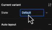
change state/property to give different role
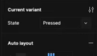
I have given second variant property/state of pressed
Step 6: As we have given different properties so we will change the color of second variant to somewhat darker so that we can differentiate between them
color of second variant is changed
Step 7: Now to make it better I want to add a disabled property so for that lets first add one more variant.so click on main frame and you will get on button to add new variant so click on it and new variant will be get added .now give its property as disabled and change its color to your liking.
click on ‘+’ to add new variant
third variant is added
give different color to new variant
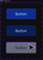
Step 8: Now that we have button with different properties so to add it we will take a screen or frame that you are designing and go to assets ,in the assets you will have buttons as local component ,so drag it on your frame and now we can see that from right side that we can choose different states like default, pressed and disabled.so everything is possible from here.
Default State
click on preview/run to view the output with different states
click on pressed state to check output
Pressed State
Disabled State
Step 9: So this is how buttons are created but to make them attractive it all depend on your creative mind that how much you can think differently, now I will show you one of my attractive button in which I have only just changed shape ,size and color but it look totally different from above.
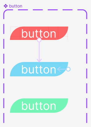
Like this
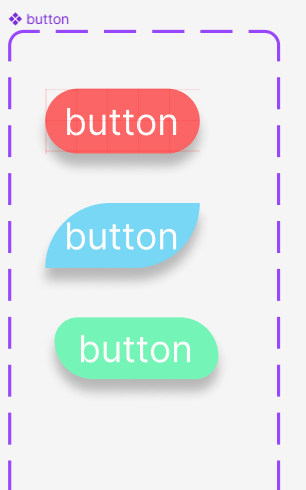
Step 10: You can notice the difference Earlier it was not that appealing but now it is looking Attractive and again if only I change its corner radius we can get three types of buttons all looking attractive in their own way.
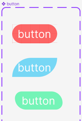
you can create new shapes by adjusting corner radius
Step 11: And if you are still not satisfied and want to make it even more Attractive then use some effect like dark Shadow.it will make your buttons more good looking.so for doing this click on button ,go to effects in right side below fill option and click on ‘+’ sign in effects and dark shadow will be applied. you can also choose whether you want it inner or outer.
you can see the difference
So by doing this you can create attractive buttons if you want to make more attractive you can use enable, hover, focus or use Icons which can be turned on/off and swapped .Rest depend on your Imagination and on How you use your mind to be creative.
- Buttons are fundamental building blocks in Figma, crucial for creating interactive and user-friendly interfaces.
- As it enhances user actions, user Experience and it also Improve Communication and Clarity between user and application.
- Figma enables you to make interactive prototypes, connecting buttons to various screens or functions. This aids in testing the user experience and spotting any usability problems prior to starting development.
Conclusion
At last ,I have only one thing to say that only your Imagination is boundary and you can make more attractive buttons if you try to think differently like out of the box. By using your mind you can make super awesome buttons just by only adjusting their size, shape, color and corner .
Share your thoughts in the comments
Please Login to comment...