How to make Image Corners Rounded using CSS ?
Last Updated :
18 Mar, 2024
In CSS, we can make the rounded corners of images to add a more attractive visual appearance to the web application. We can use the border-radius property and also its other specific corner properties to make the image corners with a rounded shape.
Using border-radius Property
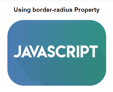
In this approach, we are using the border-radius property in CSS to create rounded corners for the image. By setting the border-radius value to 50px or another value, we can make a circular shape for the corners of the image.
Syntax:
.image {
      border-radius: VALUE;
}

// VALUE is the size that will decide the curve nature of the image
Example 1: The below example uses border-radius property to make the image rounded corner using CSS.
HTML
<!DOCTYPE html>
<html>

<head>
    <title>Example 1</title>
    <style>
        body {
            text-align: center;
            font-family: Arial, sans-serif;
        }

        h1 {
            color: green;
        }

        h3 {
            margin-bottom: 20px;
        }

        .rounded-image {
            border-radius: 50px;
            width: 300px;
            height: auto;
        }
    </style>
</head>

<body>
    <h3>
        Using border-radius Property
    </h3>
    <img class="rounded-image" src=
"https://media.geeksforgeeks.org/wp-content/uploads/20240222094205/js11.jpg">
</body>

</html>
Output:
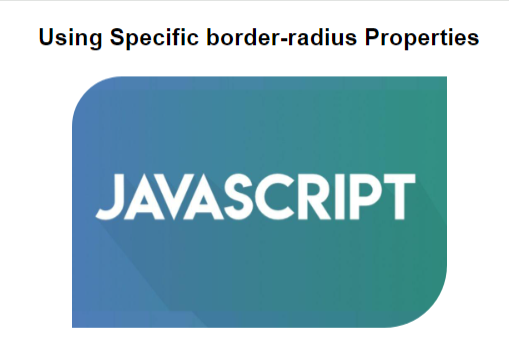
Example 2: The below example uses specific border-radius properties to make the specific corners of the image rounded using CSS.
HTML
<!DOCTYPE html>
<html>

<head>
    <title>Example 2</title>
    <style>
        body {
            text-align: center;
            font-family: Arial, sans-serif;
        }

        h3 {
            margin-bottom: 20px;
        }

        .rounded-image {
            width: 300px;
            height: auto;
            border-top-left-radius: 40px;
            border-bottom-right-radius: 50px;
            overflow: hidden;
        }
    </style>
</head>

<body>
    <h3>
        Using Specific
        border-radius Properties
    </h3>
    <img alt="Banner" class="rounded-image" src=
"https://media.geeksforgeeks.org/wp-content/uploads/20240222094205/js11.jpg">
</body>

</html>
Output:
Share your thoughts in the comments
Please Login to comment...