How to Hide Elements in Mobile Size and Display in Laptop size using Tailwind CSS ?
Last Updated :
21 Jun, 2023
Tailwind CSS is a popular utility-first CSS framework that provides a variety of built-in classes for rapid web development. One common requirement is to hide elements on mobile devices while keeping them visible on larger screens, such as laptops or desktops. In this article, we will see two different approaches for hiding elements on mobile devices while making them visible on larger screens like laptops or desktops.
Approach 1: Using the “hidden” and “block” classes
The first approach involves using the “hidden” and “block” classes provided by Tailwind CSS in conjunction with the “lg:”(typically associated with large screen devices, with a minimum width of 1024px) media query. The “hidden” class hides the element on all screen sizes, and the “block” class makes it visible again specifically on screens larger than the “lg” breakpoint.
Syntax:
<div class="hidden lg:block">
    Element
</div>
Example: In this example, the element is initially hidden using the “hidden” class. However, when the screen size reaches or exceeds the “lg” breakpoint (typically associated with laptops and larger devices), the “block” class overrides the “hidden” class, making the element visible again.
HTML
<!DOCTYPE html>
<html lang="en">
<head>
<meta charset="UTF-8" />
<meta http-equiv="X-UA-Compatible"
content="IE=edge" />
<meta name="viewport"
content="width=device-width,
initial-scale=1.0" />
<script src=
</script>
<title>
How to make elements invisible in mobile size
but visible in laptop size in TailwindCSS
</title>
</head>
<body>
<div class="text-center">
<h1 class="text-green-500 text-6xl">
GeeksforGeeks
</h1>
<div class="hidden text-6xl bg-green-500
m-4 text-white lg:block">
Using the "hidden" and "block" classes
</div>
</div>
</body>
</html>
|
Output:
.gif)
Approach 2: Using the “invisible” and “visible” classes
The second approach involves utilizing the “invisible” and “visible” classes provided by Tailwind CSS along with the “lg:” media query. The “invisible” class hides the element while preserving its space in the layout, and the “visible” class overrides the “invisible” class specifically on screens larger than the “lg” breakpoint.
Syntax:
<div class="invisible lg:visible">
    Element
</div>
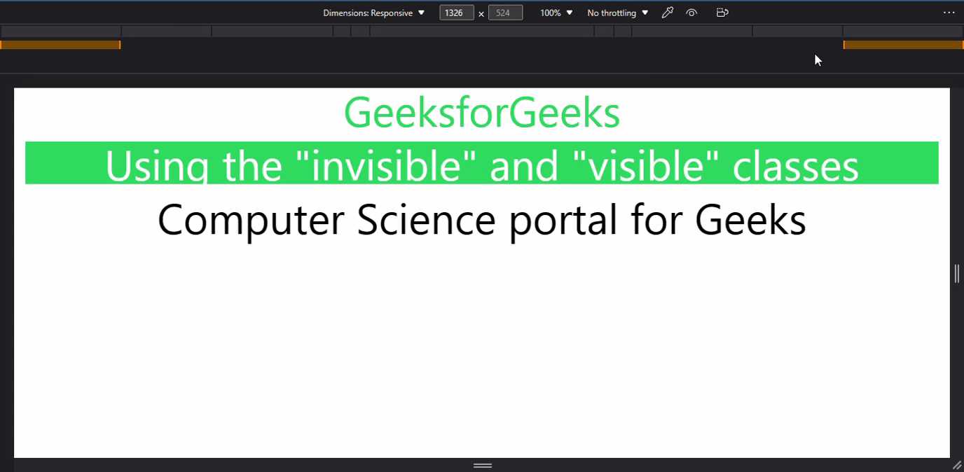
Example: In this example, the element is initially invisible using the “invisible” class. However, when the screen size reaches or exceeds the “lg” breakpoint, the “visible” class overrides the “invisible” class, making the element visible again.
HTML
<!DOCTYPE html>
<html lang="en">
<head>
<meta charset="UTF-8" />
<meta http-equiv="X-UA-Compatible"
content="IE=edge" />
<meta name="viewport"
content="width=device-width,
initial-scale=1.0" />
<script src=
</script>
<title>
How to make elements invisible in mobile size
but visible in laptop size in TailwindCSS
</title>
</head>
<body>
<div class="text-center">
<h1 class="text-green-500 text-6xl">
GeeksforGeeks
</h1>
<div class="invisible text-6xl bg-green-500
m-4 text-white lg:visible">
Using the "invisible" and "visible" classes
</div>
<div class="text-6xl m-4 ">
Computer Science portal for Geeks
</div>
</div>
</body>
</html>
|
Output:
In Conclusion, by utilizing the “hidden” and “block” classes with the “lg:” media query or the “invisible” and “visible” classes with the “lg:” media query, you can easily control the visibility of elements in Tailwind CSS. Choose the approach that best fits your project requirements and achieve the desired responsive behavior effortlessly.
Share your thoughts in the comments
Please Login to comment...