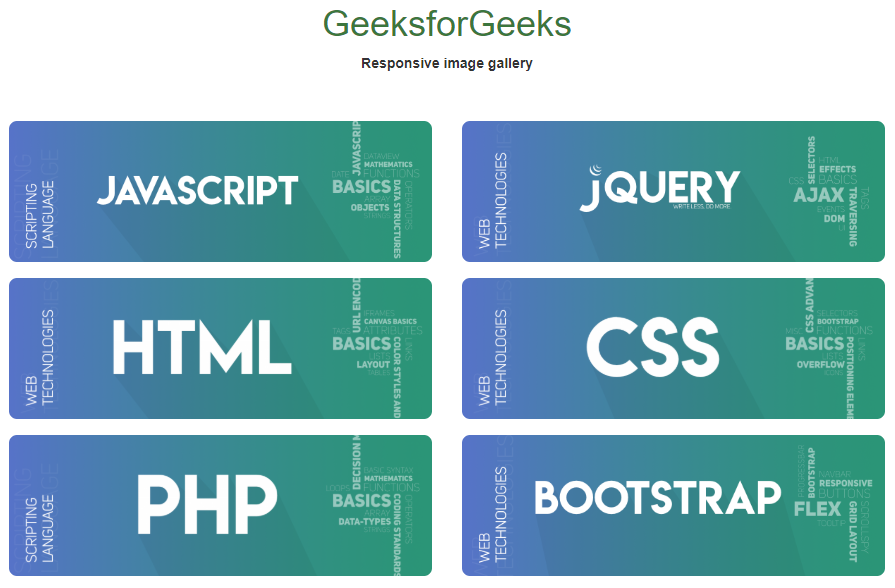
How to create responsive image gallery using HTML, CSS, jQuery and Bootstrap?
Last Updated :
06 Jul, 2023
With the advent of new frameworks in web technologies, it has become quite easy to design and implement feature-rich and responsive web pages. Here, we are going to design a responsive image gallery using HTML, CSS, jQuery, and Bootstrap.
Features or Functionalities to implement:
- Responsive images
- Responsive Grid System
- Image viewer
Prerequisites: Basic knowledge of HTML, CSS, JavaScript, jQuery, and Bootstrap. Also, the user should be aware of how the grid system in Bootstrap works. We will divide the complete solution into three different sections in the first section we will create the structure for the gallery. In the second section, we will design the gallery by using CSS. And in the last section will make it available to respond to the user’s interactions. Creating structure: Initialize HTML layout and responsive images, but we will attach the images by jQuery, in an array format.
Bootstrap code: We will use a bootstrap modal as an image viewer and modify it according to our requirements accordingly. We will render all unnecessary components of the modal transparent. Remember, we are appending the image in the modal, so we need to use on() method to attach functionalities for such selectors.
jQuery code: Below is the script for appending in this manner. We’ll be supposing that we are getting the images from the server (as an array of image URLs in JavaScript). Now we will append the image accordingly in the content panel of our page. Below is the implementation for the same
Javascript
a = [
];
let x = 0;
for (let i = 0; x < a.length; i++) {
let append = "<div class='row'>";
for (let j = 0; j < 6 && x < a.length; j++) {
append += `
<div class="contain col-sm-6 col-md-2">
<img class="img-responsive" src=` + a[x++] + `>
</div>
`;
}
append += '</div>';
appender(append);
}
function appender(x) {
$('#gallery').html(function (i, original_html) {
return (original_html + x);
});
}
$(document).on('click', 'img', function () {
imgAddr = $(this).attr('src');
data = "<center><img src=" + imgAddr + " width='50%'>";
$('#myModal').find('.modal-body').html(data);
$('#myModal').modal();
});
|
html
<!DOCTYPE html>
<html>
<meta charset="utf-8">
<head>
<link rel="stylesheet"
href=
<script src=
</script>
<script src=
</script>
</head>
<body>
<br>
<br>
<center>
<h1 class="text text-success">GeeksforGeeks</h1>
<b>Responsive image gallery</b>
</center>
<br>
<br>
<div class="container-fluid">
<center>
<div id=gallery>
</div>
</center>
<div class="modal fade" id="myModal" role="dialog">
<div class="modal-dialog">
<div class="modal-content">
<div class="modal-header">
<button type="button" class="close"
data-dismiss="modal">
×
</button>
</div>
<div class="modal-body">
</div>
<div class="modal-footer">
</div>
</div>
</div>
</div>
</div>
</body>
</html>
|
CSS
img {
border-radius: 8px;
}
.container-fluid {
margin-left: 12px;
margin-right: 12px
}
.contain {
padding-top: 8px;
padding-bottom: 8px;
}
|
CSS
.modal,
.modal-content,
.modal-header,
.modal-footer {
background-color: transparent;
border: 0px;
color: white;
-webkit-box-shadow: 0px 0px 0px 0px rgba(255, 255, 255, 1);
-moz-box-shadow: 0px 0px 0px 0px rgba(255, 255, 255, 1);
box-shadow: 0px 0px 0px 0px rgba(255, 255, 255, 1);
}
.modal-dialog {
width: 100%;
height: 50%;
margin-top: 8px;
}
.close {
color: white;
opacity: 0.8;
}
.modal-body {
height: 75%;
}
|
Output: To see live running example click here

Share your thoughts in the comments
Please Login to comment...