How to Create Pie Chart Using Plotly in R
Last Updated :
13 Jun, 2023
The pie chart is a circular graphical representation of data that is divided into some slices based on the proportion of it present in the dataset.
In R programming this pie chart can be drawn using Plot_ly() function which is present in the Plotly package. In this article, we are going to plot a pie chart for the default dataset iris which is present in CRAN Repository. In Plotly the pie chart can be plotted in different ways simple, styled, and donut chart.
Loading Libraries
As we require the Plotly library, we can install and load it with the given command.
R
install.packages("plotly")
library(plotly)
|
Loading Dataset
Here, we are using Iris Dataset, so we need to load it. For that run the code below.
R
data(iris)
df<-data.frame(iris)
|
Once we have the dataset, we can now plot the pie chart. Let’s start with the Simple pie chart.
Simple Pie Chart
Syntax : plot_ly(df,type,marker,labels,values) %>% layout()
where,
- df – data frame
- type – used to specify the type of plot we want to visualize
- marker() – function used to set marker genotype objects
- labels – names of categorical variables in the dataset
- values – values of the columns in the dataset that we want to plot are specified here (optional)
- layout() – this function is used to change the layout as required (like assigning a title to the plot…)
R
library(dplyr)
Pie_Data<-count(iris,Species)
plotly::plot_ly(data=Pie_Data,values=~n,labels=~factor(Species),
marker=list(colors=c("green","orange","blue")),
type="pie") %>% layout(title="Species Percentage of Iris Dataset")
|
Output:

pie chart using Plotly in R
- Pie_Data – count(iris, Species): This line counts the number of times each distinct value appears in the Species column of the iris dataset using the count() function from the dplyr package. It produces a brand-new data frame with the name Pie_Data and two columns: Species and n, where n denotes the total number of species.
- plotly::plot_ly(…): Using the plot_ly() function from the Plotly package, this line generates a pie chart. The input data is the Pie_Data data frame.
- data = Pie_Data: This specifies the data frame for the plot’s input data.
- values = “n,” labels = “factor(Species”)”: This sets the pie chart’s values to the Pie_Data’s n column and its labels to that column. The variables are to be indicated by the symbol.
- Sets the colors for the pie chart sectors using marker = list(colors = c(“green”, “orange”, “blue”)). A vector of strings representing the color names is used to specify the colors.
- Specifies the chart type as a pie chart with type = “pie”.%>%: The various function calls are chained together using the pipe operator (%>%).
The layout() function sets the chart’s title to “Species Percentage of Iris Dataset” by substituting “title” for “Species Percentage of Iris Dataset”.
Styled Pie chart
Here we will add the colors, text-info, text-position, etc. to the pie chart.
R
plotly::plot_ly(data=Pie_Data,values=~n,labels=~factor(Species),
textposition="outside",textinfo = 'label+percent',
hoverinfo='label',outsidetextfont = list(color = 'red'),
marker=list(colors=c("grey", 'blue', 'yellow'),
line=list(color="white",width=2)),type="pie") %>%
layout(title="Species Percentage of Iris Dataset")
|
Output:
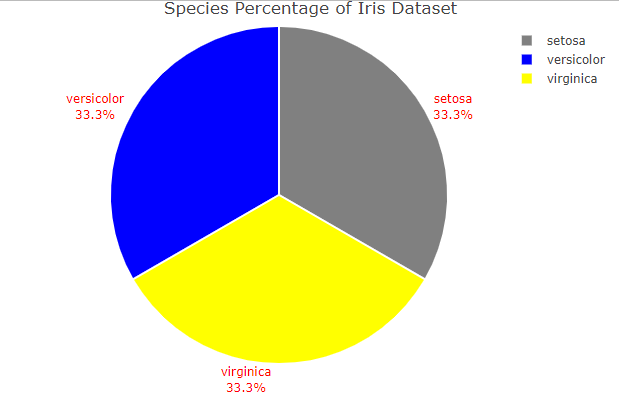
pie chart using Plotly in R
Donut Chart
In the Donut pie chart, we need to mention the hole value.
R
plotly::plot_ly(Pie_Data)%>%
add_pie(Pie_Data,labels=~factor(Species),values=~n,
textinfo="label+percent",type='pie',hole=0.6)%>%
layout(title="Donut Plot Using R")
|
Output:
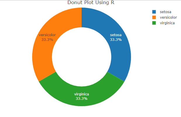
Donut chart using Plotly in R
Custimiozation of Donut charts
We can increase or decrease the circle rediuas by changing hole size of the donut to make more attractive.
R
plotly::plot_ly(Pie_Data)%>%
add_pie(Pie_Data,labels=~factor(Species),values=~n,
textinfo="label+percent",type='pie',hole=0.3)%>%
layout(title="Donut Plot Using R")
|
Output:

Donut chart using Plotly in R
Share your thoughts in the comments
Please Login to comment...