How to create image overlay hover slide effects using CSS ?
Last Updated :
10 Jan, 2024
In this article, we will learn how to make image overlay hover slide effects using CSS. When the users hover over the image, a smooth sliding overlay effect occurs. This technique gives a visual appeal with interactivity, making your website more interactive.
Full Width Slide-In Text and Image Overlay
In this approach, we will create a slide-in effect for text and image overlay on hover. The design is rendered as the full-width visibility of the text and image to provide a pleasing experience to the user. The transition effects add smoothness to the animation.
- Make a basic structure of the project with the elements including <div>, <img>. Link the external stylesheet to the project. The CSS imports the “Poppins” font from Google Fonts for the body.
- The element having the class name “overlaytext” div is initially hidden and positioned at the bottom with
top: 80% and left: 40%
- On hover, it expands to cover the entire box, showing an image background with a slide-up effect.
- The class named “gfg” text is centered within the overlay.
Example: The example illustrates how to create image overlay hover slide effects using CSS.
HTML
<!DOCTYPE html>
<html lang="en">
<head>
<meta charset="UTF-8">
<meta name="viewport"
content="width=device-width,
initial-scale=1.0">
<link rel="stylesheet"
href="style.css">
</head>
<body>
<h1>GeeksforGeeks</h1>
<h3>How to slide text on hover</h3>
<div class="box">
<img src=
alt="img">
<div class="overlaytext">
<div class="gfg">
Welcome to GfG
</div>
</div>
</div>
</body>
</html>
|
CSS
@import url(
body {
font-family: 'Poppins', sans-serif;
}
h1 {
color: green;
}
.gfg {
position: absolute;
top: 80%;
left: 40%;
text-align: center;
color: rgb(248, 248, 228);
font-size: 25px;
font-weight: 700;
}
.box:hover .overlaytext {
bottom: 0;
height: 100%;
width: 100%;
}
.overlaytext {
position: absolute;
bottom: 50%;
left: 0;
right: 0;
overflow: hidden;
width: 100%;
height: 0;
transition: .8s ease;
background-repeat: no-repeat;
background-size: cover;
border-radius: 20px;
background-image:
url(
}
.box {
position: relative;
width: 50%;
border: 5px solid rgb(180, 155, 155);
border-radius: 20px;
}
img {
width: 100%;
height: auto;
border-radius: 20px;
}
|
Output:
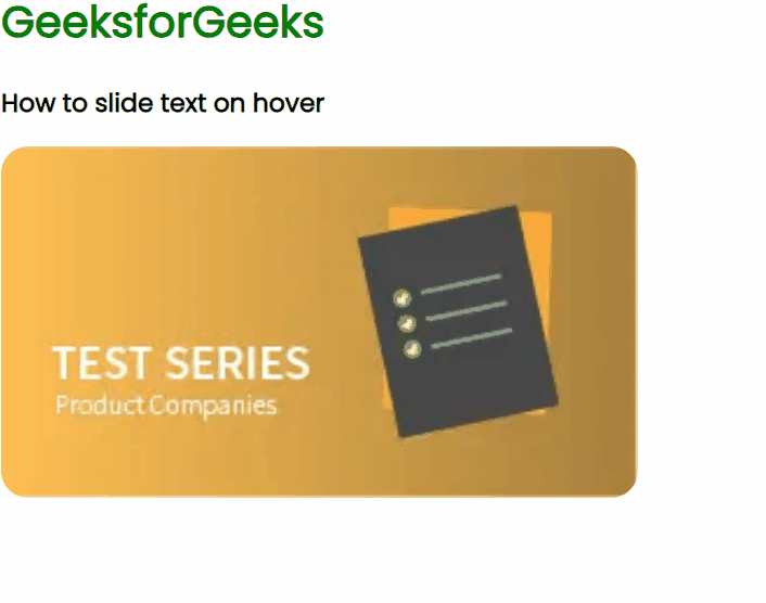
Slide-In Text on Hover with Image Overlay
In this approach, we will create an effect where text slides in from the right side and an image overlay expands on hover.
- Make a basic structure of the project with the elements including <div>, <img>. Link the external stylesheet to the project. The CSS imports the “Poppins” font from Google Fonts for the body.
- For Overlay Text Styling Set the position initially outside the box with
right having value -100%. Apply property positioned absolute with a transition effect of 0.7s for the right property. On hover, the overlay text slides inside by changing the right property to 25%.
- Style the element having class box with Position relative with a maximum width of
500pxand overflows are hidden.
Example: The example illustrates how to create image overlay hover slide effects with Slide-In Text.
HTML
<!DOCTYPE html>
<html lang="en">
<head>
<meta charset="UTF-8">
<meta name="viewport"
content="width=device-width,
initial-scale=1.0">
<link rel="stylesheet"
href="styles.css">
<title>How to slide text on hover</title>
</head>
<body>
<h1>GeeksforGeeks</h1>
<h3>How to slide text on hover</h3>
<div class="box">
<img src=
alt="img">
<div class="overlaytext">
<div class="gfg">
Welcome to GfG
</div>
</div>
</div>
</body>
</html>
|
CSS
@import url(
body {
font-family: 'Poppins', sans-serif;
margin: 0;
}
h1 {
color: green;
text-align: center;
}
h3 {
text-align: center;
}
.gfg {
position: absolute;
top: 30%;
right: -100%;
text-align: center;
color: rgb(248, 248, 228);
font-size: 25px;
font-weight: 700;
transition: right 0.7s ease;
}
.box:hover .gfg {
right: 25%;
}
.overlaytext {
position: absolute;
left: 0;
right: 0;
overflow: hidden;
width: 100%;
height: 0;
transition: .8s ease;
background-repeat: no-repeat;
background-size: cover;
border-radius: 20px;
background-image: url(
}
.box:hover .overlaytext {
bottom: 0;
height: 100%;
}
.box {
position: relative;
max-width: 500px;
margin: 0 auto;
border-radius: 20px;
overflow: hidden;
}
img {
width: 100%;
border-radius: 20px;
}
|
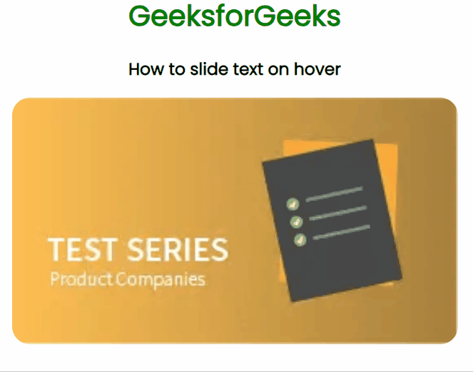
Output:
Share your thoughts in the comments
Please Login to comment...