How to Create an Image Overlay Slide to Bottom Effect on Hover ?
Last Updated :
19 Mar, 2024
Image Overlay Sliding effect in CSS is a user interactive component triggered when the users hover the image and a smooth sliding overlay effect occurs in the application.
These are the following approaches:
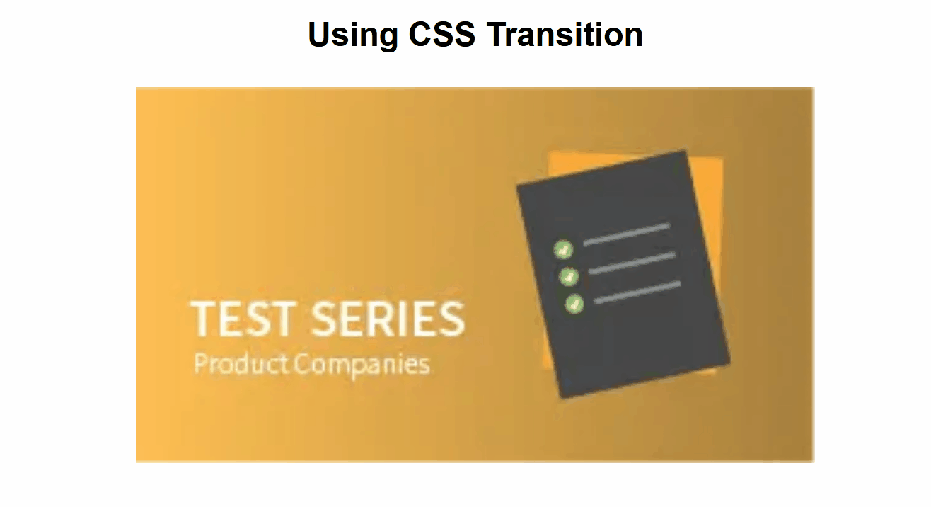
Using CSS Transition
In this approach, we are using CSS Transition to create an image overlay slide-to-bottom effect on hover. The .image-overlay div initially has a bottom of 100 and transitions smoothly to 0 height with a color change when the parent .image-container is hovered, which creates a sliding overlay effect.
Example: The below example uses CSS Transition to create an Image Overlay slide to-bottom effect on hover.
HTML
<!DOCTYPE html>
<html>

<head>
    <style>
        body {
            margin: 0;
            font-family: Arial, sans-serif;
        }

        .image-container {
            position: relative;
            overflow: hidden;
            width: 50%;
            margin: auto;
        }

        .image-overlay {
            text-align: center;
            position: absolute;
            bottom: 100%;
            left: 0;
            right: 0;
            background-color: green;
            overflow: hidden;
            width: 100%;
            height: 0;
            transition: .5s ease;
        }

        .image-container:hover .image-overlay {
            color: aliceblue;
            bottom: 0;
            height: 100%;
        }

        .image {
            width: 100%;
            height: auto;
            display: block;
        }
        h3 {
            text-align: center;
        }
    </style>
</head>
<body>
    <h3>Using CSS Transition</h3>
    <div class="image-container">
        <img class="image"
            src=
 "https://media.geeksforgeeks.org/wp-content/uploads/20240316132055/img1.webp">
        <div class="image-overlay">
            Hello GeeksforGeeks
        </div>
    </div>
</body>

</html>
Output:
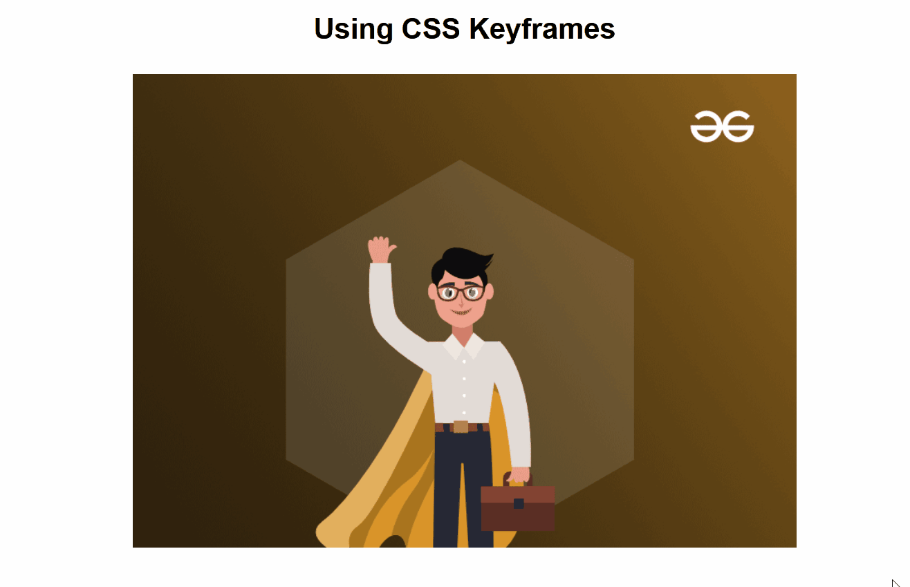
Using CSS Keyframes
In this approach, we are using CSS Keyframes to perform an image overlay slide-to-bottom effect on hover. The .image-overlay div initially has a bottom of 100% and smoothly animates to 0 with a sliding motion, triggered by the hover event on the parent .image-container.
Example: The below example uses CSS Keyframes to create an Image Overlay slide-to-bottom effect on hover.
HTML
<!DOCTYPE html>
<html>

<head>
    <style>
        body {
            margin: 0;
            font-family: Arial, sans-serif;
        }

        .image-container {
            position: relative;
            overflow: hidden;
            width: 50%;
            margin: auto;
        }

        .image-overlay {
            position: absolute;
            bottom: 100%;
            left: 0;
            right: 0;
            background-color: green;
            overflow: hidden;
            width: 100%;
            height: 0;
            transition: height 0.5s ease;
        }

        .image-container:hover .image-overlay {
            animation: slideFromBottom 0.5s ease forwards;
        }

        @keyframes slideFromBottom {
            0% {
                height: 0;
                bottom: 100%;
            }
            100% {
                height: 100%;
                bottom: 0;
            }
        }

        .image {
            width: 100%;
            height: auto;
            display: block;
        }

        h1 {
            color: #008000;
            text-align: center;
        }

        h3 {
            text-align: center;
        }
    </style>
</head>

<body>
    <h3>Using CSS Keyframes</h3>
    <div class="image-container">
        <img class="image"
              src=
 "https://media.geeksforgeeks.org/wp-content/uploads/20240316132219/img2.png">
        <div class="image-overlay">
            <img class="image"
                src=
 "https://media.geeksforgeeks.org/wp-content/uploads/20190802021607/geeks14.png"
                alt="Overlay Image">
        </div>
    </div>
</body>

</html>
Output:
Share your thoughts in the comments
Please Login to comment...