How To Create a Responsive Table in CSS ?
Last Updated :
02 Apr, 2024
Creating a responsive table is important for ensuring that the table’s content remains accessible and readable on devices with different screen sizes and resolutions.
The below approaches can be used to make a table responsive:
Using Media Queries
In this approach, we are using Media Queries to make the table responsive. Media query switches the table layout to a vertical display when the screen becomes narrower than 600px. Each cell’s content is preceded by a data label for clarity. This approach ensures readability and accessibility on small screens by stacking the table cells vertically.
Example: This example uses media queries to create a responsive table in CSS.
HTML
<!DOCTYPE html>
<html lang="en">
<head>
<meta charset="UTF-8">
<meta name="viewport" content=
"width=device-width, initial-scale=1.0">
<title>Responsive Table</title>
<style>
table {
width: 100%;
border-collapse: collapse;
}
th,
td {
padding: 8px;
border: 1px solid #ddd;
}
@media screen and (max-width: 600px) {
table,
thead,
tbody,
th,
td,
tr {
display: block;
}
thead tr {
position: absolute;
top: -9999px;
left: -9999px;
}
tr {
margin-bottom: 20px;
border: 1px solid #ddd;
}
td {
border: none;
position: relative;
padding-left: 50%;
}
td:before {
position: absolute;
left: 6px;
content: attr(data-label);
font-weight: bold;
}
}
</style>
</head>
<body>
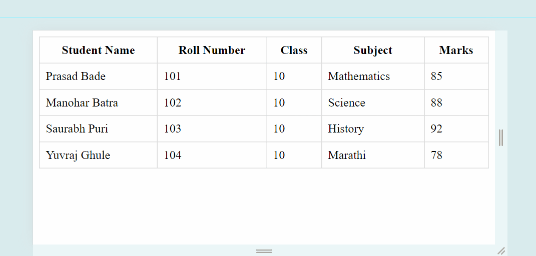
<table>
<thead>
<tr>
<th>Student Name</th>
<th>Roll Number</th>
<th>Class</th>
<th>Subject</th>
<th>Marks</th>
</tr>
</thead>
<tbody>
<tr>
<td data-label="Student Name">
Prasad Bade
</td>
<td data-label="Roll Number">101</td>
<td data-label="Class">10</td>
<td data-label="Subject">Mathematics</td>
<td data-label="Marks">85</td>
</tr>
<tr>
<td data-label="Student Name">
Manohar Batra
</td>
<td data-label="Roll Number">102</td>
<td data-label="Class">10</td>
<td data-label="Subject">Science</td>
<td data-label="Marks">88</td>
</tr>
<tr>
<td data-label="Student Name">
Saurabh Puri
</td>
<td data-label="Roll Number">103</td>
<td data-label="Class">10</td>
<td data-label="Subject">History</td>
<td data-label="Marks">92</td>
</tr>
<tr>
<td data-label="Student Name">
Yuvraj Ghule
</td>
<td data-label="Roll Number">104</td>
<td data-label="Class">10</td>
<td data-label="Subject">Marathi</td>
<td data-label="Marks">78</td>
</tr>
</tbody>
</table>
</body>
</html>
Output:
Using overflow-x property
In this approach, we will use the overflow-x property and set it to auto to enable horizontal scrolling on small screens. This property value (auto) instructs the browser to show a horizontal scrollbar only when the content overflows, allowing users to scroll horizontally to view the hidden content.
Example: The below example uses overflow-x property to create responsive table in CSS.
HTML
<!DOCTYPE html>
<html>

<head>
    <meta name="viewport" content=
"width=device-width, initial-scale=1">
    <style>
        table {
            width: 100%;
            border: 1px solid blue;
        }

        th,
        td {
            text-align: left;
            padding: 8px;
        }
    </style>
</head>

<body>
    <div style="overflow-x:auto;">
        <table>
            <thead>
                <tr>
                    <th>Student Name</th>
                    <th>Roll Number</th>
                    <th>Class</th>
                    <th>Subject</th>
                    <th>Marks</th>
                    <th>Grade</th>
                    <th>Attendance</th>
                    <th>Behavior</th>
                </tr>
            </thead>
            <tbody>
                <tr>
                    <td data-label="Student Name">
                        Prasad Bade
                    </td>
                    <td data-label="Roll Number">101</td>
                    <td data-label="Class">10</td>
                    <td data-label="Subject">Mathematics</td>
                    <td data-label="Marks">85</td>
                    <td data-label="Grade">A</td>
                    <td data-label="Attendance">90%</td>
                    <td data-label="Behavior">Good</td>
                </tr>
                <tr>
                    <td data-label="Student Name">
                        Manohar Batra
                    </td>
                    <td data-label="Roll Number">102</td>
                    <td data-label="Class">10</td>
                    <td data-label="Subject">Science</td>
                    <td data-label="Marks">88</td>
                    <td data-label="Grade">A</td>
                    <td data-label="Attendance">95%</td>
                    <td data-label="Behavior">Excellent</td>
                </tr>
                <tr>
                    <td data-label="Student Name">
                        Saurabh Puri
                    </td>
                    <td data-label="Roll Number">103</td>
                    <td data-label="Class">10</td>
                    <td data-label="Subject">History</td>
                    <td data-label="Marks">92</td>
                    <td data-label="Grade">A</td>
                    <td data-label="Attendance">85%</td>
                    <td data-label="Behavior">Excellent</td>
                </tr>
                <tr>
                    <td data-label="Student Name">
                        Yuvraj Ghule
                    </td>
                    <td data-label="Roll Number">104</td>
                    <td data-label="Class">10</td>
                    <td data-label="Subject">Marathi</td>
                    <td data-label="Marks">78</td>
                    <td data-label="Grade">B</td>
                    <td data-label="Attendance">80%</td>
                    <td data-label="Behavior">
                        Satisfactory
                    </td>
                </tr>
            </tbody>
        </table>

    </div>
</body>

</html>
Output:

Share your thoughts in the comments
Please Login to comment...