How to Create a Responsive Table in Bootstrap ?
Last Updated :
05 Mar, 2024
Bootstrap makes it easy to create responsive tables that look great on any device like mobile, tablet, PC, and Laptop. In this post, we’ll explore how to create a responsive table in Bootstrap using the grid system and utility classes.
Using the table-responsive class
Using the “.table-responsive” class Wrapping a table in a div with the “.table-responsive” class will make the table scroll horizontally on small screens. The table will behave normally on larger screens. This creates a responsive wrapper that detects when the table is too wide for the viewport and enables horizontal scrolling. The widths of the columns are maintained rather than wrapped. This approach is mainly used when you have a fixed no of columns However, it may not be the best choice for tables with a large number of columns, as it can be difficult to scroll horizontally on small screens.
Example: To demonstrate creating a responsive table using table responsive class showcasing students’ information with columns such as Index, First Name, Last Name, Age, and Enrolled Course.
HTML
<!DOCTYPE html>
<html lang="en">
<head>
<meta charset="UTF-8">
<meta name="viewport"
content="width=device-width, initial-scale=1.0">
<title>Sticky Footer with Bootstrap 5</title>
<link href=
rel=
"stylesheet">
<script src=
</script>
</head>
<body>
<div class="text-center py-3 mb-4 border-bottom">
<h1 style="color: green;">
GeeksForGeeks Student Data:
</h1>
</div>
<div class="table-responsive">
<table class="table table-striped
table-bordered table-hover">
<thead>
<tr>
<th>Index</th>
<th>First Name</th>
<th>Last Name</th>
<th>Age</th>
<th>Enrolled Course</th>
</tr>
</thead>
<tbody>
<tr>
<td>1</td>
<td>Rahul </td>
<td>Mishra</td>
<td>23</td>
<td>DSA In JAVA</td>
</tr>
<tr>
<td>2</td>
<td>Raj </td>
<td>Shukla</td>
<td>23</td>
<td>Advanced Java</td>
</tr>
<tr>
<td>3</td>
<td>Prahant </td>
<td>Shuka</td>
<td>19</td>
<td>Web Development</td>
</tr>
</tbody>
</table>
</div>
</body>
</html>
|
Output:
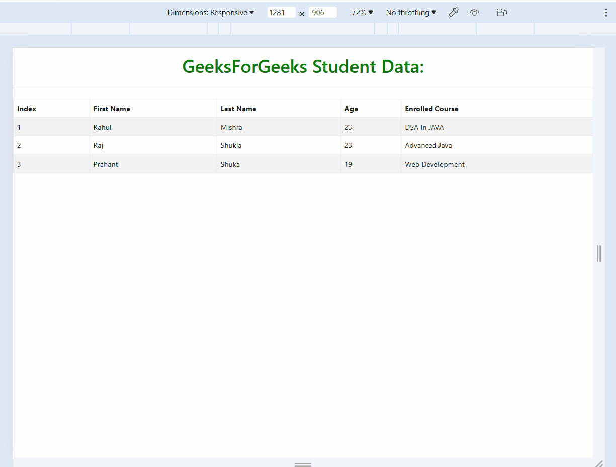
table-1
The “table-scrollable” class is not a built-in class in Bootstrap, but you can create it yourself by adding some custom CSS. The main concept of this approach is to create a fixed-height “<div>” element that contains the table, and then add an overflow-y property to allow vertical scrolling. Add .table-scrollable class to the <div> wrapping the table. This makes the table scrollable horizontally while keeping the table header fixed when scrolling vertically. Columns stay the same width regardless of screen size. May require custom CSS for specialized layouts.
Example: To demonstrate creating a responsive table using table-scrollable class showcasing students’ information with columns such as Index, First Name, Last Name, Age, and Enrolled Course.
HTML
<!DOCTYPE html>
<html lang="en">
<head>
<meta charset="UTF-8">
<meta name="viewport" content=
"width=device-width, initial-scale=1.0">
<title>Sticky Footer with Bootstrap 5</title>
<link href=
rel="stylesheet">
<script src=
</script>
</head>
<body>
<div class="text-center py-3 mb-4 border-bottom">
<h1 style="color: green;">GeeksForGeeks Student Data:</h1>
</div>
<div class="table-scrollable">
<table class="table table-striped table-bordered table-hover">
<thead>
<tr>
<th>Index</th>
<th>First Name</th>
<th>Last Name</th>
<th>Age</th>
<th>Enrolled Course</th>
</tr>
</thead>
<tbody>
<tr>
<td>1</td>
<td>Rahul </td>
<td>Mishra</td>
<td>23</td>
<td>DSA In JAVA</td>
</tr>
<tr>
<td>2</td>
<td>Raj </td>
<td>Shukla</td>
<td>23</td>
<td>Advanced Java</td>
</tr>
<tr>
<td>3</td>
<td>Prahant </td>
<td>Shuka</td>
<td>19</td>
<td>Web Development</td>
</tr>
</tbody>
</table>
</div>
</body>
</html>
|
Output:
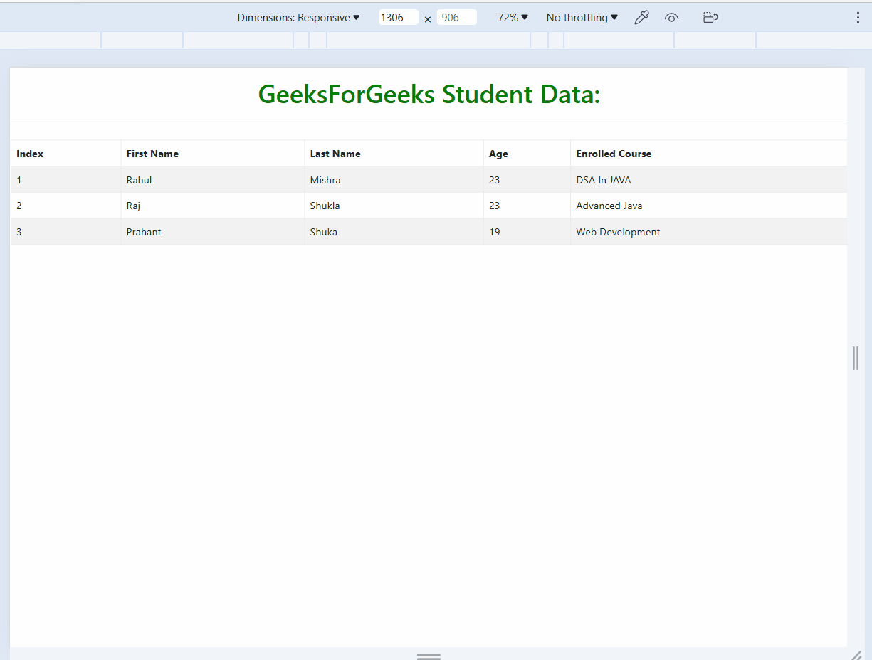
table-2
Using the Bootstrap Grid System
In this approach, we are creating a grid layout with a row for each table row and a column for each table cell. You can then use the grid system’s built-in utilities classes to control the visibility and display of the columns on different screen sizes. This approach is more flexible than the “table-responsive” and “table-scrollable” classes, as it allows you to control the visibility and display of each column on different screen sizes. In this approach, we wrap each table column in a div with a grid column class like .col-md-4. Sets column widths using the grid system rather than table layout. Columns will stack responsively based on screen size. Allows for more custom column widths. Requires more markup changes than other approaches.
Example: To demonstrate creating a responsive table using bootstrap grid system showcasing students’ information with columns such as Index, First Name, Last Name, Age, and Enrolled Course.
HTML
<!DOCTYPE html>
<html lang="en">
<head>
<meta charset="UTF-8">
<meta name="viewport" content="width=device-width,
initial-scale=1.0">
<title>Sticky Footer with Bootstrap 5</title>
<link href=
rel="stylesheet">
<script src=
</script>
</head>
<body>
<div class="text-center py-3 mb-4 border-bottom">
<h1 style="color: green;">
GeeksForGeeks Student Data:
</h1>
</div>
<div class="container">
<div class="row">
<div class="col">
<table class="table table-striped table-bordered table-hover">
<thead>
<tr>
<th>Index</th>
<th scope="col">First Name</th>
<th scope="col">Last Name</th>
<th scope="col">Age</th>
<th scope="col">Enrolled Course</th>
</tr>
</thead>
<tbody>
<tr>
<th scope="row">1</th>
<td>Raj </td>
<td>Shukla</td>
<td>23</td>
<td>Advanced Java</td>
</tr>
<tr>
<th scope="row">2</th>
<td>Rahul </td>
<td>Mishra</td>
<td>23</td>
<td>DSA In JAVA</td>
</tr>
<tr>
<th scope="row">3</th>
<td>Prahant </td>
<td>Shuka</td>
<td>19</td>
<td>Web Development</td>
</tr>
</tbody>
</table>
</div>
</div>
</div>
</body>
</html>
|
Output:
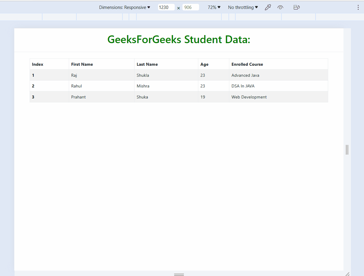
table-3
Share your thoughts in the comments
Please Login to comment...