How to create a Responsive Carousel in React JS ?
Last Updated :
08 Mar, 2024
A carousel, often seen in web and mobile applications, is a user interface component used to display a set of content items such as images or text in a rotating manner. It allows users to view multiple items within a limited space by scrolling horizontally or vertically through the content.
In this article, we will look at how to create a responsive carousel for a website built with React JS without using Bootstrap or any other CSS framework.
Output Preview: Let us have a look at how the final output will look like.

Project Preview
Steps to Create a responsive carousel:
Step 1: Create a React project using the following command.
npx create-react-app carousel
cd carousel
Step 2: Install the required dependencies using the following command.
npm install react-slick slick-carousel
Folder Structure:
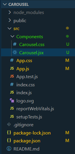
Folder Structure
The updated dependencies in package.json file will look like:
"dependencies": {
    "@testing-library/jest-dom": "^5.17.0",
    "@testing-library/react": "^13.4.0",
    "@testing-library/user-event": "^13.5.0",
    "react": "^18.2.0",
    "react-dom": "^18.2.0",
    "react-scripts": "5.0.1",
    "react-slick": "^0.30.2",
    "slick-carousel": "^1.8.1",
    "web-vitals": "^2.1.4"
}
Example of Responsive Carousel in React
Code: Create the required files as seen in the folder structure and add the following codes.
CSS
.full-width-carousel {
width: 100%;
margin: 0 auto;
}
.full-width-slide {
width: 100vw;
height: 60vh;
display: flex;
justify-content: center;
align-items: center;
}
.full-width-slide img {
max-width: 100%;
max-height: 100%;
object-fit: cover;
}
.slide-image {
width: 100%;
height: auto;
}
|
Javascript
import Carousel from "./Components/Carousel";
function App() {
return (
<>
<h2 style={{ textAlign: "center" }}>Carousel Show</h2>
<Carousel />
</>
)
}
export default App;
|
Javascript
import React from 'react';
import Slider from 'react-slick';
import './Carousel.css';
import 'slick-carousel/slick/slick.css';
import 'slick-carousel/slick/slick-theme.css';
const Carousel = () => {
const settings = {
dots: true,
infinite: true,
speed: 500,
slidesToShow: 1,
slidesToScroll: 1,
appendDots: dots => (
<div>
<ul style={{
margin: "0px", padding: "0px"
}}> {dots} </ul>
</div>
),
responsive: [
{
breakpoint: 1024,
settings: {
slidesToShow: 1,
slidesToScroll: 1,
infinite: true,
dots: true
}
},
{
breakpoint: 600,
settings: {
slidesToShow: 1,
slidesToScroll: 1,
initialSlide: 1
}
}
]
};
return (
<>
<div className="full-width-carousel">
<Slider {...settings}>
<div className="full-width-slide">
<img src=
alt="Slide 1"
className="slide-image" />
</div>
<div className="full-width-slide">
<img src=
alt="Slide 2"
className="slide-image" />
</div>
<div className="full-width-slide">
<img src=
alt="Slide 3"
className="slide-image" />
</div>
</Slider>
</div>
</>
);
};
export default Carousel;
|
To start the application run the following command.
npm start
Output:

Final Output
Share your thoughts in the comments
Please Login to comment...