How to create a 3D Flip Box with CSS ?
Last Updated :
21 Feb, 2024
The 3D Flip Box effect is a CSS3 transform function that creates a mirror image of the container box and flips all the inner elements of the container as well. You don’t need to use JavaScript to achieve this effect.
Approach
- Create an HTML document containing the div element ‘flip_box’. Inside it creates another div element ‘inner’ that will have two children div elements ‘front’ and ‘back’. These ‘front’ and ‘back’ elements will contain the text respective to their class names.
- Link the CSS file with the HTML file using the ‘link’ tag.
- In the CSS file, design the parent div by adding ‘width’, ‘height’, ‘border’, etc. Then design the children elements adding background colors to them.
- Add the ‘transform’ property to the parent div so that when you hover over it, the desired Flip Box effect is displayed.
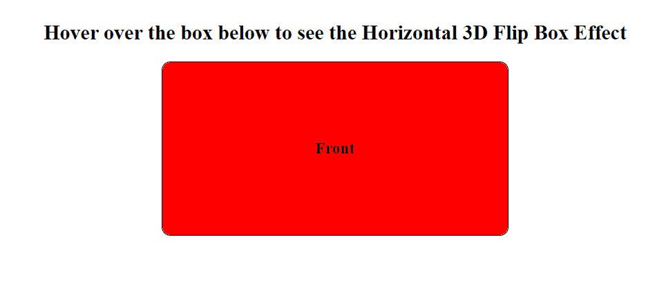
Example 1: Implementation to show horizontal 3D Flip Box Effect.
HTML
<!DOCTYPE html>
<html>
<head>
<title>3D Flip Box</title>
<link rel="stylesheet" href="styles.css" />
</head>
<body>
<h2>
Hover over the box below to
see the Horizontal 3D Flip Box Effect
</h2>
<div class="flip_box">
<div class="inner">
<div class="front">
<h3>Front</h3>
</div>
<div class="back">
<h3>Back</h3>
</div>
</div>
</div>
</body>
</html>
|
CSS
.flip_box {
width: 400px;
height: 200px;
border: 1px solid black;
border-radius: 10px;
perspective: 1000px;
margin-left: auto;
margin-right: auto;
}
h2 {
text-align: center;
}
.inner {
position: relative;
width: 100%;
height: 100%;
text-align: center;
transition: transform 1s;
transform-style: preserve-3d;
}
.flip_box:hover .inner {
transform: rotateY(180deg);
}
.front,
.back {
position: absolute;
width: 100%;
height: 100%;
border-radius: 10px;
-webkit-backface-visibility: hidden;
backface-visibility: hidden;
}
.front {
background-color: red;
color: black;
display: flex;
align-items: center;
justify-content: center;
}
.back {
background-color: green;
color: white;
display: flex;
align-items: center;
justify-content: center;
transform: rotateY(180deg);
}
|
Output:
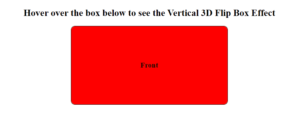
Example 2: Implementation to show Verticle 3D Flip Box Effect.
HTML
<!DOCTYPE html>
<html>
<head>
<title>3D Flip Box</title>
<link rel="stylesheet" href="styles.css" />
</head>
<body>
<h2>Hover over the box below to see the Vertical 3D Flip Box Effect</h2>
<div class="flip_box">
<div class="inner">
<div class="front">
<h3>Front</h3>
</div>
<div class="back">
<h3>Back</h3>
</div>
</div>
</div>
</body>
</html>
|
CSS
.flip_box {
width: 400px;
height: 200px;
border: 1px solid black;
border-radius: 10px;
perspective: 1000px;
margin-left: auto;
margin-right: auto;
}
h2 {
text-align: center;
}
.inner {
position: relative;
width: 100%;
height: 100%;
text-align: center;
transition: transform 1s;
transform-style: preserve-3d;
}
.flip_box:hover .inner {
transform: rotateX(180deg);
}
.front,
.back {
position: absolute;
width: 100%;
height: 100%;
border-radius: 10px;
-webkit-backface-visibility: hidden;
backface-visibility: hidden;
}
.front {
background-color: red;
color: black;
display: flex;
align-items: center;
justify-content: center;
}
.back {
background-color: green;
color: white;
display: flex;
align-items: center;
justify-content: center;
transform: rotateX(180deg);
}
|
Output:
Share your thoughts in the comments
Please Login to comment...