Angular is one of the popular JavaScript libraries that allows web developers to develop dynamic and interactive single-page applications. There are different components that are used in the user interfaces to provide functionality in the application. One of the components is the Dropdown Menus, which allows users to select the choice item from the list of many items. While developing the ngbDropdown Menu in Angular, we need to add validation to these menus to make sure that user experiences by preventing invalid selections and guiding users toward selecting the proper choices. In this article, we will see how we can validate the ngbDropdown menu in Angular with two different scenarios or Approaches.
Installation Syntax
Before we proceed to install & configure the Angular Bootstrap, we need to install the Angular CLI. Please refer to the Build an App with Angular and Angular CLI article for a detailed description of the installation.
- Now, to use the Angular Bootstrap, follow the below command:
npm install --save @ng-bootstrap/ng-bootstrap
ng add @angular/material
- Import ng bootstrap module in app.module.ts file.
import { NgbModule } from '@ng-bootstrap/ng-bootstrap';
imports: [
    NgbModule
]
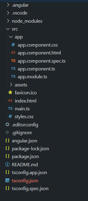
Project Structure
After following the above installation process, the below project structure will be generated.
Example 1: In this example, we will validate the ngbDropDownMenu in Angular.
Javascript
import { Component } from '@angular/core';
import { FormBuilder, FormGroup, Validators }
from '@angular/forms';
@Component({
selector: 'app-root',
templateUrl: './app.component.html',
styleUrls: ['./app.component.css'],
})
export class AppComponent {
dropdownItems: string[] =
['GFG Bag', 'GFG Tshirt', 'GFG Hoodie'];
selectedItem: string = '';
dropdownForm: FormGroup;
dropdownVisible: boolean = false;
constructor(private formBuilder: FormBuilder) {
this.dropdownForm = this.formBuilder.group({
selectedItem: ['', Validators.required],
});
}
toggleDropdown(): void {
this.dropdownVisible = !this.dropdownVisible;
}
submitForm(): void {
if (this.dropdownForm.valid) {
this.selectedItem =
this.dropdownForm.value.selectedItem;
this.dropdownForm.reset();
this.toggleDropdown();
} else {
window.alert('Please select an item.');
}
}
}
|
Javascript
import { BrowserModule }
from '@angular/platform-browser';
import { NgModule } from '@angular/core';
import { ReactiveFormsModule }
from '@angular/forms';
import { AppComponent } from './app.component';
@NgModule({
declarations: [AppComponent],
imports: [
BrowserModule,
ReactiveFormsModule
],
providers: [],
bootstrap: [AppComponent]
})
export class AppModule { }
|
HTML
<div class="container">
<h1 class="page-title">GeeksforGeeks</h1>
<h3 class="page-title1">
Add validation to ngbDropdownMenu in Angular
</h3>
<div class="dropdown-container">
<div ngbDropdown class="dropdown">
<button class="dropdown-button"
id="validation-dropdown"
(click)="toggleDropdown()">
Open Dropdown
</button>
<div class="dropdown-menu"
*ngIf="dropdownVisible"
aria-labelledby="validation-dropdown" ngbDropdownMenu>
<form [formGroup]="dropdownForm"
(ngSubmit)="submitForm()"
class="form">
<div class="form-group">
<label for="dropdownSelect">
Select an Item:
</label>
<select id="dropdownSelect"
class="form-control"
formControlName="selectedItem" ngbDropdownToggle>
<option value="" disabled>
Select an option
</option>
<option *ngFor="let item of dropdownItems"
[value]="item">
{{ item }}
</option>
</select>
<div class="error-message"
*ngIf=
"dropdownForm.get('selectedItem')?.hasError('required')">
Please select an item.
</div>
</div>
<button type="submit"
class="btn-primary">
Submit
</button>
</form>
</div>
</div>
</div>
<p class="validation-message"
*ngIf="selectedItem">
You have selected: {{ selectedItem }}
</p>
</div>
|
CSS
.container {
display: flex;
flex-direction: column;
align-items: center;
justify-content: flex-start;
min-height: 100vh;
background-color: #f0f2f5;
}
.header {
text-align: center;
margin-bottom: 30px;
}
.geeks-title {
font-size: 36px;
color: #28a745;
margin-bottom: 5px;
}
.page-title {
font-size: 24px;
color: #28a745;
}
.dropdown-container {
text-align: center;
position: relative;
}
.dropdown-button {
padding: 12px 24px;
background-color: #007bff;
color: #fff;
border: none;
border-radius: 8px;
cursor: pointer;
transition: background-color 0.3s;
font-size: 16px;
margin-bottom: 10px;
}
.dropdown-button:hover {
background-color: #0056b3;
}
.dropdown-menu {
position: absolute;
top: calc(100% + 10px);
left: 50%;
transform: translateX(-50%);
width: 260px;
padding: 12px;
background-color: #fff;
border: 1px solid #ccc;
border-radius: 8px;
box-shadow: 0px 5px 10px rgba(0, 0, 0, 0.1);
z-index: 1000;
text-align: left;
}
.form-group {
margin-bottom: 20px;
}
.form-control {
width: 100%;
padding: 12px;
border: 1px solid #ccc;
border-radius: 8px;
font-size: 16px;
}
.btn-primary {
background-color: #28a745;
color: #fff;
border: none;
border-radius: 8px;
padding: 12px 24px;
cursor: pointer;
font-size: 16px;
}
.btn-primary:hover {
background-color: #218838;
}
.error-message {
color: #dc3545;
font-size: 14px;
margin-top: 5px;
}
.validation-message {
margin-top: 10px;
text-align: center;
color: #28a745;
font-size: 14px;
}
|
Below are the configuration files:
{
    "name": "ngb-dropdown-validation-example",
    "version": "0.0.0",
    "scripts": {
        "ng": "ng",
        "start": "ng serve",
        "build": "ng build",
        "watch": "ng build --watch --configuration development",
        "test": "ng test"
    },
    "private": true,
    "dependencies": {
        "@angular/animations": "^16.2.0",
        "@angular/cdk": "^16.2.0",
        "@angular/common": "^16.2.0",
        "@angular/compiler": "^16.2.0",
        "@angular/core": "^16.2.0",
        "@angular/forms": "^16.2.0",
        "@angular/material": "^16.2.0",
        "@angular/platform-browser": "^16.2.0",
        "@angular/platform-browser-dynamic": "^16.2.0",
        "@angular/router": "^16.2.0",
        "@ng-bootstrap/ng-bootstrap": "^15.1.1",
        "bootstrap": "^5.3.1",
        "rxjs": "~7.8.0",
        "tslib": "^2.3.0",
        "zone.js": "~0.13.0"
    },
    "devDependencies": {
        "@angular-devkit/build-angular": "^16.2.0",
        "@angular/cli": "~16.2.0",
        "@angular/compiler-cli": "^16.2.0",
        "@types/jasmine": "~4.3.0",
        "jasmine-core": "~4.6.0",
        "karma": "~6.4.0",
        "karma-chrome-launcher": "~3.2.0",
        "karma-coverage": "~2.2.0",
        "karma-jasmine": "~5.1.0",
        "karma-jasmine-html-reporter": "~2.1.0",
        "typescript": "~5.1.3"
    }
}
{
    "$schema": "./node_modules/@angular/cli/lib/config/schema.json",
    "version": 1,
    "newProjectRoot": "projects",
    "projects": {
        "ngb-dropdown-validation-example": {
            "projectType": "application",
            "schematics": {},
            "root": "",
            "sourceRoot": "src",
            "prefix": "app",
            "architect": {
                "build": {
                    "builder": "@angular-devkit/build-angular:browser",
                    "options": {
                        "outputPath": "dist/ngb-dropdown-validation-example",
                        "index": "src/index.html",
                        "main": "src/main.ts",
                        "polyfills": [
                            "zone.js"
                        ],
                        "tsConfig": "tsconfig.app.json",
                        "assets": [
                            "src/favicon.ico",
                            "src/assets"
                        ],
                        "styles": [
                            "@angular/material/prebuilt-themes/deeppurple-amber.css",
                            "src/styles.css"
                        ],
                        "scripts": []
                    },
                    "configurations": {
                        "production": {
                            "budgets": [
                                {
                                    "type": "initial",
                                    "maximumWarning": "500kb",
                                    "maximumError": "1mb"
                                },
                                {
                                    "type": "anyComponentStyle",
                                    "maximumWarning": "2kb",
                                    "maximumError": "4kb"
                                }
                            ],
                            "outputHashing": "all"
                        },
                        "development": {
                            "buildOptimizer": false,
                            "optimization": false,
                            "vendorChunk": true,
                            "extractLicenses": false,
                            "sourceMap": true,
                            "namedChunks": true
                        }
                    },
                    "defaultConfiguration": "production"
                },
                "serve": {
                    "builder": "@angular-devkit/build-angular:dev-server",
                    "configurations": {
                        "production": {
                            "browserTarget": "ngb-dropdown-validation-example:build:production"
                        },
                        "development": {
                            "browserTarget": "ngb-dropdown-validation-example:build:development"
                        }
                    },
                    "defaultConfiguration": "development"
                },
                "extract-i18n": {
                    "builder": "@angular-devkit/build-angular:extract-i18n",
                    "options": {
                        "browserTarget": "ngb-dropdown-validation-example:build"
                    }
                },
                "test": {
                    "builder": "@angular-devkit/build-angular:karma",
                    "options": {
                        "polyfills": [
                            "zone.js",
                            "zone.js/testing"
                        ],
                        "tsConfig": "tsconfig.spec.json",
                        "assets": [
                            "src/favicon.ico",
                            "src/assets"
                        ],
                        "styles": [
                            "@angular/material/prebuilt-themes/deeppurple-amber.css",
                            "src/styles.css"
                        ],
                        "scripts": []
                    }
                }
            }
        }
    },
    "cli": {
        "analytics": false
    }
}
{
  "extends": "./tsconfig.json",
  "compilerOptions": {
    "outDir": "./out-tsc/app",
    "types": []
  },
  "files": [
    "src/main.ts"
  ],
  "include": [
    "src/**/*.d.ts"
  ]
}
{
  "compileOnSave": false,
  "compilerOptions": {
    "baseUrl": "./",
    "outDir": "./dist/out-tsc",
    "forceConsistentCasingInFileNames": true,
    "strict": true,
    "noImplicitOverride": true,
    "noPropertyAccessFromIndexSignature": true,
    "noImplicitReturns": true,
    "noFallthroughCasesInSwitch": true,
    "sourceMap": true,
    "declaration": false,
    "downlevelIteration": true,
    "experimentalDecorators": true,
    "moduleResolution": "node",
    "importHelpers": true,
    "target": "es5",
    "module": "es2022",
    "useDefineForClassFields": false,
    "lib": [
      "es2022",
      "dom"
    ]
  },
  "angularCompilerOptions": {
    "enableI18nLegacyMessageIdFormat": false,
    "strictInjectionParameters": true,
    "strictInputAccessModifiers": true,
    "strictTemplates": true
  }
}
{
  "extends": "./tsconfig.json",
  "compilerOptions": {
    "outDir": "./out-tsc/spec",
    "types": [
      "jasmine"
    ]
  },
  "include": [
    "src/**/*.spec.ts",
    "src/**/*.d.ts"
  ]
}
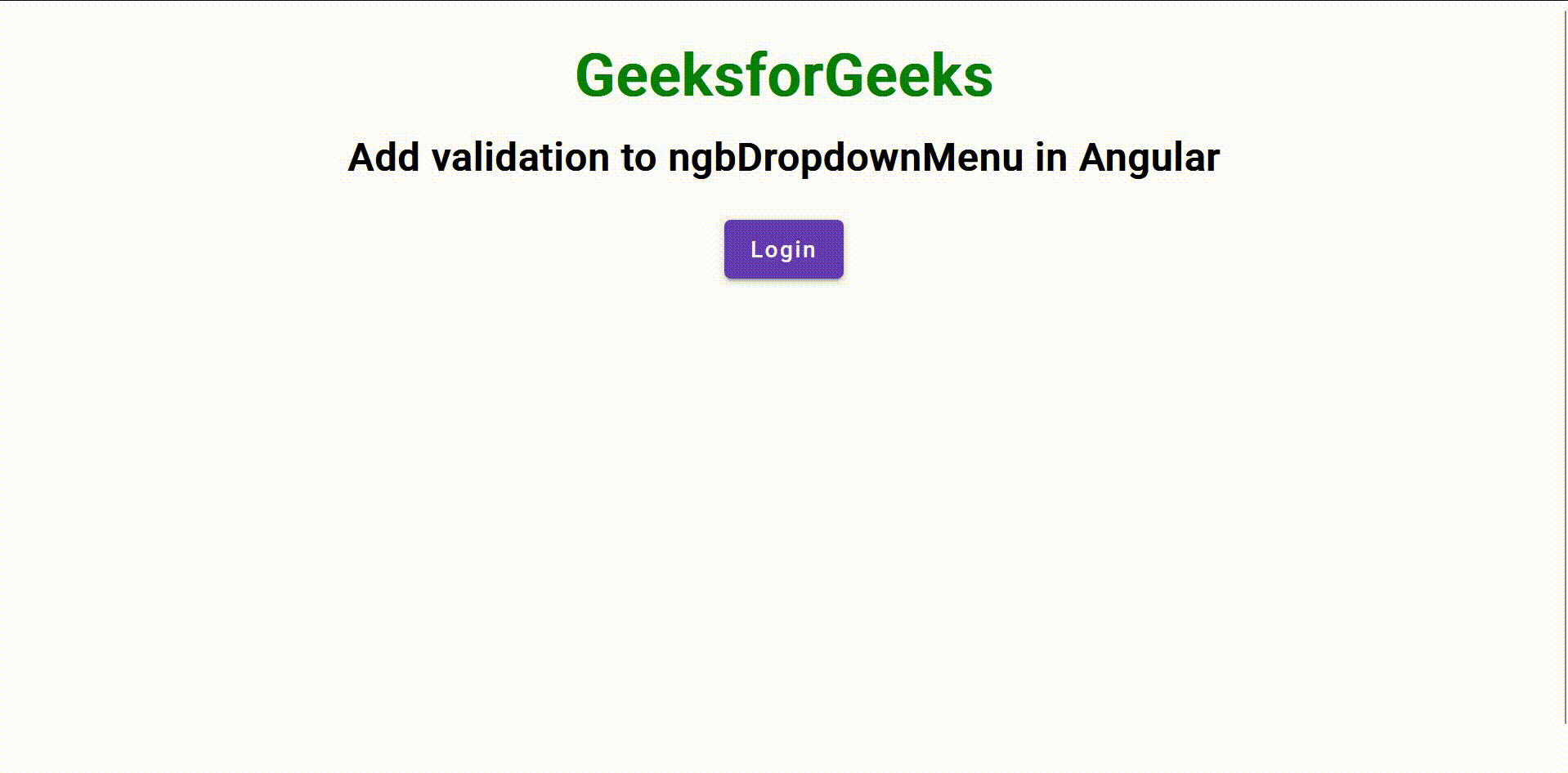
Output:

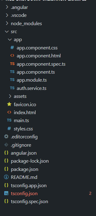
Example 2: In this example, we have used the Validation before using the ngbDropdownMenu. If the user logs in, then only the DropDown is been accessed and the user can select the item from the drop-down. Follow the below directory structure and create the files according to it. Then add the below code to the respective files.
Code Snippets:
Javascript
import { Component, ViewChild }
from '@angular/core';
import { AuthService } from './auth.service';
import {
trigger,
state,
style,
animate,
transition,
} from '@angular/animations';
import { MatMenuTrigger }
from '@angular/material/menu';
@Component({
selector: 'app-root',
templateUrl: './app.component.html',
styleUrls: ['./app.component.css'],
animations: [
trigger('fadeIn', [
state('void', style({ opacity: 0 })),
transition(':enter', animate('300ms ease-out')),
]),
],
})
export class AppComponent {
@ViewChild(MatMenuTrigger) menuTrigger!: MatMenuTrigger;
dropdownItems: string[] =
['GFG Bag', 'GFG Tshirt', 'GFG Hoodie'];
selectedItem: string = '';
showForm: boolean = false;
validationValue: string = '';
constructor(public authService: AuthService) { }
toggleAuthentication(): void {
if (this.authService.isAuthenticated) {
this.authService.logout();
this.closeValidationForm();
this.menuTrigger.closeMenu();
} else {
this.authService.login();
}
}
showValidationForm(): void {
this.showForm = true;
}
submitValidation(): void {
if (this.validationValue.trim() !== '') {
console.log('Validation value submitted:',
this.validationValue);
this.closeValidationForm();
}
}
closeValidationForm(): void {
this.showForm = false;
this.validationValue = '';
}
selectDropdownItem(item: string): void {
this.selectedItem = item;
setTimeout(() => {
this.selectedItem = '';
}, 3000);
}
openDropdownMenu(): void {
if (this.menuTrigger) {
this.menuTrigger.openMenu();
}
}
}
|
Javascript
import { NgModule } from '@angular/core';
import { BrowserModule }
from '@angular/platform-browser';
import { BrowserAnimationsModule }
from '@angular/platform-browser/animations';
import { FormsModule } from '@angular/forms';
import { AppComponent } from './app.component';
import { MatButtonModule }
from '@angular/material/button';
import { MatMenuModule } from '@angular/material/menu';
import { MatInputModule } from '@angular/material/input';
import { MatFormFieldModule }
from '@angular/material/form-field';
import { MatDividerModule }
from '@angular/material/divider';
@NgModule({
declarations: [AppComponent],
imports: [
BrowserModule,
BrowserAnimationsModule,
FormsModule,
MatButtonModule,
MatMenuModule,
MatInputModule,
MatFormFieldModule,
MatDividerModule,
],
providers: [],
bootstrap: [AppComponent],
})
export class AppModule { }
|
Javascript
import { Injectable } from '@angular/core';
@Injectable({
providedIn: 'root'
})
export class AuthService {
private _isAuthenticated: boolean = false;
get isAuthenticated(): boolean {
return this._isAuthenticated;
}
login(): void {
this._isAuthenticated = true;
}
logout(): void {
this._isAuthenticated = false;
}
}
|
HTML
<div class="header">
<h1 class="geeks-title">GeeksforGeeks</h1>
<h3 class="page-title">
Add validation to ngbDropdownMenu in Angular
</h3>
</div>
<div class="container">
<button mat-raised-button color="primary"
(click)="toggleAuthentication()">
{{ authService.isAuthenticated ? "Logout" : "Login" }}
</button>
<div class="dropdown-container"
*ngIf="authService.isAuthenticated">
<button mat-button [matMenuTriggerFor]="menu"
(click)="openDropdownMenu()">
Open Dropdown
</button>
<mat-menu #menu="matMenu" xPosition="before">
<button mat-menu-item class="dropdown-item"
*ngFor="let item of dropdownItems; let i = index" [@fadeIn]
(click)="selectDropdownItem(item)">
{{ item }}
</button>
</mat-menu>
</div>
<p class="selected-item-message"
*ngIf="selectedItem !== ''">
{{ selectedItem }} is selected
</p>
</div>
<div class="validation-form" *ngIf="showForm">
<mat-form-field appearance="outline">
<mat-label>Validation Field</mat-label>
<input matInput [(ngModel)]="validationValue" required />
</mat-form-field>
<button mat-button color="accent"
class="validation-button"
(click)="submitValidation()">
Submit
</button>
</div>
|
CSS
@import
'@angular/material/prebuilt-themes/deeppurple-amber.css';
.header {
text-align: center;
margin-bottom: 20px;
}
.geeks-title {
font-size: 36px;
color: green;
}
.page-title {
font-size: 24px;
margin-top: -10px;
}
.container {
display: flex;
flex-direction: column;
align-items: center;
}
.dropdown-container {
display: inline-block;
position: relative;
margin-top: 20px;
}
.dropdown-item {
display: flex;
align-items: center;
padding: 10px 20px;
cursor: pointer;
transition: background-color 0.3s;
}
.dropdown-item:hover {
background-color: #e6e6e6;
}
.disabled {
opacity: 0.5;
pointer-events: none;
}
|
Note: Configuration files for this example are the same. All the packages are specified in the above files.
Output:
Share your thoughts in the comments
Please Login to comment...