How to Add Icon in Form Input Field in Tailwind CSS ?
Last Updated :
14 Sep, 2023
User interface components are essential to current web development since they improve the user experience. To give visual clues and enhance the usability of numerous components, including input fields, icons, in particular, are frequently utilized. In this article, we will see how to effectively include Tailwind CSS icons into input elements to improve the visual appeal and usability of your web forms, along with understanding different techniques to implement them.
Approaches
The Tailwind CSS icons can utilized with the given following approaches with the Form Input:
- Using Inline SVG Icons
- Using Icon Fonts
We will explore both approaches, along with understanding them with relevant suitable illustrations.
Implementing inline SVG icons to Form input
In this method, input elements are enhanced with Tailwind CSS using inline SVG icons. Since SVG (Scalable Vector Graphics) icons are easily customizable, scaleable, and styleable using CSS, they are a flexible option for icons. By directly integrating the SVG code into the HTML, we can use Tailwind CSS classes to modify the SVG’s look and behavior.
Syntax:
<svg class="h-5 w-5 text-gray-400"
         fill="none"
         stroke="currentColor">
         <!-- Your SVG icon code here -->
</svg>
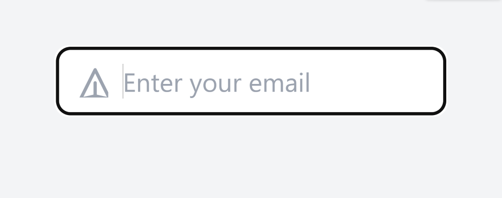
Example: This example uses the SVG icons with the Form Input.
HTML
<!DOCTYPE html>
<html lang="en">
<head>
<meta charset="UTF-8" />
<meta name="viewport"
content="width=device-width,
initial-scale=1.0" />
<link href=
rel="stylesheet" />
<title>
Tailwind CSS Icon in Input
</title>
</head>
<body class="bg-gray-100
min-h-screen
flex items-center
justify-center">
<div class="relative">
<input type="text"
class="pl-10 pr-4 py-2 border rounded-lg"
placeholder="Enter your email" />
<div class="absolute inset-y-0 left-0 pl-3
flex items-center
pointer-events-none">
<svg class="h-5 w-5 text-gray-400"
fill="none"
stroke="currentColor">
<path stroke-linecap="round"
stroke-linejoin="round"
stroke-width="2"
d="M12 19l9 2-9-18-9 18 9-2zm0 0v-8">
</path>
</svg>
</div>
</div>
</body>
</html>
|
Output:
Utilizing Icon Fonts with Form Input
In this method, we make use of icon font libraries, in particular the Font Awesome library, to include icons into input elements using Tailwind CSS. Collections of symbols or glyphs that are used as font characters are known as icon fonts. Including the Font Awesome CSS gives us access to a large number of insertable icons.
Syntax:
<i class="fas fa-envelope text-gray-400"></i>
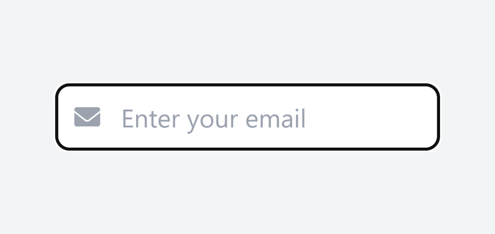
Example: This example uses the Font-awesome icons with the Form Input.
HTML
<!DOCTYPE html>
<html lang="en">
<head>
<meta charset="UTF-8" />
<meta name="viewport"
content="width=device-width,
initial-scale=1.0" />
<link href=
rel="stylesheet" />
<link href=
rel="stylesheet" />
<title>
Tailwind CSS Icon in Input
</title>
</head>
<body class="bg-gray-100
min-h-screen
flex items-center
justify-center">
<div class="relative">
<input type="text"
class="pl-10 pr-4 py-2 border rounded-lg"
placeholder="Enter your email" />
<div class="absolute inset-y-0 left-0 pl-3
flex items-center
pointer-events-none">
<i class="fas fa-envelope text-gray-400"></i>
</div>
</div>
</body>
</html>
|
Output:
Share your thoughts in the comments
Please Login to comment...