How to Add an Average Line to Plot in Matplotlib
Last Updated :
27 Jan, 2024
In this article, we will learn how we can add an average line to a plot in matplotlib. We will discuss the steps to add a horizontal average line using the axhline function, as well as the steps to add a vertical average line using the axvline function in Matplotlib. Throughout the article, we will use examples and code so that you can easily implement the learnings.
Adding a Horizontal Average Line to a Plot in Matplotlib
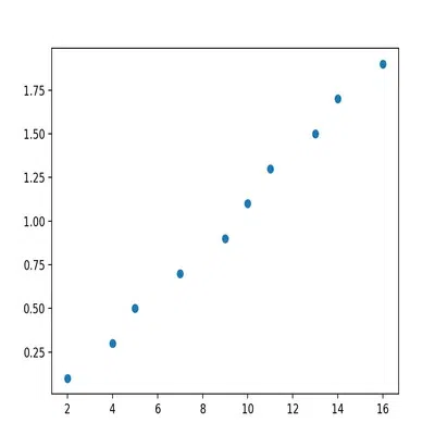
Before we begin with adding an average line to a plot in Matplotlib, let us first prepare a sample Matplotlib scatterplot. Here is the code for the same:
Python3
import matplotlib.pyplot as plt
import pandas as pd
df = pd.DataFrame({'x': [2, 4, 5, 7, 9, 10, 11, 13, 14, 16],
'y': [0.1, 0.3, 0.5, 0.7, 0.9, 1.1, 1.3, 1.5, 1.7, 1.9]})
plt.scatter(df.x, df.y)
plt.show()
|
Output:
output
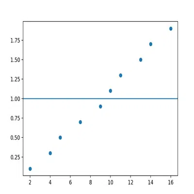
Now, we can use the following piece of code to add a horizontal average line to the plot:
Python3
import numpy as np
plt.axhline(y=np.nanmean(df.y))
|
Here is the complete code to add an average line to a plot in matplotlib:
Python3
import pandas as pd
import numpy as np
df = pd.DataFrame({'x' : [2, 4, 5, 7, 9, 10, 11, 13, 14, 16],
'y' : [0.1, 0.3, 0.5, 0.7, 0.9, 1.1, 1.3, 1.5, 1.7, 1.9]})
import matplotlib.pyplot as plt
plt.scatter(df.x, df.y)
plt.axhline(y=np.nanmean(df.y))
plt.show()
|
Output:
output
You can see that the line is drawn at the mean of all values of Y axis, that is 1. You can use this Python code to check the mean of the values on the Y axis:
Output:
1.0
Let us now understand how the code for adding the horizontal line works. The code has two main functions, axhline and nanmean. Let us look at them in detail.
The axhline function
The axhline function stands for axis horizontal line and as per its name, it draws a horizontal line on the plot across the axes.
Python3
matplotlib.pyplot.axhline(y=0, xmin=0, xmax=1, **kwargs)
|
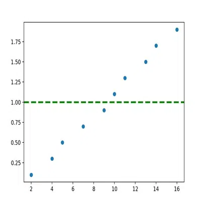
In the code, we have passed only one argument that gives the y position of the line. You can further use other parameters to change the line color, style, and width of the line. Here is the code and corresponding output for the same:
Python3
import pandas as pd
import numpy as np
df = pd.DataFrame({'x' : [2, 4, 5, 7, 9, 10, 11, 13, 14, 16],
'y' : [0.1, 0.3, 0.5, 0.7, 0.9, 1.1, 1.3, 1.5, 1.7, 1.9]})
import matplotlib.pyplot as plt
plt.scatter(df.x, df.y)
plt.axhline(
y=np.nanmean(df.y),
color = 'g',
linestyle = '--',
linewidth = 3
)
plt.show()
|
Output
output
You can see that this time, the horizontal average line is green in colour and dotted in style. It is also a lot thicker than usual. You can learn more about the axhline function here.
The nanmean function
The nanmean function is used to calculate the average for a given data. The term ‘nan’ in the nanmean function signifies that this function takes care of NAN or Not a number values as well.
Python3
numpy.nanmean(a, axis=None, dtype=None, out=None, keepdims=<no value>, *, where=<no value>)
|
In our code, we have only passed one parameter, i.e, ‘df.y’ to pass the y coordinates of the data.
If your data has no NAN values, then you can simply use the mean() function as follows:
Python3
plt.axhline(y=np.mean(df.y))
|
Adding a Vertical Average Line to a Plot in Matplotlib
You can also add an average line in a plot in matplotlib vertically, i.e, along the y axis.
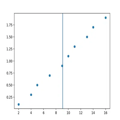
To add a vertical average line in a plot in matplotlib, you simply have to use the axvline function instead of the axhline function. Further, we will need to find the average of values along the x axis this time, so we will use ‘x.np.nanmean(df.x)’ as the argument for axvline function.
Here is the code for the same:
Python3
import pandas as pd
import numpy as np
df = pd.DataFrame({'x' : [2, 4, 5, 7, 9, 10, 11, 13, 14, 16],
'y' : [0.1, 0.3, 0.5, 0.7, 0.9, 1.1, 1.3, 1.5, 1.7, 1.9]})
import matplotlib.pyplot as plt
plt.scatter(df.x, df.y)
plt.axvline(x=np.nanmean(df.x))
plt.show()
|
Output :
output
Let us now understand the axvline function in detail.
The axvline function
The axvline function as the name suggests, draws a vertical line along the axis.
Python3
matplotlib.pyplot.axvline(x=0, ymin=0, ymax=1, **kwargs)
|
In the code, we have passed only one argument that gives the x position of the line. You can further use other parameters just like we did with axhline function, to change the line color, style, and width of the line. Here is the code and corresponding output for the same:
Python3
import pandas as pd
import numpy as np
df = pd.DataFrame({'x' : [2, 4, 5, 7, 9, 10, 11, 13, 14, 16],
'y' : [0.1, 0.3, 0.5, 0.7, 0.9, 1.1, 1.3, 1.5, 1.7, 1.9]})
import matplotlib.pyplot as plt
plt.scatter(df.x, df.y)
plt.axvline(
x=np.nanmean(df.x),
color = 'g',
linestyle = '--',
linewidth = 3
)
plt.show()
|
Output:
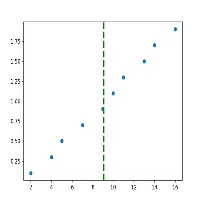
output
In this post, we learned how we can add an average line to a plot in matplotlib. You can use different functions from the matplotlib library of Python to add a horizontal as well as a vertical line to a plot in matplotlib. Further, you can change how the line appears by using the parameters provided with the axhline and axvline functions.
Share your thoughts in the comments
Please Login to comment...